
The New Image Flow Screen Component
Note: This is not an official Salesforce posting or an official piece of Salesforce technology.
I will be the first to admit that it’s not like you couldn’t put an image in a flow screen before now. The techniques are out there, but the pathways have been, shall we say, convoluted. Here’s a message from 2012:

Got that? Or maybe do it this way:

Over this weekend, I decided to take advantage of Lightning Component technology and the new Lightning Navigation to make a new component that’s easy to deploy and provides access to serious css styling.
The result is a new component called imageFSC. Like other Flow Screen Components, it comes in a package that you install into your org, and you add it to regular Flow Screens that are either running in Lightning Experience or are in Visualforce pages in the Flow container component.
Here’s an example of a screen

Let’s take a look at how this is done.
Images are Static Resources
To start with, you have to identify the specific images you want, and upload them to your Salesforce org as Static Resources.

I find the term “Static Resources” somewhat off-putting, but this is really just a storage location where you can stick images and other data files.
The simplest implementation of an image is this:
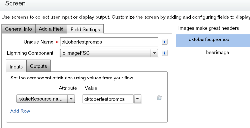
As you can see, you only have to provide the imageFSC component with a single input value, the name of your Static Resource.
These images are pretty big, but you can use css directives to resize your images:

The configuration for that looks like this:

Note that I have to use px to specify that I’m talking about pixels. The documentation for this component is here, and it provides links to some of the source material for learning about what’s possible with each of these attributes. For image height and width, you can, for example, use any of these:
- in: inches
- cm: centimeters
- mm: millimeters
- pt: points — the points used by CSS are equal to 1/72nd of 1in.
- pc: picas — 1pc is equal to 12pt.
- px: pixel units — 1px is equal to 0.75pt.
Let’s talk about positioning. If I make my screen wide enough, you can see that these two images end up on the same line:

That’s because the imageFSC component uses span elements instead of div elements. This allows you to put images side by side. Suppose you don’t want to? let’s say that instead we want to center these images like this:

The configuration involves two steps. First we instruct the browser to treat an image like a block (something that runs the full length of the screen from right to left), and then we tell it to auto-center it:

The attribute styleDisplayAsBlock defaults to false but should be set true if you want centering behavior. Note that you can enter a full four margin configuration into styleMargin or configure the four margin values separately.
Improving Presentation: Thumbnails
You can create a thumbnail effect by setting border values as follows:

This results in a border that looks like this:

Resizing Images Proportionally
To resize images while maintaining their proportion, use a combination of “auto” width and height and specific max-width and max-height:

In this image, the two photographs use that approach:

Showing Images On The Same Line
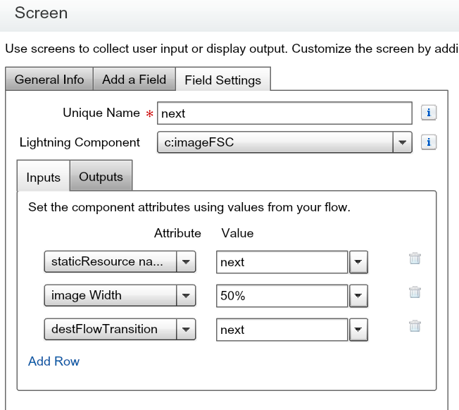
You can also specify that images should use a percentage of the total width. Here, each of the bottom images has been given 50% of their block:

Here’s the configuration:

I don’t actually need to set styleDisplayAsBlock to false. The fine tuning of the image Height has allowed me to match up two images with different size.
Using Images as Navigation
You can also choose to allow people to click on your image and have something happen, just like regular web page images. There are basically three things you can do with this component when someone clicks on an image:
- Move the Flow (equivalent to clicking Next, Previous, or Finish)
- Load a Web URL into another tab (Lightning Experience only)
- Replace the flow with another Salesforce page (Lightning Experience only)
Here’s an example, where two imageFSC components are used to provide custom Next and Back buttons:

The configuration of these images is:
There’s more information about flow transitions in the navigationButton component writeup.
I’ll cover the details of flow navigation in a later blog post. For now, the documentation is available here.
Want to install this component? You can do so here.
