
Datatable – Lightning Web Component for Flow Screens
Created by Eric Smith
This Post was most recently updated on: 5/15/26
Current Version: 4.3.7
5/15/26 – Eric Smith – Version 4.3.7
Updates:
- Made the Preselected Rows Attribute Reactive
Bug Fixes:
- Fixed bug where table won’t display when the Row Action button has the default label
Click here for Troubleshooting & Restrictions
See the complete list of changes in the Release Notes
Table of Contents
Table of Contents (Click to Expand)
ABOUT
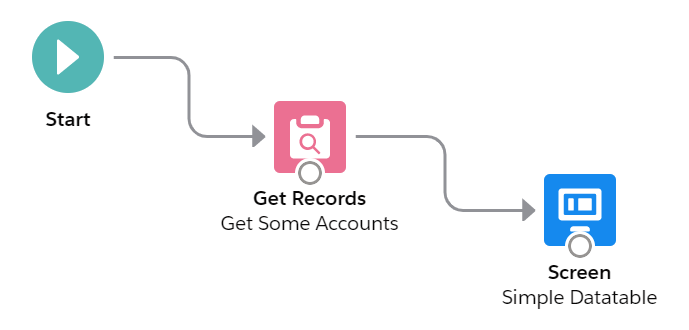
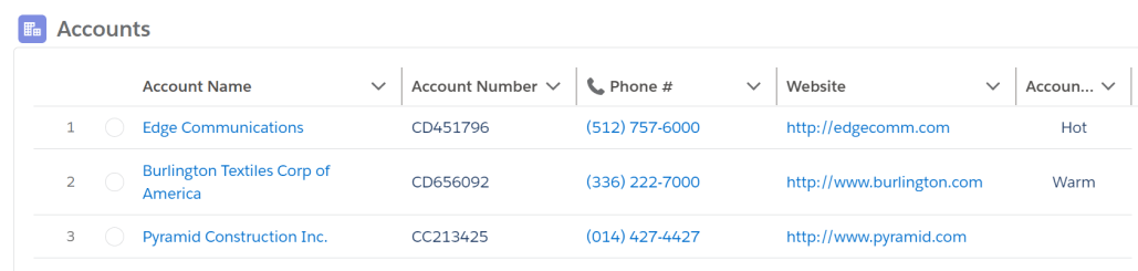
Datatable is a Flow Screen Component that allows you to configure and display a datatable on a flow screen. All you need to do is drag it onto the flow screen in the Flow Builder and give it a collection of records and a list of field names. The field label, type, and numeric formatting will default to what is defined in the object. The displayed records can be selected and/or edited for further use in the flow.
While interacting with the datatable, the user can sort columns, filter columns, search for records, change column widths, wrap or clip the displayed text, select rows, and edit fields.
In addition to supporting standard and custom Salesforce objects, user created Apex-Defined objects can be used as well. See Flow and Process Builder List View with Batch Delete for an example.

Additional Optional Functionality
Even though the component can be very simple to use in its basic format, you have a tremendous amount of flexibility and capability when you take advantage of some of the numerous optional attributes that are available.
- Rows can be selected and passed back to a collection variable in the flow
- A collection of pre-selected rows can be passed into the component
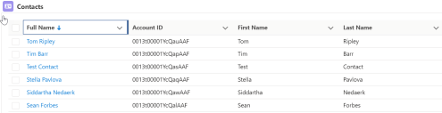
- The selection column can be multi-select (Checkboxes), single-select (Radio Buttons), or hidden
- The records can be filtered by column values
- The records can be filtered with a search term
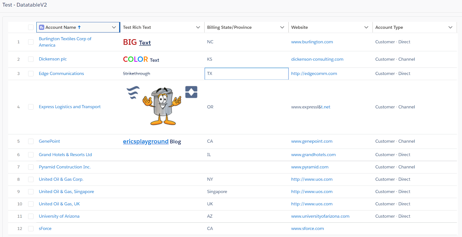
- Rich Text, Images and Hyperlink formulas are supported
- The Standard object Name field and Lookup fields can be displayed as clickable links
- Inline editing is supported with changed values passed back to the flow
- Output parameters include # of selected records, # of edited records, SObject and SObject Collection variables
- When just a single record is selected, the output will include a Record variable in addition to a Record Collection variable
- Pagination attributes can define the number of rows to display at one time and buttons are provided to page back and forth through the table
- You can make record selection Required
- You can add a customizable Row Action to trigger a reactive component, run a flow or remove a record from the datatable
- You can add an Icon, Header Label and Record Count to the datatable
- The datatable height and border can be customized
- You can fix each individual column width or allow it to flex to fit the screen
- Optional attribute overrides are supported and can be specified by list, column # or by field name, including:
- Cell Alignment
- Column Header Icon
- Column Header Label
- Initial Column Width
- Column Filter Allowed
- Column Edit Allowed
- Custom Cell Attributes with nested values {name: {name:value}}
- Custom Type Attributes with nested values {name: {name:value}}
- Other Custom Column Attributes with nested values {name: {name:value}}

Object Support
The Salesforce Object is specified at the time of configuration, allowing just one version of this component to be used for all Salesforce Objects.
User defined Apex-Defined Object variables are supported.
Troubleshooting & Restrictions
- The datatable will only display the first 2000 records in the input collection. A collection passed in with more than 2000 records could cause an Apex CPU time limit exceeded error.
When filtering rows in a datatable, any previously selected rows that are not part of the resulting filtered rows will be deselected.- Columns of data type Time cannot be filtered.
- Datetime columns can only be filtered on the date.
- Some data types cannot yet be edited in a datable (lookup, location, time, multi-select picklists, encrypted, rich text, long text area).
- For a Screen Reader to work correctly, the datatable must have a value for the Table Header. The header does not have to be displayed.
- If you add custom TypeAttributes to a Date or Datetime field, the value will be converted from a ‘date-local’ value to a standard datetime value. This will cause the value to be processed as UTC time rather than being converted to the browser’s local time zone.
- In order for a lookup or master/detail field to display as a link, it must be “reparentable”
- In order to have the Datatable display a Lookup field as a link to the record rather than just the recordId value in the field, the running User must have Edit access to the object whose records are being displayed in the Datatable. For example, if you have a Datatable for Contact records and include the AccountId(Lookup) field, the running User needs to have Edit access for the Contact object in order for the AccountId field to show as a clickable link with the Account’s Name. Without Edit access to the Contact record, the Datatable will display, as unclickable, the Account’s recordId value. For information on how you can temporarily add then remove Edit access in a Flow, read the referenced Help Article and/or complete the referenced Trailhead.
Help Article: Create a Flow That Can Activate or Deactivate a Session-Based Permission Set
Trailhead: Session-Based Permission Sets and Security
- With the update to selecting a record type for picklist field edits, the running User must have Read Access to the object being displayed in the Datatable. If they do not, any Record Type Id attribute will be ignored and all Picklist values will be available when editing a Picklist field.
- When allowing editing of picklist fields in a table with a small number of records, you can set the “Allow table to overflow its container” attribute so the list of picklist values will not be constrained to the dimensions of the datatable. Note that, with this setting enabled, a wide table could overflow when being displayed in a narrow container. When setting this attribute, the “Table Height” attribute will be ignored.

- When editing Percent fields you must enter the true decimal value. Example: .25 for 25%
- 2 fewer decimal places will be available when editing than what has been defined for the percent field
- If you pass in pre-selected records that are not actually in the collection of displayed records, the numberOfRowsSelected output attribute will be equal to the # of pre-selected rows passed into the component if no additional selection changes are made by the user. However, the outputSelectedRows output attribute will not include any records not in the input collection.
- When using the Datatable for the ContentVersion object, do not let Salesforce “Automatically store all fields” in your Get Records. Instead, pick “Choose fields and let Salesforce do the rest” and be sure NOT to include the VersionData field. That field contains the entire content of the referenced file and can be too large to be handled correctly by this component.
- If you see this error (Received exception event aura:systemError from Server) and the Datatable doesn’t display, you may be trying to pass in to much data for the component to handle. The limit is around 4MB. Change your Get Records from “Automatically store all fields” to “Choose fields and let Salesforce do the rest” and include only those fields you’ll need for your Datatable.
- If you are selecting an Object that contains Geolocation fields (ie: Contact), you may experience a Salesforce Bug where the Flow will stop just before the Datatable should be displayed or the Flow will display an error when clicking Next and show another copy of the same datatable. If this happens, unselect “Automatically store all fields” in your Get Records and choose your fields manually.
- If you see this error “Apex Action Error: Unable to read SObject“, you may also have an issue with certain types of compound fields like Address or Geolocation. Try only choosing the fields you need in your Get Records rather than selecting “Automatically store all fields”.
- If you are editing, then updating records that contain a non-custom integer field (Account: NumberOfEmployees) you may experience a Salesforce Bug and see this error:
- This error occurred when the flow tried to update records: Argument must be a big decimal java.lang.Long.
- If you see this error when trying to Configure Columns, try going to Setup > Security > Session Settings and unchecking “Enable clickjack protection for customer Visualforce pages with headers disabled“. Also, in your Setup > User settings, make sure both Debug Mode and Development Mode are Unchecked.

- Starting in v4.1.0, if Debug Mode is enabled, the Column Configuration Wizard is unable to display any sample records
Top
Installation
Step 1
This component requires that you first install or upgrade the Flow Base Packs*
- FlowActionsBasePack Version 3.18.0 or later
- FlowScreenComponentsBasePack Version 3.3.8 or later
Step 2
Install the Datatable package
Step 3 (New in v4.1.0)
Activate the latest version of the “Datatable Configuration Wizard” Flow
Step 4
Manage Assignments for the USF Flow Screen Component – Datatable Permission Set
- Setup > Users > Permission Sets > USF Flow Screen Component – Datatable > Manage Assignments > Add Assignments > Select Users > Assign
- Or you can manually add permissions to access these Apex Classes to any Profiles that will be running Flows using the Datatable component
- ers_DatatableController
- ers_EncodeDecodeURL
- ers_QueryNRecords
* The following components from the Flow Base Packs are used in Datatable:
FlowActionsBasePack
usf3.FieldDescriptor
usf3.FieldPickerController
usf3.GetFieldInformation
FlowScreenComponentsBasePack
CustomLabels.labels
fsc_displayError
fsc_flowBanner
fsc_flowCheckbox
fsc_flowCombobox
fsc_flowComboboxUtils
fsc_pickIcon
fsc_pickObjectAndField
fsc_pickObjectAndFieldUtils
fsc_screenFlow
fsc_screenFlow.page
fsc_screenFlowApp.app
fsc_searchableDataTable
Note:
Starting with Version 3.0.9 you can check the current version of your Datatable component by looking at the bottom of the Advanced section in the Custom Property Editor.
Top
Source Code
Top
Reference
Starting with Version 3.0.0, this component includes a CPE (Custom Property Editor). This makes it much easier to configure the Datatable when adding it to your Flow Screens.
Each section in the CPE (Custom Property Editor) has a help page you can access by clicking on the (i) in the header.
Top
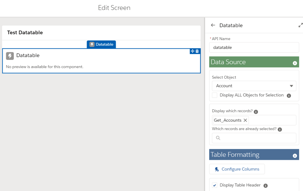
Data Source
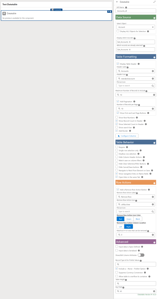
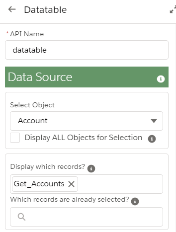
Each instance of the Datatable Component requires an API Name, an Object and a Collection of Records to display.
Normally, the Select Object picklist will display the most common Standard objects and all Custom objects. If you select the “Display ALL Objects for Selection” checkbox, all Salesforce objects should be available in the Select Object picklist.
Normally, the Select Object picklist will display the most common Standard objects and all Custom objects. If you select the “Display ALL Objects for Selection” checkbox, all Salesforce objects should be available in the Select Object picklist.
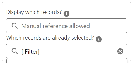
Not all flow components, such as Transform and Filter, are currently supported by the attribute picker. To make sure you can pick the record collections you want, the record selections allow you to manually enter a flow attribute in this format: {!MyAttributeName}

Top
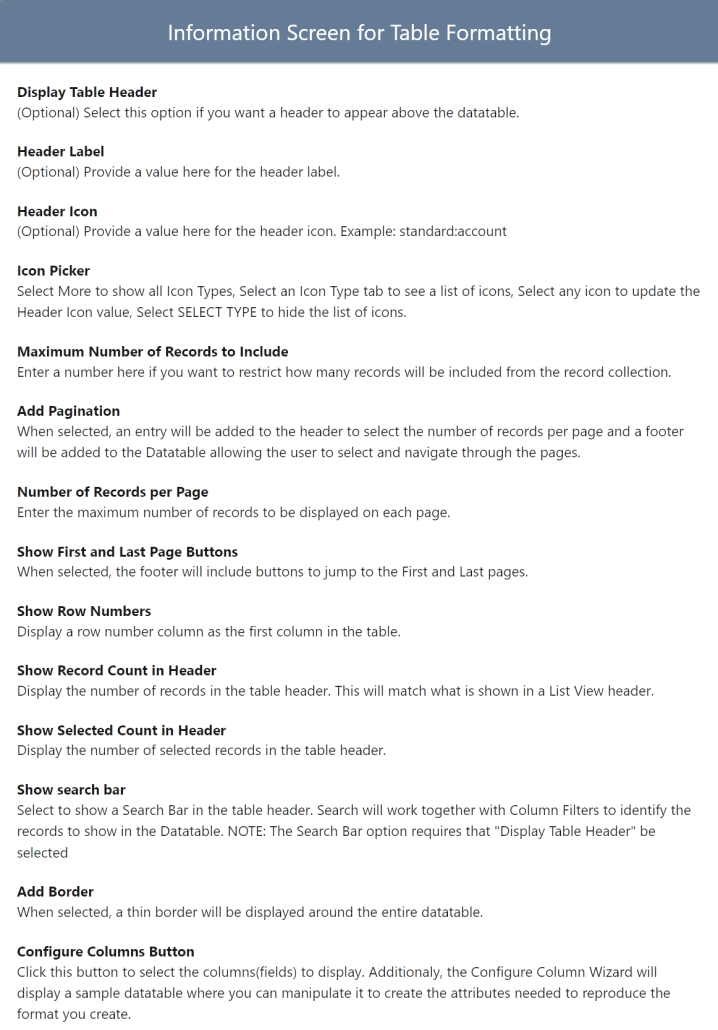
Table Formatting
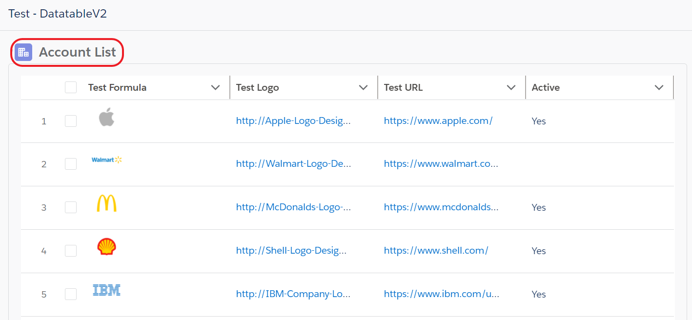
If you select the checkbox for Display Table Header, the system will automatically pick the system defined icon and plural object name for you. You can change these if you like.

The Icon Picker can also be used to select the Header Icon. Any icon selected in the picker will populate the Header Icon value automatically.

Example Header Icon and Label
Note: Starting in version 4.2.0 the Header Label is reactive to any changes in the flow.

The value you enter for “Maximum Number of Records to Display” will reduce the size of the record collection to the first number of records specified in the value setting.
The “Add Pagination” checkbox changes the datatable to display a fixed number of records at a time with buttons below the table to allow the user to navigate back and forth in the datatable. Additional attributes allow you to specify the default number of records to display at a time and whether or not you want to include First and Last buttons in the footer.

The header will include a user adjustable entry to specify how many records to display at a time and the footer will include Previous and Next buttons along with a Page Number value that the user can enter directly to jump to a particular page.
If you check the “Show Row Numbers” checkbox, a column will be added on the left side of the datatable with the row number for each record in the table. The default for this setting is False, however it will always be displayed if any columns are configured to be editable.
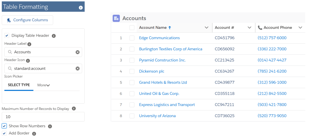
If you select the “Show Record Count in Header” checkbox, the number of records in the datatable will be included as part of the header. This is similar to what Salesforce displays for List Views.

If you select the “Show Selected Count in Header” checkbox, the number of selected records in the datatable will be included as part of the header.

When checking the “Show search bar” checkbox, a search box will display in the table header. The data in all table columns will be searched and records with matching values will be displayed. The Search can be combined with the individual column Filters to restrict which records will be displayed in the Datatable. When the Datatable has been searched and/or filtered, the header will show both the number of displayed records along with the total number of records.
NOTE: When the Search Bar is enabled, the Header is required and will appear slightly larger than a table without a Search Bar.
NOTE: When the Search Bar is enabled, the border can’t be disabled and it will appear with rounded rather than square corners.
NOTE: When searching for a Date, enter the value in the YYYY-MM-DD format.
Top
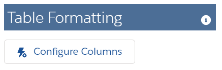
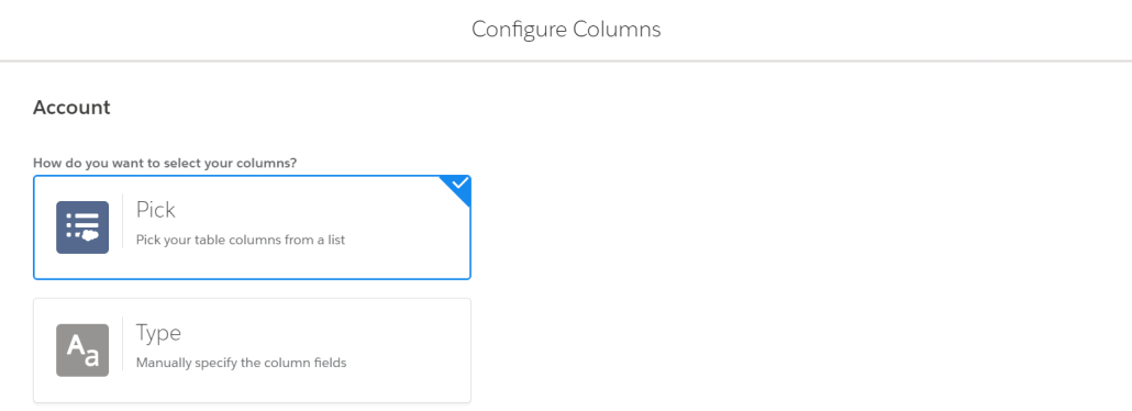
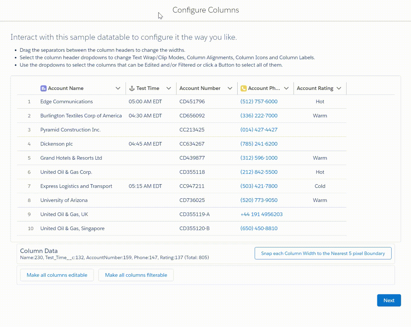
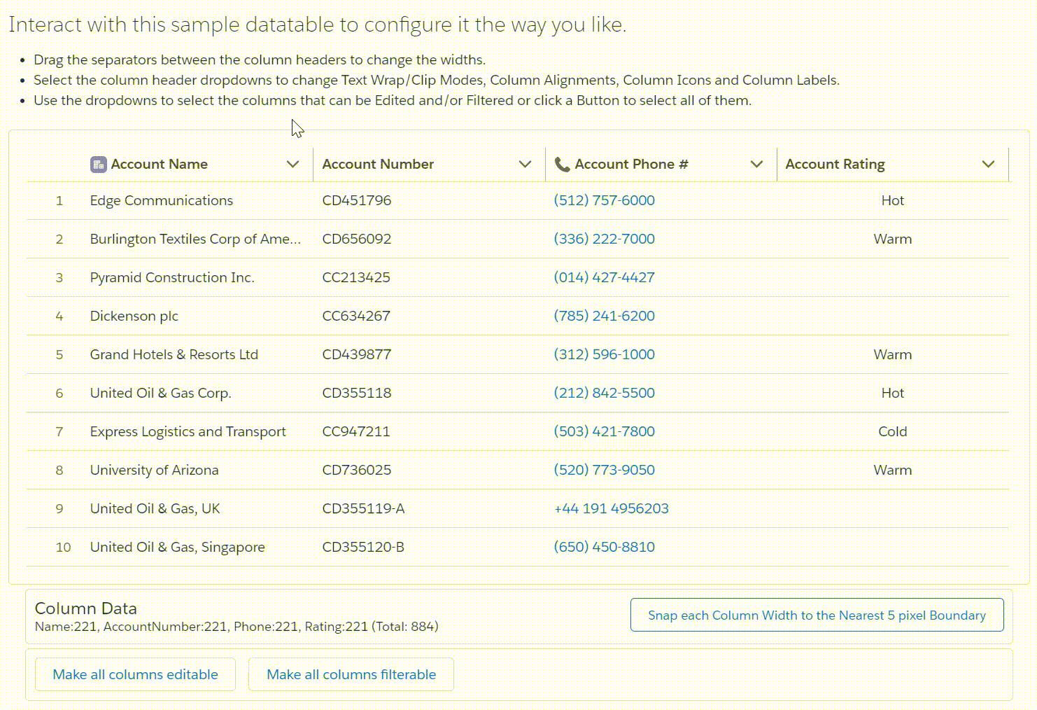
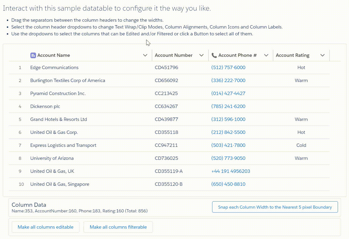
Configure Columns
The Configure Columns button runs a special configuration wizard flow that lets you select the columns(fields) to include in your datatable. Once the fields are selected, it creates a sample table that you can interact with to customize your datatable. Upon completion of the customization, the wizard will populate up to 8 separate Column Attribute parameters for you.
Column Fields
You can select and order your fields from a list of all the fields from your datatable’s object.
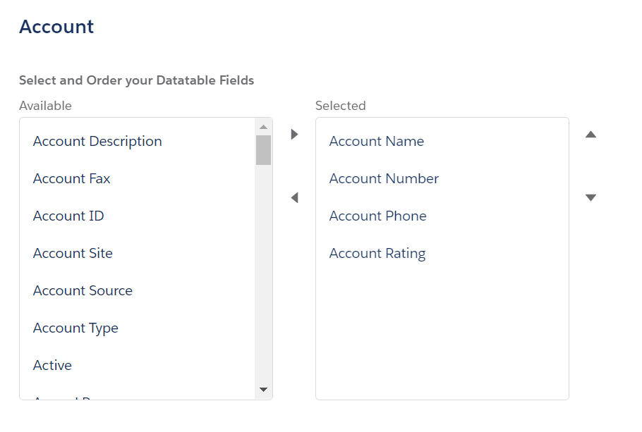
You also have the option to type in a list of the field API names instead of picking from a list.

If you have saved any column configuration records, you will see a third option to select and load any of the previously saved configuration records for the current Object.
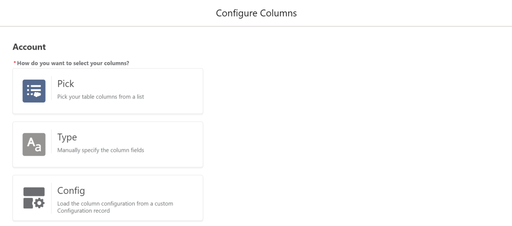

Once the fields are selected, you will see a sample datatable with your selected fields and the first few records from your selected object.

Column Alignments
You can change the default Column Alignment by selecting the drop-down on a column heading and then selecting Align Left, Align Center or Align Right.

Column Edits
You can pick which columns you want to allow editing on by selecting the drop-down on a column heading and then clicking the Allow Edit tag on or off. You can also click the “Make all columns editable” button below the table to make all or none of the columns editable.
Note that some data types cannot be edited in a datatable (lookup, location, encrypted, rich text, long text area). The edited record values are not saved directly to the object, but are passed back to the Flow where an Update Records can be used to permanently save the changes.

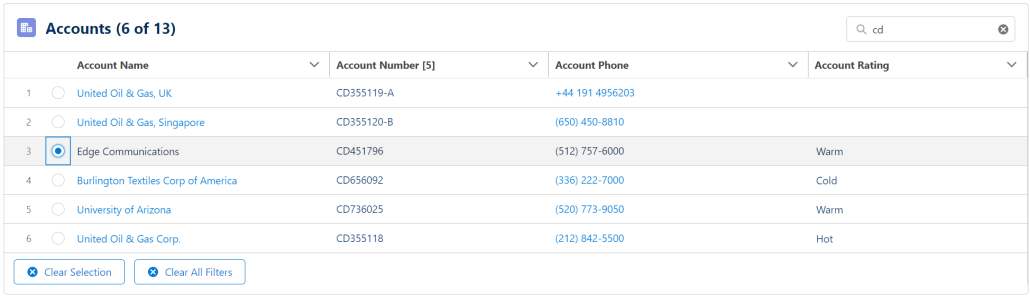
Column Filters
You can pick which columns you want to allow filtering on by selecting the drop-down on a column heading and then clicking the Allow Filter tag on or off. You can also click the “Make all columns filterable” button below the table to make all or none of the columns filterable.
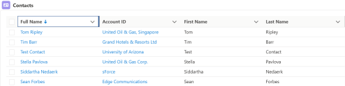
Column Filters allow a user to narrow down the number of displayed records in the Datatable by entering filter values for any columns where filters are allowed. See the Filter Example at the end of this article.
When any column filters have been applied, a Clear All Filters button will be displayed under the Datatable. The button can be hidden by selecting the Hide Clear Selection/Filter Buttons option.

New in v4.3.3 – When applying filters by column, you now have the ability to filter rows that have blank values in the filtered column.
Column Icons
You can add an Icon to the header of any column by selecting the drop-down on a column heading and then clicking Select Icon. Use the Icon Picker to select the Icon Type and then the Icon. See https://www.lightningdesignsystem.com/icons/ for a complete list of available Icons.
Column Labels
Column Labels can be changed by selecting the drop-down on a column heading and then clicking Change Label. If a column label has been changed, you can reset it back to the default by selecting the drop-down on a column heading and then clicking Cancel Change.

Column Widths
By default, the sample table will start with each column the same width. You can change column widths by dragging the vertical line between columns. The minimum width of a column is 80 and the maximum is 1500.
To assist with column width consistency, once you have the columns sized approximately the way you want them, you can click the “Snap each Column Width to the Nearest 5 pixel Boundary” button below the table to adjust each column’s width to the nearest 5 pixel width.
Special Note: If you want the entire table width to fill the available container with columns all the same size, activate the “Show/Edit Column Attributes” toggle in the Advanced section and clear the entry for Column Widths. If you want certain columns to start with a particular width, set just their entries in the attribute with the desired width in pixels and all the rest of the columns with no entries will expand to fill the rest of the container width.
New in v4.1.0 – A Flex Width column attribute has been added to the Configure Columns Wizard. When selected, all flexed columns width’s will evenly expand or contract to fill the available space. You can pick which columns you want to allow flexible widths on by selecting the drop-down on a column heading and then clicking the Flex Widths tag on or off. You can also click the “Make all column widths flexible” button below the table to make all or none of the column widths flexible.
This option gives you more control over columns that you specifically want to be narrow or wide while allowing the other columns to find the best fit.
If a user manually changes the width of a flexed column, it will stay at that width and no longer flex if the size of the window changes.

Column Wraps
You can specify if a column should wrap or clip text when it is first displayed by selecting the drop-down on a column heading and then clicking Wrap Text or Clip Text. By default all columns are set to Clip Text with the exception of the Object’s Name field, which will always display as wrapped.
Note: Starting in v4.3.1 Column Headers will also Wrap or Clip based on the column setting.
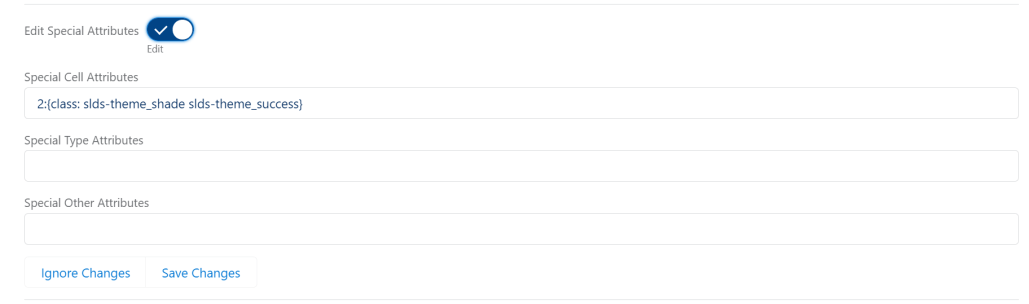
Edit Special Attributes
You can edit the special Cell, Type & Other attributes in the Configure Columns Wizard screen as well as on the component configuration page. Edits made here can be saved with any Configuration Records you create or update while in the Wizard. You must select Save Changes for the attributes to be passed back to the configuration page.
Configuration Record Options
You can save the current configuration by selecting an existing Configuration record to update or you can enter a new unique name to save the configuration in a new Configuration record.

When you have finished making adjustments to the sample table, click the Done button then close the final window to return to the Flow Builder.
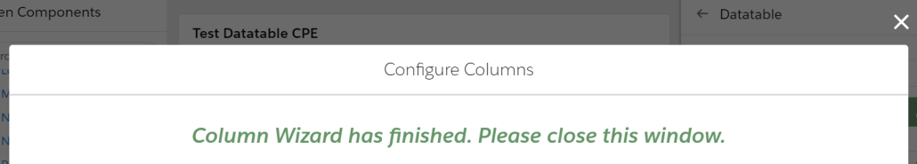
NOTE: Starting in v4.1.0, clicking Done on the Column Configuration Wizard screen will close the window for you.
Top
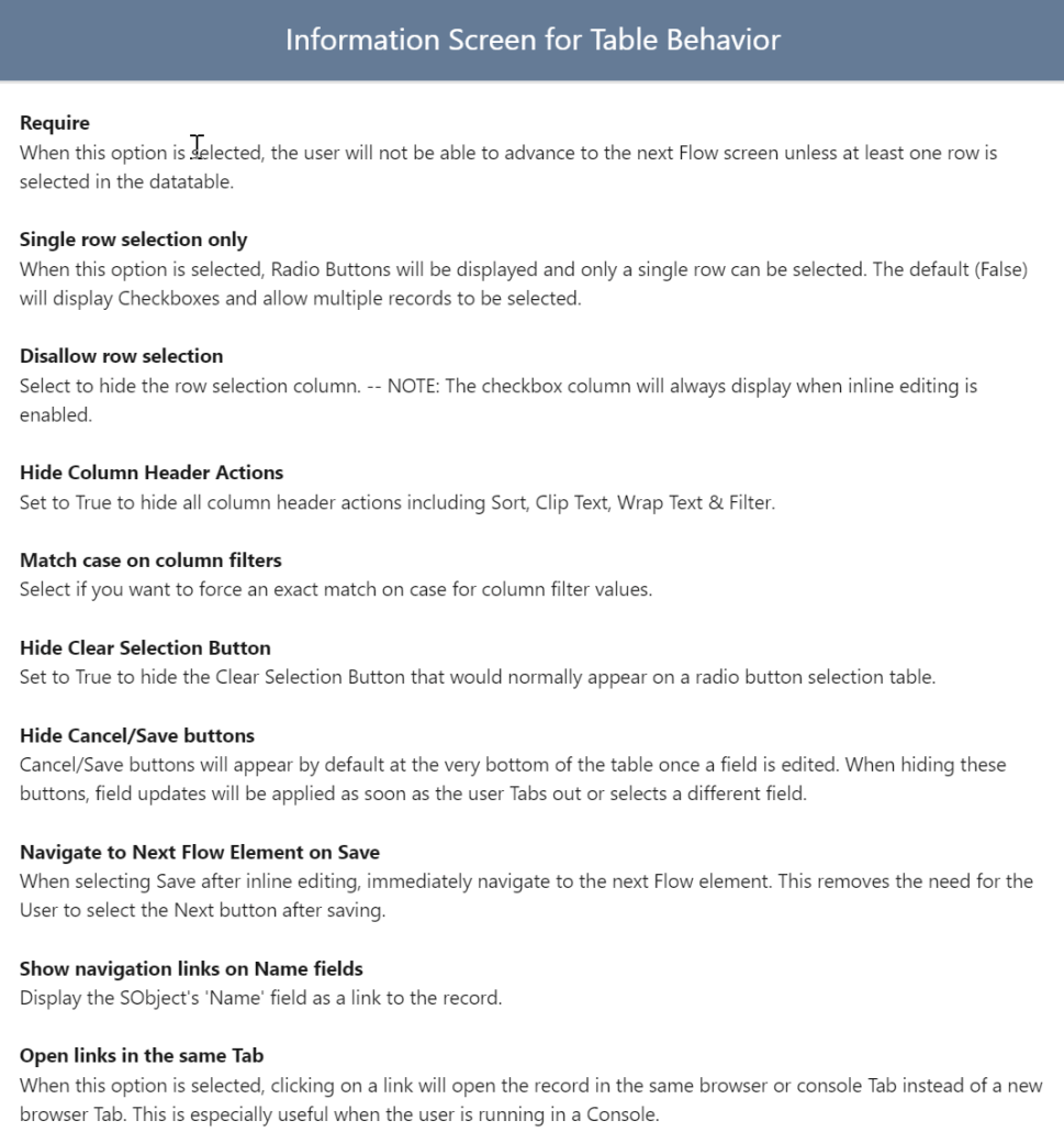
Table Behavior
The Table Behavior checkboxes let you fine-tune how you want the user’s interaction with the table to be. Certain options could be disabled based on the values of other options.

Top
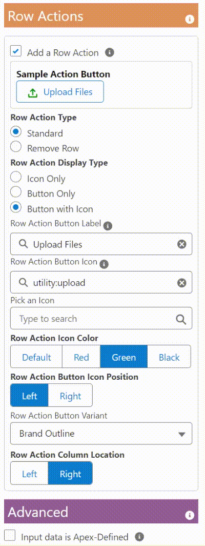
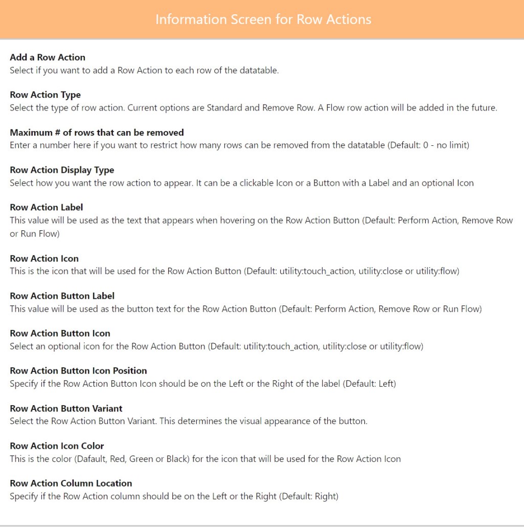
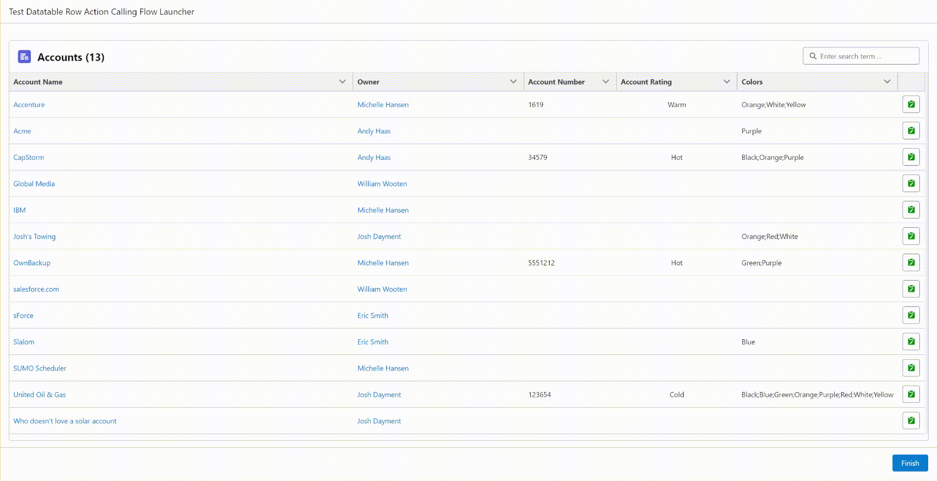
Row Actions
The Row Actions let you add a Standard or Remove Row Action Button to each record in the datatable. You can configure the action as a clickable icon or a button. Additional configurable options include button variant, icon position, icon color, hover text and the position of the row action column. For Remove Row you can also limit the total number of rows that can be acted on with the action. The property editor will show you a sample of what the button will look like based on your current configuration.
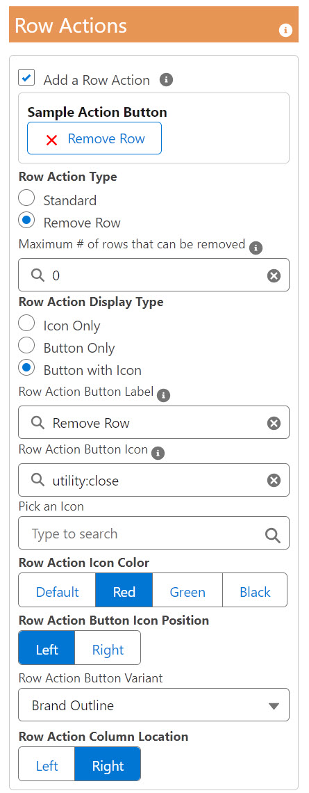
If you select 0 for the maximum number of rows that can be removed, the system will allow all rows to be removed.
See this post for some examples of using the Remove Row action to select and remove records from a datatable.
See this article for an example of using a Row Action to launch a Screen Flow to update the actioned record.
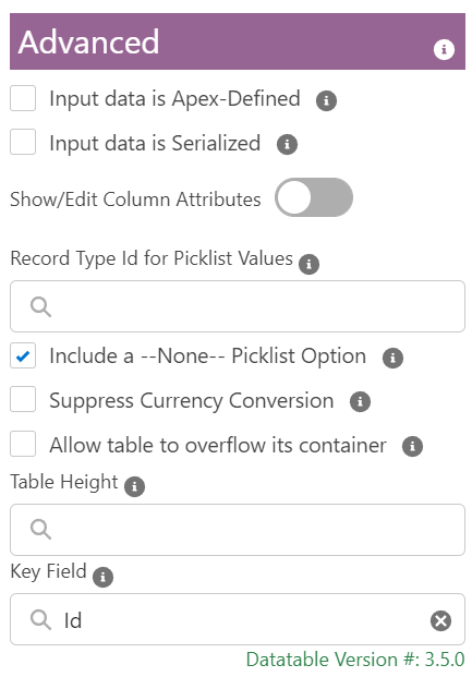
Advanced
The advanced options let you do things like see and change all of the individual column attributes, specify a record type for picklist edit values or select an Apex-Defined object instead of a regular Salesforce object.

By default, the values shown when editing a picklist field will be all of the available options for that field regardless of Record Type restrictions. If you want to restrict the values to only be those defined for a particular Record Type, you can provide that Record Type Id in the Advanced section. This setting will apply to all rows in the datatable regardless of the individual record’s record type.
If you don’t want a –None– option to be included when editing a picklist field, clear this checkbox. Keep in mind that leaving this option out will not allow you to clear a picklist value when editing a picklist field.
Automatic currency conversion to the User’s currency in Multi-Currency orgs was introduced in v3.1.1. This option allows you to suppress that conversion.
By default, sorting a datatable column is case sensitive. String values will sort upper case characters before lower case characters (ACEbd). Select the Ignore character case when sorting option to match the same sort sequence as standard List Views and Get Records queries (AbCdE).
Selecting the “Allow table to overflow its container” option is helpful when you are editing picklist values in a table with only a few records. Although this removes the need to scroll vertically to see the entire picklist drop-down, it will also cause wide datatables to horizontally overflow narrow regions on the screen.


When you select the “Show/Edit Column Attributes” toggle, you will see each of individual column attributes settings. These are the same attributes that were required for datatableV2. You can enter your own data here or change what was pre-filled by the Configure Columns Wizard.

If you select the “Input data is Apex-Defined” or the “Input data is Serialized” checkbox, other attributes will be displayed including different selections for which records to display and which records are pre-selected.
For more information about using Apex-Defined Data Types, please see these additional resources.
Manipulate Rich Web Data in Flow Without Code (Apex-Defined Data Types)
How to use Apex-Defined Objects with the DatatableFor more information about using Serialized record data, please see this post.
Working with Serialized Data


The Configure Columns Wizard is not available for Apex-Defined objects. By default, each of the individual Column Attributes will be displayed, including Column Scales and Column Types which are unique to Apex-Defined data sources.

NOTE: For non-standard field types in Apex Defined Objects (Arrays, JSON, etc), specify a Column Type of ‘richtext‘ in order to display the complete field contents.

Special Formatting for Comma Separated List Attributes
- Column Alignments
- Column Edits
- Column Filters
- Column Icons
- Column Labels
- Column Scales
- Column Types
- Column Widths
- Column Wraps
These optional attributes can be specified as a comma separated list of Column Identifier:Value pairs. The Column Identifiers can be either the column number or the field API name. Keep in mind that if you use column numbers instead of the field API name, you will have to update the identifiers if you insert, remove or change the order of the columns.
Another option is to omit the column identifiers and just provide a comma separated list of values. If you choose this method, you must provide a value for every column (A,B,,D would be invalid) and you can’t use this method with attributes that already contain a ‘:’, such as Column Icons (standard:account).
These Column Widths attributes would all work the same for setting the initial column widths of the sample table at the top of this page.

- Name:300, Phone:150, BillingCity:140, Type:120
- 1:300, 2:150, 3:140, 4:120
- Name:300, 2:150, BillingCity:140, 4:120
- 300,150,140,120
Special Formatting for Semicolon Separated List Attributes
- Special CellAttributes
- Special TypeAttributes
- Special Other Attributes
These optional attributes can be specified as a semicolon separated list of Column Identifier:Value pairs. The Column Identifiers can be either the column number or the field API name. Keep in mind that if you use column numbers instead of the field API name, you will have to update the identifiers if you insert, remove or change the order of the columns. Another option is to omit the column identifiers and just provide a semicolon separated list of values. If you choose this method, you must provide a value for every column.
The reason for these attributes is to give the user more control over how their datatable is formatted. I included predefined options for standard attributes like Label, Alignment, and Width. These additional options allow the user to manually add in other standard attributes like WrapText, CellAttributes like appending an icon to column data, and TypeAttributes to fine-tune how different data types (like dates) are displayed. See the Salesforce Datatable Documentation for details.
Note: If you are referencing the value of another field in your attribute, that field must also be one of the fields displayed in the datatable.
Example Cell Attribute: FancyField__c:{class: slds-theme_shade slds-theme_alert-texture, iconName: {fieldName: IconValue__c}
Since the Cell Attribute for the FancyField__c column references ‘IconValue__c’, the IconValue__c field must be one of the columns included in the datatable.
Example #1: Column Icons, Column Widths & Special Column TypeAttributes
Column Icons
1:standard:account, 2:utility:builder, 3:utility:date_input, 4:utility:date_timeColumn Widths
200, 120, 200, 200Special: Column TypeAttributes
2:{year: 2-digit, month: numeric, day: numeric}; 3:{year: numeric, month: long, day: 2-digit, weekday: long}; 4:{year: 2-digit, month: 2-digit, day: 2-digit, hour: 2-digit, minute: 2-digit, time-zone-name: short}
Special Note for Date & Datetime Formatting
If you add custom TypeAttributes to a Date or Datetime field, the value will be converted from a ‘date-local’ value to a standard datetime value. This will cause the value to be processed as UTC time rather than being converted to the browser’s local time zone.
For more details on Date and Datetime formatting see the Salesforce Formatted Date Time documentation.
Other Formatting with TypeAttributes
You can use Column TypeAttributes for other types of field formatting. For additional details, reference the Formatting with Data Types section of the Salesforce documentation for the base lightning datatable. For example, to have a numeric column display with a single digit after the decimal point, use the follow format for your TypeAttribute:
fieldAPIname:{maximumFractionDigits:1}
Example #2: Column Labels, Special Column CellAttributes & Special Column Other Attributes
Column Labels
Name:Account Name, dt_Text__c:Field Value Used as Attribute, FancyField__c:Icon Value from a Different Field, IconValue__c:Icon ValueSpecial: Column CellAttributes
dt_Text__c:{class: {fieldName: dt_Text__c}}; FancyField__c:{class: slds-theme_shade slds-theme_alert-texture, iconName: {fieldName: IconValue__c}, iconPosition: left}Special: Column Other Attributes
3:{wrapText:true}

Top
Output Attributes
The following Output Attributes are available in your Flow. There is no need to manually assign these values as the system will make them available to the rest of your Flow automatically. .
| ATTRIBUTE | TYPE | NOTES |
|---|---|---|
| Output Number of Edited Records | Integer | Total count of the number of edited records NOTE: Use this to confirm if no rows were edited because the Output Edited Rows attribute will not be Null even when no rows are edited |
| Output Edited Rows ± | SObject Collection Variable | Record Collection variable to contain only the records that were edited in the datatable. NOTE: To write these edits back to the Object, you will need to do a Record Update in the Flow. |
| Output Edited Rows (User Defined) ± | String | Serialized String of Apex-Defined object records |
| ± Only one of these is provided based on the value of (User Defined) Display User Defined Object? | ||
| Output Number of Selected Records | Integer | Total count of the number of selected records |
| Output Selected Row (Object) | SObject Variable | Record Object variable that contains the single record that was selected in the datatable. NOTE: This is only provided when just a single record is selected. |
| Selected Row Key Field Value | String | The value of the keyField of the selected row. The default value for keyField is Id. NOTE: This is only provided when just a single record is selected. |
| Output Selected Rows (Collection)±± | SObject Collection Variable | Record Collection variable to contain only the records that were selected in the datatable NOTE: The Selected Rows collection will contain all of the selected records but you will need to also access the Edited Rows collection to see the edited field values. See this link in the Additional Resources section to review How to use both the Selected and the Edited records in a Datatable. |
| Output Selected Rows (User Defined) ±± | String | Serialized String of Apex-Defined object records |
| ±± Only one of these is provided based on the value of (User Defined) Display User Defined Object? | ||
| Output Actioned Row (Object) | SObject Variable | Record Object variable that contains the single record that was actioned in the datatable. NOTE: For the Remove Row action, this will be the most recent record removed. |
| Output Actioned Row (User Defined) | String | Serialized String of Apex-Defined object record NOTE: Only provided if the input data is Apex-Defined |
| Output Number of Removed Records | Integer | Total count of the number of removed records |
| Output Removed Rows (Collection)±±± | SObject Collection Variable | Record Collection variable to contain only the records that were removed from the datatable. NOTE: These records will contain all saved edited values. |
| Output Removed Rows (User Defined) ±±± | String | Serialized String of Apex-Defined object records |
| Output Remaining Rows (Collection)±±± | SObject Collection Variable | Record Collection variable to contain all the original records that were not removed from the datatable. NOTE: These records will contain all saved edited values. |
| Output Remaining Rows (User Defined) ±±± | String | Serialized String of Apex-Defined object records |
| ±±± Only one of each of these is provided based on the value of (User Defined) Display User Defined Object? |
Top
ADDITIONAL RESOURCES
Review this 4-part Blog series for some ideas on how you can take advantage of datatables in your Flows. Eric writes about how he used his original datatable component to do things like dynamic record presentation and selection, how to select and act on a collection of records, displaying formatted interactive tables and how to inline edit a group of records.
Part 1: Use a Datatable to present a dynamic choice for record selection in a Flow.
Part 2: Use a Datatable in a Flow to select and act on a collection of records.
Part 3: Use a Datatable to display a formatted, interactive table in your Flow.
Part 4: Use a Datatable to inline edit a group of records.
How to use Apex-Defined Objects with the Datatable
How to use both the Selected and the Edited records in a Datatable
Let’s Revisit How to use both the Selected and the Edited records in a Datatable

Display Rich Text and Custom Links and Images in Datatables
New features for displaying and interacting with the Datatable (Fall ’20)
Datatable with Row Actions calling a pop-up Screen Flow
Top
Videos
Datatable Overview
Formatting and Customizing
Custom User Defined Object
Column Filtering Example
How and why I created this component
Top
Old Versions & Release Notes
Installation
Click Here for Installation Links for the current version
Release Notes & Previous Versions
Current Version
5/15/26 – Eric Smith – Version 4.3.7
Updates:
- Made the Preselected Rows Attribute Reactive
Bug Fixes:
- Fixed bug where table won’t display when the Row Action button has the default label
Production or Developer Version 4.3.7
Sandbox Version 4.3.7
Previous Versions
2/28/25 – Eric Smith – Version 4.3.6
Bug Fixes:
- Fixed bug where the datatable gets reset after removing the last row
- Fixed bug introduced in v4.3.3 affecting percent field display when inline editing
- Fixed bug where clearing a column filter caused a crash when a row action column was enabled
- Fixed bug where the row action button preview was showing an incorrect icon
- Fixed Filter/Search bug introduced in v4.3.5 when a Date field column was present in the Datatable
Production or Developer Version 4.3.6
Sandbox Version 4.3.6
1/25/25 – Eric Smith – Version 4.3.5
Updates:
- Added a Standard Row Action in addition to the existing Remove Row action
- Added a new OutputActionedRow attribute which provides the record that has the most recent row action performed on it
- Using this reactive attribute along with components like Screen Actions and Flow Launcher, you can perform almost anything you want when clicking on a row action
- Row Actions can now be displayed as either an Icon or a configurable Button with or without an Icon
- Improved reactivity for the row actions
- Increased the maximum column width from 1000px to 1500px
- Updated the CPE to allow hard-coded references for the record collection and pre-selected records so outputs from the Filter and Transform elements can be referenced directly
- This requires v3.3.8 or later of the FlowScreenComponentsBasePack
Bug Fixes:
- Date field values that get adjusted by the timzoneoffset now are stored as YYYY-MM-DD – prior versions stored as a datetime which caused issues with collection processors and action butttons
- Clear SelectedRowKeyValue when no rows are selected
- When both pagination and single row selection are enabled, clear prior selection before setting the new selection
- Fixed search/filter errors when using special characters by escaping special characters in filter or search terms
- Generate correct url for record hyperlinks when running in a playground org
- Output edited ApexDefined rows when changes are saved (Issue #1565)
- Force preselected rows to be only the first record in the collection when single row selection is enabled
Production or Developer Version 4.3.5
Sandbox Version 4.3.5
11/24/24 – Eric Smith – Version 4.3.4
Updates:
- Add option to sort columns as case insensitive (AbC vs ACb) – default false for backwards compatibility
- Update component API versions from 60.0 to 62.0
Bug Fixes:
- Fixed bug where error would occur when the remove row action was in the first column
Production or Developer Version 4.3.4
Sandbox Version 4.3.4
11/21/24 – Eric Smith – Version 4.3.3
Updates:
- Added option to column filters to filter rows where the value in that column is blank
- Changed the minimum number of characters in the search term box to start searching from 2 to 1
Bug Fixes:
- Removed processing from 4.3.1 and 4.3.2 related to Winter 25 base component bug for flexible width columns
- Fixed bug where lookup field columns were not holding the flex attribute
- Fixed bug where changing or clearing a search or filter value after an edit wouldn’t display all of the original records
- Fixed bug where record selections would be cleared when filters were cleared
- Fixed bug where wrong record links could be generated in a developer org
- Fixed reactivity bug where an error could occur when a previously selected record was no longer included in the current record collection
- Fixed bug where reactive collection processors would fail trying to read the selected rows collection when a lookup field was included
- PR#1575 – Fernando-Fernandez – If keyfield is a field that doesn’t actually exist, don’t identify every record as selected
Production or Developer Version 4.3.3
Sandbox Version 4.3.3
10/5/24 – Eric Smith – Version 4.3.2
Bug Fixes:
- Fixed configuration error introduced in 4.3.1
Note:
- As of 10/5/25 there still seems to be a Salesforce bug affecting column headers of flew width columns
Production or Developer Version 4.3.2
Sandbox Version 4.3.2
9/29/24 – Eric Smith – Version 4.3.1
Updates:
- Column headers will now Clip or Wrap based on the settings for the individual column
- User’s can no longer manually change the width of Flex enabled columns while interacting with the datatable
Bug Fixes:
- Fixed bug introduced in Winter ’25 affecting columns set with Flexible Widths enabled
Production or Developer Version 4.3.1
Sandbox Version 4.3.1
7/22/24 – Eric Smith – Version 4.3.0
Updates:
- New Feature: Add a Remove Row action as the first or last column in a Datatable.
- New outputs include a collection and a count of the removed rows.
- You can specify the icon and color for the action button.
- You can specify the maximum number of rows that can be removed.
- A new output attribute (outputRemainingRows) will provide all records passed into the table with all edits made to those records, less all records (if any) that were removed
- Added additional output attributes for Apex Defined records (outputRemovedRowsString & outputRemainingRowsString)
- Selected Rows are now persistent when Paginating, Searching, Filtering, Sorting, and Removing!
- Added an option to display the number of selected records in the table header
- Console.log statements are now identified with the Datatable’s header label
- Implemented a default setting (SHOW_DEBUG_INFO = false) to hide record details from console and debug logs
- Source code changes in ers_datatableUtils.js, ers_DatatableController.cls & ers_QueryNRecords.cls
Bug Fixes:
- Fixed bug where hyperlinks would open the flow rather than the referenced record
- Fixed bug where a column filter would hang if there was no filter on the first column
Production or Developer Version 4.3.0
Sandbox Version 4.3.0
4/9/24 – Eric Smith – Version 4.2.0
Updates:
- Added optional pagination
- Adds a selectable number of Records per Page input to the header – default value 10
- Adds a navigation footer with an editable input showing the current page # and total number of pages
- The footer also includes Prev & Next buttons as well as optional First & Last Buttons
- The appropriate buttons are disabled if the user is on the first or the last page
- New pagination input prompts and button labels are translatable Custom Labels
- Note: Initial release does not support retaining selected records when sorting, filtering, searching, paginating
- Made the Table Header Label reactive
- Moved the Configure Columns button from the top to the bottom of the Table Formatting section of the Property Editor
Bug Fixes:
- Fixed bug where the maximum number of rows to be displayed gets cleared
- Fixed bug where an invalid link would show when an Apex Defined Lookup field was empty (@spyros-michailidisspyros-michailidis PR#1524)
- Fixed install issue with ers_DatatableController.cls if the target org has a class named “Test”
- Fixed a bug where Date fields from External Objects would show as blank (@philipnovak-pentair PR#1529)
Production or Developer Version 4.2.0
Sandbox Version 4.2.0
2/6/24 – Eric Smith – Version 4.1.6
Bug Fixes:
- Fixed several Spring ’24 “Cannot read properties of undefined…” errors
- Allow a full row search when empty cells are present (thanks to clev32 PR#1478)
Production or Developer Version 4.1.6
Sandbox Version 4.1.6
10/12/23 – Eric Smith – Version 4.1.5
Updates:
- Made the following changes to support passing of Datatable output collections into my Reactive Collection Processor screen components
- Remove the “attributes” attribute from each record’s details
- Process all Datetime fields in each record even if they are not displayed in the Datatable
Note: No official package link was released for this version
6/14/23 – Eric Smith – Version 4.1.4
Bug Fixes:
- Fixed issue with tables showing as empty if row selection was disabled
Production or Developer Version 4.1.4
Sandbox Version 4.1.4
6/13/23 – Eric Smith – Version 4.1.3
Bug Fixes:
- Fixed issue where Datatables fed by DataFetcher were defaulting to single row selection only
6/4/23 – Eric Smith – Version 4.1.1
Production or Developer Version 4.1.1
Sandbox Version 4.1.1
Updates:
- Added reactivity for Apex-Defind objects (Pre-Selected Rows are not reactive)
- Made the placeholder for ‘Enter search term …’ a translatable label
Bug Fixes:
Fixed reactivity for DataFetcher on initial load of screen
5/21/23 – Eric Smith – Version 4.1.0
Production or Developer Version 4.1.0
Sandbox Version 4.1.0
Updates:
- Added new Column Wizard header action to allow a column width to have a fixed or floating width
- When the Flex option is selected, that column and all other flexed columns will evenly expand or contract to fill the available space
- This gives you more control over columns that you specifically want to be narrow or wide while allowing the other columns to find the best fit
- This option can be selected individually or can be applied to all columns at once
- Added a new Search Bar option
- The Datatable will support both a Search Bar and individual Column Filters
- NOTE: When the Search Bar is enabled, the Header is required and will appear slightly larger than a table without a Search Bar
- NOTE: When the Search Bar is enabled, the border can’t be disabled and it will appear with rounded rather than square corners
- When the number of displayed records are filtered and/or reduced based on a search term, the header will show both the filtered count and the total record count
- Updated maximum record count from 1000 to 2000
- Switched Column Wizard Flow in the CPE from Aura initiated to LWC
- Provides cleaner exit behavior and eliminates conflicts with development mode and clickjack protection
- NOTE: If debug mode is turned on, there will be no sample records in the Configuration Wizard datatable
- NOTE: Requires that the Datatable Configuration Wizard flow be Activated on installation
- Added a Clear All Filters button that is displayed when any column filters are applied
- NOTE: This can be disabled by selecting the Hide Clear Selection/Filter Buttons option in the Table Behavior section
- Display spinner instead of empty table message while processing the records
- Updated API versions to 57.0
Bug Fixes:
- Fixed invalid format error when entering a filter value for a Name column when it was shown as a hyperlink
- Addressed occasional DST issues by changing the default date prepended to Time fields to be the current date
11/2/22 – Eric Smith – Version 4.0.12
Production or Developer Version 4.0.12
Sandbox Version 4.0.12
Bug Fixes:
- Fixed .slice is not a function error
- PR #1229 – fix regression bug with disableNavigateNext and suppressBottomBar attributes (JonTronki)
- Fixed issue caused by the Winter 23 Patch 12 where a table with a Date column would cause an error if a single row was selected or any record was edited
9/9/22 – Eric Smith – Version 4.0.11
Production or Developer Version 4.0.11
Sandbox Version 4.0.11
Bug Fixes:
- Fixed URL for links in Flow Builder for Objects w/ a standard name field
- Fixed intermittent failure when closing the Column Wizard flow modal
9/7/22 – Eric Smith – Version 4.0.9
Production or Developer Version 4.0.9
Sandbox Version 4.0.9
Bug Fixes:
- Get correct clickable links for LWR Experience Sites
- Fixed intermittant error with isDisableSuppressBottomBar
- Winter 23 – Fixed clickable links while running in the Flow Builder
- Winter 23 – numberOfRowsEdited now outputs the correct value
- Winter 23 – Fixed datetime columns not displaying any values
- Test Class fix for ers_DatatableController
- Multiple date field edits will no longer clear the edited rows output when the bottom bar is suppressed
7/9/22 – Eric Smith – Version 4.0.8
Production or Developer Version 4.0.8
Sandbox Version 4.0.8
Bug Fixes:
- Removed Virtual Rendering as it would not display tables with a single record
7/7/22 – Eric Smith – Version 4.0.7
Production or Developer Version 4.0.7
Sandbox Version 4.0.7
Updates:
- Removed View All and Modify All Permissions on the FlowTableViewDefinition Object in the included Permission Set
Bug Fixes:
- Fixed issue with 4.0.6 package being released as a beta
7/4/22 – Eric Smith – Version 4.0.6
Production or Developer Version 4.0.6
Sandbox Version 4.06
Updates:
- Enabled the new Virtual Rendering attributes to ensure smooth scrolling (New in Summer ’22)
- Added link support for Enhanced Domain orgs when running in a Sandbox or in the Flow Builder
Bug Fixes:
- Fixed the ability to edit date values when date columns are using Type Attributes
5/28/22 – Eric Smith – Version 4.0.5
Production or Developer Version 4.0.5
Sandbox Version 4.0.5
Updates:
- Added new Output Attribute – Selected Row Key Field Value
This outputs the value of the KeyField(Id) when single row selection is enabled. This is designed to support inputs to other components on the same screen when Reactive Screens are implemented - Enhanced how Column Wizard configuration files are created and updated
- Saved Column Wizard configuration files now support >255 characters per attribute
Bug Fixes:
- Fix Column Wizard error when reselecting after saving a flow
- Column Wizard configuration files now store the column widths values
- Fix test class for orgs without Orders enabled
5/22/22 – Eric Smith – Version 4.0.4
Production or Developer Version 4.0.4
Sandbox Version 4.0.4
Bug Fixes:
- Changed the Date time zone offset to start at Noon instead of Midnight in order to avoid DST issues with the offset
4/14/22 – Alex Edelstein – Version 4.0.3
Production or Developer Version 4.0.3
Sandbox Version 4.0.3
Updates:
- Updated to use the new v3 versions of the Base Packs
3/25/22 – Eric Smith – Version 3.5.1
Production or Developer Version 3.5.1
Sandbox Version 3.5.1
Bug Fixes:
- Fixed a bug where table sorting, edits and column widths were getting reset when using the datatable on a screen with Sections or in an org with the Reactive Screens pilot activated
3/15/22 – Eric Smith – Version 3.5.0
Production or Developer Version 3.5.0
Sandbox Version 3.5.0
Updates:
- Eliminate padding/margin for Table Border (Thanks to Jerry Poon)
- Add option to Navigate Next when selecting the Save button for inline editing (Thanks to Idan Damari)
- Rearranged the order of the options in the Table Behavior Section
- Changed the Configuration Wizard to use the new FlowTableViewDefinition object from the ScreenComponentsBasePack instead of the ers_datatableConfig object
- Added Created and Modified Date columns to the Configuration Record selection datatable
- Added optional Record Count to Table Header
- Added option to suppress the currency conversion introduced in v3.1.1
Bug Fixes:
- Fixed bug when using a % character in a column label [Issue-1069]
2/16/22 – Eric Smith – Version 3.4.5
Production or Developer Version 3.4.5
Sandbox Version 3.4.5
Updates:
- Updated all component API versions to 53.0 (Winter ’22)
- Changed tableData attribute to support Reactive Screens (pilot) see PR_944
- Replaced hardcoded messages with Custom Labels to allow for translations
Bug Fixes:
- Fixed horizontal scroll bar disappearing after a field edit (This will increase the table’s height while the footer is present) [Issue-890]
- Fix for clicking the dropdown arrow not expanding the selections when editing a picklist [Issue-883]
- Fix lookup links when the datatable is on a non-home Community(Experience) page
- Reapply timezone offset on date fields for edited records
- Fix for currency conversion on manually created records when the object has no records [Issue-1047]
- Fix conditional display of Clear Selection button
- Allow the clearing of a header icon in the Column Wizard
- Fix pre-selected records being highlighted and passed through to the output if no additional selections are made
2/4/22 – Alex Edelstein – Version 3.4.3 – bug fix
Production or Developer Version 3.4.3
Sandbox Version 3.4.3
1/30/22 – Alex Edelstein – Version 3.4.2
- Production or Developer Version 3.4.2
- Sandbox Version 3.4.2
Updates:
- Supports a JSON datastring as an input and output
- Supports reactive screens pilot
- Visible Left border where there wasn’t one previously
8/13/21 – Eric Smith – Version 3.3.2
- Production or Developer Version 3.3.2
- Sandbox Version 3.3.2
Updates:
- Converted interface elements to Custom Labels so they can be Translated
- Added support for Screen Readers for the visually impaired
- Updated all component API versions to 52.0
Bug Fixes:
- Added missing variable in the CPE to support automaticOutputVariables
- Check for CurrencyConversion returning null values before committing any changes
- Fix filtering on Date and Datetime column types
- Keep Checkbox selection instead of Radio Button when table size is 1 and Single Row Selection is not activated
7/18/21 – Eric Smith – Version 3.3.0
- Production or Developer Version 3.3.0
- Sandbox Version 3.3.0
Updates:
- Added a custom object (ers_datatableConfig) to provide the ability to Save and Retrieve column configuration attributes
- Added an attribute to allow the datatable to overflow its container (helpful when editing picklists on a table with only a few records)
- Changed the number of rows in the Configure Columns Wizard datatable from 10 to 6
Bug Fixes:
- Fixed an error that ocurred when trying to save an edited row from a datatable that contained a time field
- Fixed a bug that kept Date and Time fields from displaying in datatables when the User’s locale displays numbers with a . separator
- Rows with editable picklist fields will not default to a taller height (Even without picklist fields, all rows will still be slightly taller if any fields are editable)
6/26/21 – Eric Smith – Version 3.2.4
- Production or Developer Version 3.2.4
- Sandbox Version 3.2.4
Updates:
- New Output Attribute for the Number of Rows Edited (Because even when no rows are edited, the OutputEditedRows attribute is not null)
- The Datatable CPE now supports Automatic Output Variables in the Flow Builder
Bug Fixes:
- Orgs with multi-currency enabled can now add currency rollup and currency formula fields to the datatable
- The edit picklist dropdown will overflow the displayed table if necessary (Only if the Table Height attribute is not set)
- The dropdown picklist values when editing will show the picklist labels instead of the picklist API names (The selected edit prior to selecting Save will show as the API name)
6/13/21 – Eric Smith – Version 3.2.3
- Production or Developer Version 3.2.3
- Sandbox Version 3.2.3
Updates: 3.2.3
- When the running User doesn’t have Read access to the Datatable’s SObject, Record Type Id for Picklist Values is ignored and all picklist values will be available when editing a picklist field
- Fields that are Read Only to the running User can still be edited when the Flow is running in System Mode
6/11/21 – Eric Smith – Version 3.2.2
- Production or Developer Version 3.2.2
- Sandbox Version 3.2.2
Updates: 3.2.2
- Editable picklist fields now show a pencil icon when editable (Same behavior as all other field edits)
- Icon Pickers in the CPE and Configure Columns Wizard have been updated to the latest version
- Added a new attribute to optionaly hide the Clear Selection button that appears on a table with radio button selection
Bug Fixes:
- Fixed alignment of picklist fields when selecting Center or Right alignment
- Adjust edited Date fields by the running User’s timezone offset to keep the correct day
- Enforced no edits on fields such as Rollups and Formulas
- Fixed occasional error message about the not_suppressNameFieldLink attribute
- Fixed v3.2.1 bug where pre-selected rows did not display as selected
5/18/21 – Eric Smith – Version 3.2.1
- Production or Developer Version 3.2.1
- Sandbox Version 3.2.1
Updates:
- Picklist values can now be restricted to a single record type per table
Bug Fixes:
- Text formula fields will now wrap correctly (This had regressed in v3.2.0)
- Output Selected Rows is no longer null if the screen containing the Datatable also has a Section component
5/3/21 – Eric Smith – Version 3.2.0
- Production or Developer Version 3.2.0
- Sandbox Version 3.2.0
Updates:
- Picklist fields are now editable. Big thanks to Jerry Poon and Guillaume Davies.
- (Does not yet support Dependent picklists nor filtering by Record Type)
- Changed Table Header font from 1.5em to 1.2em to match the format of List Views
- Renamed components used by Datatable to reduce conflicts and allow easier upgrading from older versions
Bug Fixes:
- Do not display a header if there is a Header Label value but the Display Table Header attribute is not checked
- Make output attributes available to visibility filters (this was inadvertantly removed from some prior releases)
- Better handling of number & percent fields from different locales (Thanks to GDuboc-hub)
- (Edited percent fields must be the actual number ie: .25 = 25%)
- (Edited percent fields lose 2 decimal places during the edit from what is defined for the field)
- Edited date fields will stay in the User’s local time-zone rather than switching to UTC
4/15/21 – Eric Smith – Version 3.1.1
- Production or Developer Version 3.1.1
- Sandbox Version 3.1.1
Updates:
- Moved the “Display ALL Objects for Selection” choice in the CPE from Advanced to Data Source
- Added an attribute to hide all column header actions such as Sort, Clip/Wrap Text and Filters
- If Multi-Currency is enabled, convert currency field values to the User’s currency (Thanks to Novarg1)
Bug Fixes:
- Text formula fields will now wrap correctly
- Display ALL Objects for Selection attribute is now persistent
- Input data is Apex-Defined attribute is now persistent
- The number of pre-selected rows will now not exceed the Maximum Number of Records to Display attribute value
- Don’t require the key field to be explicitly listed in the Column Edits attribute for Apex Defined Objects
- The Clear Selection button will no longer appear on single row tables when Disallow row selection is checked
- The Clear Selection button will clear the Output Selected Rows (User Defined) attribute for Apex Defined Objects
- Fixed the column filtering on Checkbox Fields when the filter value is ‘false’
- Fixed the vertical alignment of the table header text
2/27/21 – Eric Smith – Version 3.0.10
- Production or Developer Version 3.0.10
- Sandbox Version 3.0.10
Updates:
- Record links have been updated to now support a Flow running in a Community
- Added a new Table Behavior option to specify if Links should open in the same Tab
- You can now use a Flow variable to set the Maximum Number of Rows value
- Changed the display of error messages to match the Salesforce standard
- Allow all TypeAttibute settings for Date fields (This will switch datetime fields to UTC)
- Added a Permission Set that gives access to the @AuraEnabled Apex Classes that are part of the Datatable Flow Screen LWC
Bug Fixes:
- Fixed incorrect links when running in a Sandbox whose name started with the letter c
- Now longer require the Checkbox column if any columns are selected for editing
- Reset the Number of Rows Selected to 0 when clearing the row selections
- Retain the new setting when clearing a checkbox in the CPE
- Fixed an error when trying to exit the CPE after selecting the Apex Defined Object option
- Fixed the delay that occurred when selecting a large (>200) number of records
- Fixed the delay that occurred when editing multiple (>20) records
- Fixed an issue with being unable to edit Apex-Defined columns unless Type was specified
- Made sure that the Key Field could not be edited
- Now regular Textarea fields of 255 characters or less can be edited
2/17/21 – Eric Smith – Version 3.0.9
Updates:
Add option to Display Row Numbers (default=false)
Allow setting of Table Header for Apex Defined Objects
Display the current Version # at the bottom of the CPE
Bug Fixes:
Allow a Type Attribute to set the Maximum number of decimal places to display to be less than the field default Minimum
Fix initial attribute display in the CPE when using an Apex Defined Object
Fix attribute corruption when updating multiple times
- Production or Developer Version 3.0.9
- Sandbox Version 3.0.9
1/8/21 – Eric Smith – Version 3.0.8
Updates:
Relocate source code to the correct packaging org
Users with version 3.0.3 through 3.0.6 will need to uninstall & reinstall
Users with versions up to 3.0.2 should be able to upgrade directly
- Production or Developer Version 3.0.8
- Sandbox Version 3.0.8
1/6/21 – Eric Smith – Version 3.0.6
Bug Fixes:
Fixed checkbox behavior in the CPE
Fixed an error selecting checkboxes in the CPE
Fixed an error with attributes not being able to be cleared
Fixed an error with Textarea not showing Rich Text correctly
- Production or Developer Version 3.0.6
- Sandbox Version 3.0.6
1/1/21 – Eric Smith – Version 3.0.5
Updates:
Added Icon Pickers to the CPE and Configure Columns Wizard (Requires FlowScreenComponentBasePack v2.1.2 or later)
Changed ‘Display ALL Objects for Selection’ checkbox to default to unchecked
Bug Fixes:
Removed field names from Empty Table Header
Fixed “Apex CPU time limit exceeded” error (FlowActionsBasePack v2.9 or greater)
12/19/20 – Eric Smith – Version 3.0.4
Updates: Object picklist now supports an option to include ALL Salesforce SObjects
- Production or Developer Version 3.0.4
- Sandbox Version 3.0.4
12/14/20 – Eric Smith – First Version 3 Release – Now with a Custom Property Editor (CPE)
Production or Developer Version 3.0.2
Sandbox Version 3.0.2
10/14/20 – Eric Smith – datatableV2 – v2.47
Bug Fix:
Display correct icon for Table Header (was always showing standard:account icon)
OPTIONAL INSTALLATION METHOD:
Use the Deploy to Salesforce button found here – https://github.com/ericrsmith35/DatatableV2
10/7/20 – Eric Smith – datatableV2 – v2.46
Updates:
Added new Output Parameter for the # of Selected Records
(this can be used for conditional visibility on the same screen as the datatable)
New Selected Record Output Parameter – Returns an SObject record if just a single record is selected
New Required? Parameter – Requires the user to select at least 1 row to proceed
New option to suppress the link for the object’s standard Name field
New optional Table Header with Table Icon and Table Label Parameters
Switched DualListbox to the fbc version
Added spinners while sorting & filtering data
Allow case insensitive field API names
Allow custom field API names w/o the __c suffix
Bug Fixes:
Display Picklist Labels instead of API Names for Picklist and Multipicklist fields
Added a Clear Selection button for tables with just a single record
9/22/20 – Eric Smith – datatableV2 – v2.45
Bug Fix: Fixed inability to edit some field types (introduced by v2.44)
9/20/20 – Kevin Hart – datatableV2 – v2.44
Updates: Added ability to display Rich Text fields
Bug Fix: Eric Smith – Fixed error when selecting column action of WrapText or ClipText
8/26/20 – Eric Smith – datatableV2 – v2.43
Bug Fix: Update Percent Field Handling and set Formula Fields to be Non-Editable
8/26/20 – Eric Smith – datatableV2 – v2.42
Bug Fix: Update Time fields with the User’s Timezone Offset value so they display as intended
Bug Fix: Fix field type so Datetime fields display correctly
8/14/20 – Eric Smith – datatableV2 – v2.41
Bug Fix: Fixed issue with time and date-time fields being displayed as a day earlier
8/11/20 – Eric Smith – datatableV2 – v2.40
Updates: Added attribute to allow the suppression of the record link on the SObject’s ‘Name’ field
Bug Fix: Fixed code so the ‘Name’ Field column now sorts correctly
7/31/20 – Eric Smith – datatableV2
v2.39 – Updates: Added Datatable Configuration Helper Flow
REQUIRES: Flow Base Components (https://unofficialsf.com/introducing-flowbasecomponents/)
REQUIRES: Dual List Box (https://unofficialsf.com/duallistbox/)
REQUIRES: Remote Site Setting (Setup)
7/31/20 – Andy Hass – datatableV2
v2.38 – Updates: Added support for Checkbox Field Type
7/7/20 – Eric Smith – datatableV2
v2.37 – Bug Fix: Fixed issue with the date being displayed as a day earlier
7/1/20 – Eric Smith – datatableV2
v2.36 – Updates: Now displays the primary “Name” field as a Link (textWrap = true)
Added button in Config Mode to round off Column Width values
v2.35 – Updates: Extended Configuration Mode to handle Column Alignments, Labels, Widths, Allow Edit & Allow Filter
Added Configuration Mode buttons to select all columns for Edit and/or Filter
Selecting an attribute string now copies the contents into the system Clipboard
6/24/20 – Eric Smith – datatableV2
v2.34 – Bug Fix: Fixed issue with column widths resetting when filtering
Updates: Added Datatable Configuration Helper Flow
(Requires transferMetadata LWC @ https://unofficialsf.com/retrieve-and-deploy-metadata-with-flow-using-transfer-metadata-as-a-screen-component/)
6/19/20 – Eric Smith – datatableV2
v2.33 – Updates: Removed default value for Table Height
Bug Fix: Fixed issue with lookup fields being blank in the first record
6/9/20 – Eric Smith – datatableV2
v2.32 – Fixed error when editing multiple columns on the same row while Cancel/Save buttons were suppressed
Unmanaged v2.32 (Production/Developer)
Unmanaged v2.32 (Sandbox)
6/4/20 – Eric Smith – datatableV2
v2.31 – Initial release for Summer ’20 orgs
Unmanaged v2.31 (Production/Developer)
Unmanaged v2.31 (Sandbox)
Prior versions of the datatableLwcFsc can now be replaced by datatableV2 starting in Summer ’20 orgs
4/22/20 – Eric Smith
v2.0 – NOTE: Summer ’20 pre-release orgs only – Unmanaged v2.0 (Developer Org)
4/15/20 – Eric Smith
v1.1 – Added the ability to filter a datatable by individual columns, cleaned up some error handling.
Unmanaged v1.1 (Production/Developer)
Unmanaged v1.1 (Sandbox)
4/2/20 – Eric Smith
v1.0 – Initial Release – Includes versions for Account, Asset, Campaign, Case, Contact, Contract, Lead, Opportunity, OpportunityLineItem, Product2, User
Unmanaged v1.0 (Production/Developer)
Unmanaged v1.0 (Sandbox)
The original datatableFSC component is a Lightning Aura Component that supports up to 10 columns. It can be found here.
View Source
Click Here for Source Link