It’s surprisingly straightforward to add a complex SOQL query to your Lightning Flow.
The process involves creating a simple Apex class that carries out your query, and then ensuring that class shows up in Flow Builder as a declarative building block that can be dragged into your flow.
Here’s an example of an apex class I wrote to carry out a single, complex SOQL query.
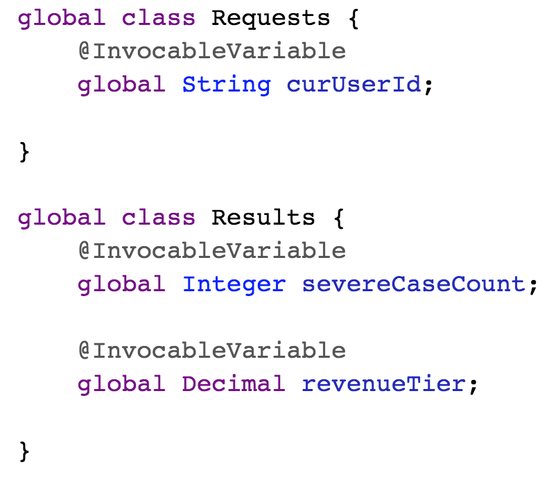
Note that in this pattern, I create a Requests class to store the inputs that my SOQL query will need and a Results class to define the values that my flow action will return to the flow.
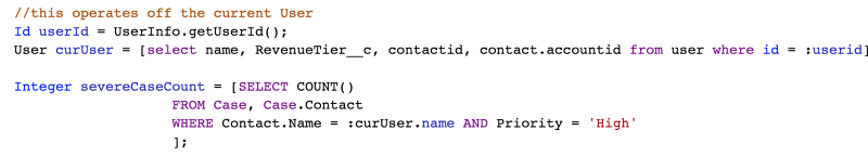
In this particular example, I carry out my SOQL query in two parts. I first retrieve the name of the user and then retrieve a count of all cases associated with that user name.
I then create a Result instance and pack it with the important values returned with my queries:
Finally, I create a List container and add my Result to it. I use a List even though I know I’ll only have a single Result. That’s just part of how the Invocable Actions interface works: each action is expected to return a List (this makes it possible for the interface to support collections and single value responses with a single method).
Because I’ve annotated a method in my AssessCustomerStatus class with @invocableMethod, this functionality will now appear in flow as a declarative building block:
If you can create advanced SOQL queries, you‘re enough of salesforce dev to expose them as declarative flow actions. This opens a lot of new applications up to you.
Expressions are used in several NBA elements to determine at run-time which propositions should be allowed to flow through.
You can build expressions one of two ways:
Formula Mode provides a text box into which you can enter any expression that the Salesforce formula engine is capable of processing.
Builder Mode provides a point-and-click way to assemble an expression with a minimum of manual entry.
To understand expressions in NBA you need to understand the concept of context records. The context record for a particular execution of a strategy depends on where the execution request came from. If the request came from an NBA Component sitting on a Case record page, then the context record will be that particular Case. If the request comes from a self-serve Community portal page, the context record will be the User that’s logged in. When consumers of NBA recommendations send an execution request to the Strategy Engine, they provide a context record Id.
When you’re configuring an NBA strategy (sometimes referred to as “Config Mode” or “Design Time”), your design something that might get hundreds of different unique recordId’s passed into it. So you need a placeholder that will represent those different values. These placeholders are referred to as global resources and are expressed with a dollar sign. “$Record” is the placeholder representing the actual recordId that will be passed in at Run Time.
There are other global resources that you can use:
$User is the current user logged into the session that generated the execution request
$Request contains any arguments that were passed in with the execution request.
Expressing Field Values
You can span from a global resource to its fields like this:
$Record.mycustomerfield__c
Expressing Relationships
You can span across relationships up to 5 levels like this:
$Record.Contact.FirstName
Creating Expressions in Builder Mode
In Builder Mode, you can start an expression from any available global resource:
Understanding “Object Lock-In”
Consider the expression above ($Record.Contact.FirstName). This will work if the recordId passed in at run-time has a relationship to Contact, so you could use this expression in a strategy intended for generating recommendations for a Case page, because Case objects have a built-in relationship to Contact objects. The expression would resolve at runtime into Case.Contact.FirstName.
However, suppose you took that same strategy and called it from an NBA Component that had been placed on a Contact page? In that case the expression would attempt to resolve as Contact.Contact.FirstName. That doesn’t work because Contacts don’t have relationships to Contacts, so an error will be generated.
What this demonstrates is that most strategies are crafted to ‘fit’ a particular object-type. We refer to that as Object Lock-in. One of the most common sources of errors comes when someone attempts to use a Strategy from a page that isn’t a fit for that strategy’s expressions.
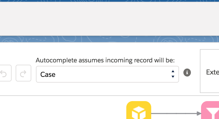
Using AutoComplete in Builder Mode
The Builder Mode of Strategy Crafter can provide you with a list of fields to choose from. However, Strategy Crafter can’t read your mind and doesn’t know from which record pages you intend to call this strategy. To give Strategy Crafter the necessary hint, you can use the “Autocomplete assumes incoming record…” drop-down to pick the object around which you want to design your strategy.
The value of this drop-down has no direct impact on your strategy. It only effects which fields will pop up in the expression builder when you start to create an expression.
If you change this setting on an existing strategy, it will not change any of the existing expressions.
https://unofficialsf.com/wp-content/uploads/2022/09/largeUCSF-300x133.png00Alex Edelsteinhttps://unofficialsf.com/wp-content/uploads/2022/09/largeUCSF-300x133.pngAlex Edelstein2018-08-17 15:38:452019-02-03 02:24:37Building Expressions in Strategy Crafter
Version 1.1 of DynamicQuestion allows defaults to be set for each question, including the parent question. These default values can be a string or a Flow variable. Based on a request by JodieM. Get the new version here.
3. Lightning Input, The super uber lightning input, by Ryan McConnell
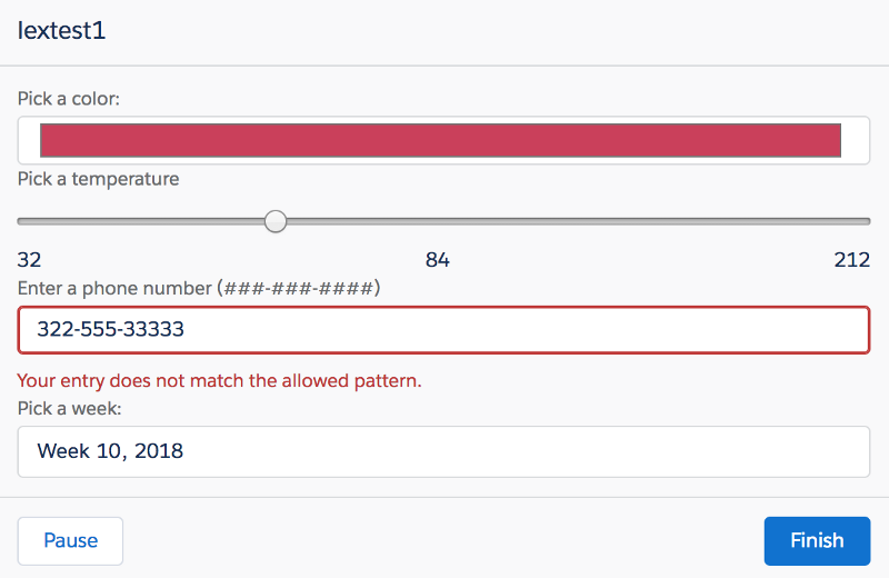
I can’t even begin to tell you all this things this control does. It can do time. It can do sliders. It can do radio buttons. It’s basically a universal input control built by the Lightning Platform team, and now made available for Flow. Here’s a set of four lightningInput controls, set to the following types: color, slider, telephone, and week.
Get it here. Ryan McConnell, an engineer at Salesforce, built this sweet Flow component.
This is the first Flow Extension that taps into the power of a non-Salesforce web service. Of course, Flow has a built-in Send Email element. But some users may want to use the powerful SendGrid messaging and templating services. Get it here.
5. Learn about Navigation Overrides.
Here’s an attractive new Flow you can install that demonstrates a couple of useful new tricks. It shows off the MultiShim component described above. And this flow also demonstrates how easy it is to override the Next and Previous buttons with two lines of Javascript and use attractive images as Flow Screens.
Was building a demo at Salesforce and the VP says, he says to me “can you do something about the black space that can be seen when you go from one flow screen to the next and the first screen is large and the next screen is really small?” And it occurred to me that I’m used to that bounce effect but it’s hardly attractive.
So I built a simple little Flow Screen Component that simply adds a specified number of blank lines. It just adds </br>’s to itself and then renders a bunch of blank space.
See it in action in this video, and install it into your org from here.
https://unofficialsf.com/wp-content/uploads/2022/09/largeUCSF-300x133.png00Alex Edelsteinhttps://unofficialsf.com/wp-content/uploads/2022/09/largeUCSF-300x133.pngAlex Edelstein2018-03-11 02:44:422021-05-05 06:29:09MultiShim, a new Flow Screen Component to let you pad your screen sizes
Once you have headless SFDX auth working in your development environment, you can start to leverage it by building build automation. Here’s a simple script I’m using to bootstrap my SFDX environment. I run it every time I start up a new session:
#!/bin/bash -x echo “Starting Dev Environment”
if [[ $# -eq 0 ]] ; then echo ‘you need to pass in a string name for your scratch org’ exit 1 fi
echo “authenticating to devhubtrial2” sfdx force:auth:jwt:grant -i 3MVG9mclR62wycM2eQwLGugMMMWe5zQvP33hzD_0yCIWytEEI73gZsu8wtNti51PfxuTT_p0F6BrRyAeCVQjN -u [mydevhubusername] -f ~/dev/certificates/server.key — setdefaultdevhubusername echo “creating a new scratch org” sfdx force:org:create -a $1 -s -f config/project-scratch-def.json -d 2 echo “install testing environment” sfdx force:lightning:test:install -u $1 echo “pushing project to scratch org” sfdx force:source:push -u $1 echo “upload test fixture data” sfdx force:data:tree:import -u $1 -f data/[my fixture objects].json echo “get web url for manual open” sfdx force:org:open -r -u
This takes a couple of minutes to run but doesn’t need any attention while it’s going, and at the end, I have a new scratch org fully loaded with my project and fixture data, ready to go.
The scratch orgs that this script creates are set to expire in just 2 days. That’s because, with a script like this, it’s so easy to create them that you end up bumping up against the limit on total orgs!
NOTE: This component is basically obsolete. Flow now includes a dependent picklist as an official component. You should have a good reason to bother dealing with the community component, which paved the way and served nobly, but is now deservedly retired.
Flow users have been asking for a one-screen dependent picklist solution for a long time. For those not familiar with this UI combination, it works like this:
Starting with a single set of choices that comes from a standard Salesforce field of type “picklist”…
Depending on the value you pick….
…you get a different set of choices in the second, dependent selection control:
DependentPicklists is an installable Flow Screen Component that works on Spring ’18 and later orgs. Each pair of picklists can be configured using the standard Cloud Flow Designer tools. This is what the control shown in the above images looks like, configured:
Let’s walk through the process of setting up a dependent picklist:
Enable your org to run Lightning Components in Flow Screens. You need to have the “Enable Lightning runtime for flows” checkbox checked in Process Automation Settings, and you need to have My Domain configured.
Install the DependentPicklist component. We’re working on making this component installable from AppExchange and possibly part of the included set of base screen components in the future, but for now you need to install it yourself.
Configure it. (See Configuring a DependentPicklists Component, below)
Configuring a DependentPicklists Component
The control consists of a “Parent” selection control and a “Dependent” selection control. The main job you have, when you configure this control, is to tell the control, for every possible value that can be selected in the Parent control, which dependent picklist to use to populate the Dependent control. Let’s look at the picklists we’re using in the example visible above:
For the Parent select, we’re going to use the IssueType Picklist custom field, which looks like this:
Step 1: Configure the Parent Control
For this control you need to tell the component which object and field to use to populate the Parent select control. Simply type the object and field names into the attributes Parent Object Name and Parent Field Name:
Step 2: Link each Parent Value to a Dependent Picklist
There are three possible values for this Parent control, so we need to provide the component with guidance for all three possibilities.
To do this, in Flow, you enter a pair of values:
a specific possible “choice”, such as “PrivateBank”
if that choice is selected, what dependent picklist should be used for the Dependent controls.
This image shows two of the three pairs of information:
The interpretation should be pretty clear, if the user selects the value International in the Parent control, the component will go and find the picklist values from that field.
Note that while the component assumes by default that all of the dependent picklists are on the same object as the Parent, you can specify a picklist on a different object, by entering it like this:
Account.MyOtherPicklist__c
3) Map your Output Values
As always you need to map your output values to Flow variables so you can do something productive with the values entered by the user.
The two output values are shown here:
Hope this is useful! If you want to customize this control, the source code is available here.