
datatable – Lightning Web Component for Flow Screens
Created by Eric Smith – April 2020
Go here for the current component and documentation
_
_
_
_
_
_
_
_
_
_
_
_
About
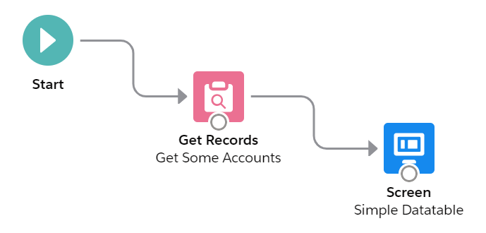
datatableLwcFsc is a Flow Screen Component that allows you to configure and display a datatable on a flow screen. All you need to do is drag it onto the flow screen in the Flow Builder and give it a collection of records and a list of field names. The field label, type, and numeric formatting will default to what is defined in the object. Lookup fields are supported and will display the referenced record’s name field as a clickable link. The user can manually resize the columns, wrap or clip text, and sort the rows by most any column.


Additional Optional Functionality
Even though the component can be simple to use in its basic format, you have a tremendous amount of flexibility and capability when you take advantage of some of the numerous optional attributes that are available.
- Rows can be selected and passed back to a collection variable in the flow
- A collection of pre-selected rows can be passed into the component
- The selection column can be multi-select (Checkboxes), single-select (Radio Buttons), or hidden
- The results can be filtered by column values (Version 1.1)
- Inline editing is supported with just the records with changed values passed back to the flow
- The maximum number of rows to display can be set by the user
- Optional attribute overrides are supported and can be specified by list, column # or by field name, including:
- Cell Alignment
- Inline Editable
- Column Header Icon
- Column Header Label
- Initial Column Width
- Custom Cell Attributes with nested values {name: {name:value}}
- Custom Type Attributes with nested values {name: {name:value}}
- Other Custom Column Attributes with nested values {name: {name:value}}
Object Support
The FlowScreens interface does not yet support dynamic object types, so it’s necessary to define, in the LWC .js-meta.xml file, the object type that you’re going to be passing in. The component is pre-configured to support the Account object. If you want to use a different standard or a custom object, see the instructions below on how to edit the component to create a version for a different object. I have included, in the install package, 11 different versions of the component for the following Standard Objects
- Account
- Asset
- Campaign
- Case
- Contact
- Contract
- Lead
- Opportunity
- OpportunityLineItem
- Product2
- User
UPDATE: Summer ’20 now supports Dynamic SObject attributes – check it out here.
Restrictions
NOTE: There is currently a Salesforce bug that does not allow the component to be used with any object that contains geolocation fields.
NOTE: When editing percent fields you are restricted to whole numbers.
Reference
Input Attributes – Required
| Attribute | Type | Notes |
|---|---|---|
| Column Fields | Comma Separated List | Comma separated list of field API Names to display in the datatable. |
| Datatable Record Collection | SObject Collection Variable | Record Collection variable containing the records to display in the datatable. |
Input Attributes – Optional
| Attribute | Type | Notes |
|---|---|---|
| Column Alignments | Comma Separated List* | Comma separated list of ColID:Alignment Value (left,center,right) |
| Column Edits | Comma Separated List* | ‘All’ or a Comma separated list of ColID:True or False Some data types cannot be edited in a datable (lookup, picklist, location, encrypted, rich text, long text area). |
| Column Icons | Comma Separated List* | Comma separated list of ColID:Icon Identifier EXAMPLE: 1:standard:account (Display the first column with the Account icon) See https://www.lightningdesignsystem.com/icons/ for a complete list of available Icons |
| Column Labels | Comma Separated List* | Comma separated list of ColID:Label (These are only needed if you want a label that is different from the field’s defined label) |
| Column Widths | Comma Separated List* | Comma separated list of ColID:Width (in pixels) |
| Special: Column CellAttributes | Semicolon Separated List** | Semicolon Separated List of ColID:{…};ColID:{…};… EXAMPLE: FancyField__c:{class: ‘slds-theme_shade slds-theme_alert-texture’, iconName: {fieldName: IconValue__c}, iconPosition: left} |
| Special: Column Other Attributes | Semicolon Separated List** | Semicolon Separated List of ColID:{…};ColID:{…};… EXAMPLE: Description:{wrapText: true, wrapTextMaxLines: 5} |
| Special: Column TypeAttributes | Semicolon Separated List** | Semicolon Separated List of ColID:{…};ColID:{…};… EXAMPLE: DateField__c:{year:’numeric’, day:’2-digit’, month:’long’}; NumberField__c:{minimumFractionDigits:4} |
| Hide Checkbox Column? | Boolean | Set to True to hide the row selection column. NOTE: The checkbox column will always display when inline editing is enabled. |
| Key Field | String | This is normally the Id field, but you can specify a different field API name if all field values are unique. |
| Match Case on Column Filters? | Boolean | Set to True is you want to force an exact match on case for column filter values. Default is False. |
| Maximum Number of Records to Display | Number | Enter a number here if you want to restrict how many rows will be displayed in the datatable. The component is currently hardcoded for a maximum of 1000 rows. |
| Pre-Selected Rows | SObject Collection Variable | Record Collection variable containing the records to show as pre-selected in the datatable when the screen first displays. |
| Single Row Selection (Radio Buttons)? | Boolean | When set to True, Radio Buttons will be displayed and only a single row can be selected. The default (False) will display Checkboxes and allow multiple records to be selected. |
| Suppress Cancel/Save Buttons during Edit Mode? | Boolean | Cancel/Save buttons will appear by default at the very bottom of the table once a field is edited. When hiding these buttons, field updates will be applied as soon as the user Tabs out or selects a different field. |
Output Attributes – Optional
| Attribute | Type | Notes |
|---|---|---|
| Output Edited Rows | SObject Collection Variable | Record Collection variable to contain only the records that were edited in the datatable. NOTE: To write these edits back to the Object, you will need to do a Record Update in the Flow. |
| Output Selected Rows | SObject Collection Variable | Record Collection variable to contain only the records that were selected in the datatable NOTE: These records may not contain any of the edited values. |
Comma Separated List*
These optional attributes can be specified as a comma separated list of Column Identifier:Value pairs. The Column Identifiers can be either the column number or the field API name. Keep in mind that if you use column numbers instead of the field API name, you will have to update the identifiers if you insert, remove or change the order of the columns. Another option is to omit the column identifiers and just provide a comma separated list of values. If you choose this method, you must provide a value for every column (A,B,,D would be invalid) and you can’t use this method with attributes that already contain a ‘:’, such as Column Icons (standard:account).
These Column Widths attributes would all work the same for setting the initial column widths of the sample table at the top of this page.

- Name:300, Phone:150, BillingCity:140, Type:120
- 1:300, 2:150, 3:140, 4:120
- Name:300, 2:150, BillingCity:140, 4:120
- 300,150,140,120
Semicolon Separated List**
These optional attributes can be specified as a semicolon separated list of Column Identifier:Value pairs. The Column Identifiers can be either the column number or the field API name. Keep in mind that if you use column numbers instead of the field API name, you will have to update the identifiers if you insert, remove or change the order of the columns. Another option is to omit the column identifiers and just provide a semicolon separated list of values. If you choose this method, you must provide a value for every column.
The reason for these attributes is to give the user more control over how their datatable is formatted. I included predefined options for standard attributes like Label, Alignment, and Width. These additional options allow the user to manually add in other standard attributes like WrapText, CellAttributes like appending an icon to column data, and TypeAttributes to fine-tune how different data types (like dates) are displayed. See the Salesforce Datatable Documentation for details.
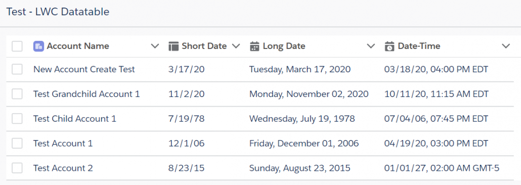
Example #1: Column Icons, Column Widths & Special Column TypeAttributes
Column Icons
1:standard:account, 2:utility:builder, 3:utility:date_input, 4:utility:date_time
Column Widths
200, 120, 200, 200
Special: Column TypeAttributes
2:{year: 2-digit, month: numeric, day: numeric}; 3:{year: numeric, month: long, day: 2-digit, weekday: long}; 4:{year: 2-digit, month: 2-digit, day: 2-digit, hour: 2-digit, minute: 2-digit, time-zone-name: short}
Example #2: Column Labels, Special Column CellAttributes & Special Column Other Attributes
Column Labels
Name:Account Name, dt_Text__c:Field Value Used as Attribute, FancyField__c:Icon Value from a Different Field, IconValue__c:Icon Value
Special: Column CellAttributes
dt_Text__c:{class: {fieldName: dt_Text__c}}; FancyField__c:{class: slds-theme_shade slds-theme_alert-texture, iconName: {fieldName: IconValue__c}, iconPosition: left}
Special: Column Other Attributes
3:{wrapText:true}

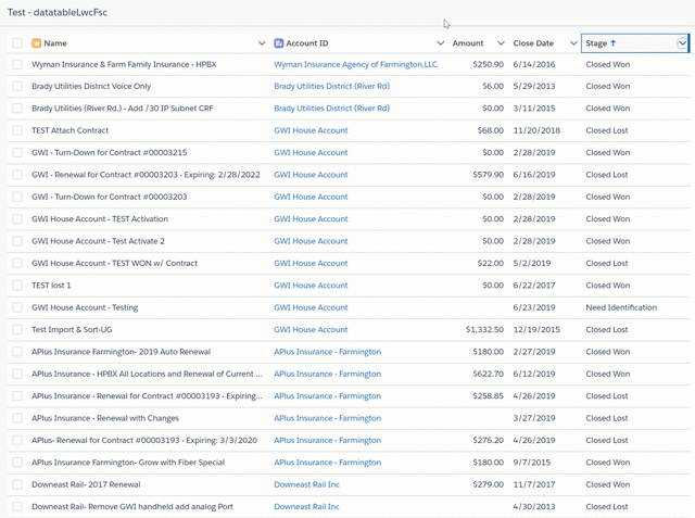
Example #3: Column Filtering (Opportunity Object)
Column Labels
Name, AccountId, Amount, CloseDate, StageName
Column Icons
1:standard:opportunity, 2:standard:account
Match Case on Column Filters?
{!$GlobalConstant.False}
Additional Resources
Read my 4-part Blog series for some ideas on how you can take advantage of datatables in your Flows. I write about how I used the original datatable component to do things like dynamic record presentation and selection, how to select and act on a collection of records, displaying formatted interactive tables and how to inline edit a group of records.
Part 1 – Use a Datatable to present a dynamic choice for record selection in a Flow.
Part 2 – Use a Datatable in a Flow to select and act on a collection of records.
Part 3 – Use a Datatable to display a formatted, interactive table in your Flow.
Part 4 – Use a Datatable to inline edit a group of records.
Version History
Go here for the current component and documentation
The original datatableFSC component is a Lightning Aura Component that supports up to 10 columns. It can be found here.
Source Code
How to Modify the Source Code to Support Different Objects
Modifying the source code to create unique versions of this component for different objects should only be necessary until the Summer ’20 release. But for now, follow the steps outlined below.
Lightning Web Components are not editable in the standard Developer Console. I recommend using Visual Studio Code (VS Code) with the Salesforce extensions to edit the source code. I also recommend that you deploy your changed versions in a Sandbox and use a Change Set to deploy them to Production.
To learn about VS Code and install it for your own use, complete this Trailhead.

You only need to update the Object name in 5 places in a single file (datatableLwcFsc_Object.js-meta.xml). Everything else stays the same.

Click Here for Detailed Instructions.