
Build Lightning Styled Screen Flows that Users will Love
Screen Flows have become an indispensable tool for Salesforce admins and developers to quickly construct guided wizards, prompts, input forms, and more without writing code. However, when it comes to look and feel, the default styling for displaying things has limited options and may not match user expectations. Many developer and third party hours have been spent building custom components or packages to help fill this styling gap instead of helping tackle more complex problems. But what if we could customize the appearance of screen flows without having to write or install any custom components?
The answer is the Salesforce Lightning Design System (SLDS), a collection of design guidelines, resources, and code samples that help you create consistent and beautiful user experiences across the Salesforce platform. The design system is intended to help developers build user interfaces that can seamlessly integrate across the platform by providing a set of styling keywords (CSS classes) that you can apply to elements to change their style, layout, and behavior. Here’s the thing: its not just for developers and designers anymore! You can take advantage of this design system directly in your Screen Flows, and its a lot easier than you might be imagining. The best part is worth repeating: this is all without building or installing any custom components.
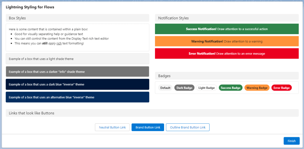
Is this too good to be true? What if I told you that the below screenshot was built entirely using out-of-the-box configuration in a screen flow?
In this post, we’ll walk through how SLDS CSS classes can be used directly in Screen Flows to style your screen flows in a few simple steps.
- The trick that makes this work (hint: Display Text and Data Table are your friends)
- How to make it easy to incorporate and use across any Screen Flow (hint: Custom Labels are your new best friend)
- Some examples of my favorites
Good news: you don’t have to be an expert in HTML or CSS to use this to your advantage. Better news: the more you learn about it, the more you do with it!
For this post, I will provide all of the “markup” you need to get going right away on your own, as well as a repository of examples you can use for reference, but I encourage you to learn more, because there is a lot more that is possible than what I have space to show you here.
How it works: HTML Markup in Display Text
I’ll try to keep this post light on the nitty-gritty details of how HTML works, but it’s important to give some context as to what’s going on. There are three key facts that work together that allow us to lightning-ify our Screen Flows:
- At its core, the standard Display Text component is really an HTML editor plus a mechanism at runtime to display that HTML after the Flow engine resolves any references to Flow resources you’ve included. When you build some formatted content in the rich text editor for the Display Text component, under the hood it is saving it as styled HTML. This means that when a Screen Flow runs and has a Display Text component, all it really is doing is rendering that HTML in the same way that HTML is rendered anywhere else on the platform.
- One of the things that the Display Text component does under the hood is that it accepts Flow Resource references, such as a field value from a record, or the result of a Flow Formula resource. Before a Screen renders, these references are resolved using the most current values in the Flow. If the resolved value of one of those Flow resources includes HTML markup elements, that markup gets treated the same as any other markup that gets displayed on the page!
- The CSS classes that make up the Salesforce Lightning Design System are loaded into the browser in almost every context that you might be running a Screen Flow, and any HTML elements on the page can use those classes to define how it is styled and displayed. (there are some exceptions to this: Screen Flows in Slack and Screen Flows in Classic come to mind)
With these three facts taken together, we can see that we can use Display Text to include Lightning Design System styling by simply including the HTML markup that uses SLDS classes merged in from a Flow Resource, like a variable, formula, or text template.
If you’re a bit lost at this point, don’t panic! You don’t have to understand this part, and if you keep following along, you’ll see how easy it is to use, whether you understand why or not. Let’s start with a basic example: let’s put an SLDS box around some text.
The Basics with Box
If you have a Screen Flow that includes some instructional text, how nice would it be to draw users’ attention to it by using SLDS’s Box utility?

The SLDS box is pretty simple, you can see the markup for it is just:
<div class="slds-box">STUFF INSIDE THE BOX!</div>How can we use this in Screen Flows without installing VS Code, firing up the Lightning Web Component Trailheads, and building a custom component? Let’s start by creating a Text Template called textInABox that has this example in it.
Important: use “Plain text” as the type of Text Template for this!
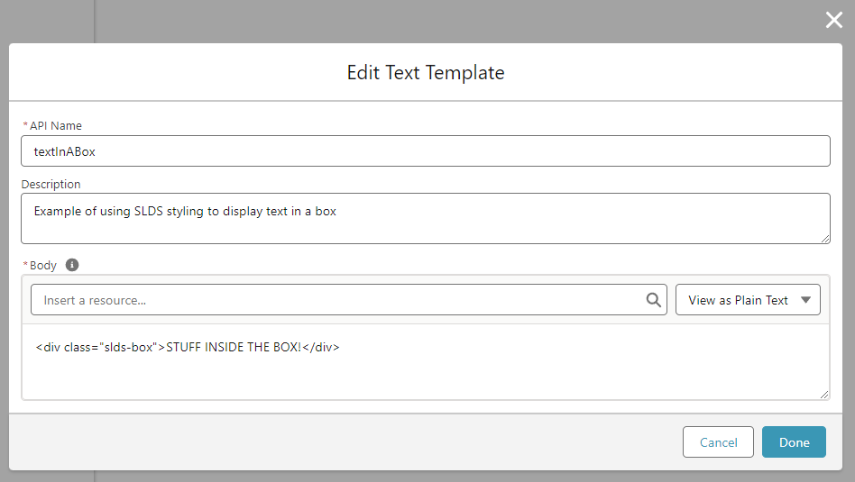
Add a Screen, and in that Screen, add a Display Text component. In that Display text component, add your textInABox resource.

Now, if you save your flow and use “Debug” to see it in action, you should see a nice rounded box with padding around the text “STUFF INSIDE THE BOX!” like this:

You can even place this inside a section’s column to constrain it to a smaller size!


Pretty cool stuff already! There are a two extra steps I think are important to really make this a practical reusable technique for use in the real world.
Reusability
But if you stop here and only use what I’ve shown above, you’d have to build a separate Text Template for each lightning-styled text that you want to display, and if you want to edit the content, you’d have to find which text template has the content and go edit that. Not very reusable or maintainable. We can do better by taking advantage of a quirk of how Display Text components show HTML markup. You’ll notice that our little HTML snippet starts with <div ...> and ends with </div>. Those are what’s known as opening and closing tags. If HTML markup for an element has an opening tag, but doesn’t have a closing tag, that’s what’s known as malformed HTML and it doesn’t show up right in the page! Luckily for us, the engineers at Salesforce are very smart people and understand that just a little bit of malformed HTML could mess up the whole page, so as part of rendering the HTML from a Display Text component, they automatically look for and add closing tags for any HTML that is missing them! In fact, this is expected because Display Text uses the lightning-formatted-rich-text base component, which has this behavior documented here.
How does this help us? This means that all we need in our Text Template is the opening tag, then we can put our content inside the Display Text after the Text Template, and the closing tag gets automatically added when we run the flow!
Let’s try our example now with an updated boxTemplate Text Template that has just <div class="slds-box"> without its corresponding </div>

Now when we add it to a Display Text component, we can add the content immediately after the boxTemplate resource (I like putting a line break between them for readability, it won’t affect the results)

And when we run the Flow, you’ll see it displays inside the box, just like before, even though we didn’t properly close the tag:

This enables us to reuse that boxTemplate resource wherever we need to in this Flow!


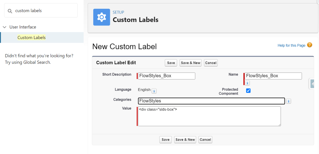
Getting pretty cool, right? There’s still one more step to go to really become practical in terms of reusability and maintenance. With what we’ve got so far, we can reuse the boxTemplate resource within this Flow, but we can’t use it in other Flows. That one last thing we need to make this reusable across Flows in our org: Custom Labels. If we add a Custom Label to the org with that HTML markup, we can reference it from any Flow, and Display Text will treat it just like it does any other resource! We can add each SLDS “blueprint” that we want to use just once now, and simply reference them where we need them. I like adding the prefix “FlowStyles_” to each Custom Label, and at the bottom of this post I’ll link you to a resource that has all my favorite reusable FlowStyles as custom labels.
To try this out, in Setup -> Custom Labels, add a new Custom Label

Using Custom Labels in a Flow is exactly the same as other resources, you’ll find them under the $Label global resource in the resource picker.


So there it is! Reusable lightning styling without building a custom component or installing a package!
What else can we do with this? I’d love to hear how this technique can be used with all the creative Flow builders out there. I’ll show a couple more examples below, and link to a resource where you can download a custom labels file that has a bunch of prebuilt SLDS blueprints ready for you to use.
Examples
Notification Messages
Wouldn’t it be nice to show success, warning, and error messages in a way that’s familiar and expected to users? You can do that with the SLDS Scoped Notification blueprint!
Custom Label: FlowStyles_Notification_Success
<div class="slds-scoped-notification slds-theme_success" role="status">Custom Label: FlowStyles_Notification_Warning
<div class="slds-scoped-notification slds-theme_warning" role="status">Custom Label: FlowStyles_Notification_Error
<div class="slds-scoped-notification slds-theme_error" role="status">How these look in the Screen Editor:

And how they look when you run the Flow:

Section Headers
In Summer 22, Sections got an upgrade to allow you to display a Header Label with the Section. It’s been a great feature. But there are a few limitations in its current state:
- If you provide a label, it will be collapsible, with no option to disable the collapsibility.
- You can only apply the header label across the entire section, not within a column of a section.
- The label is static, meaning it can’t be derived from an “upstream” variable reference from the Flow.
With our SLDS in Flows technique (I like the word “technique” better than “trick”, don’t you?), we can have non-collapsible, dynamic Section Headers that can be placed within a single column of a Flow Section (or spread the entire width if that’s what you need)
Here’s the markup for a Custom Label we’ll call FlowStyles_SectionHeader
<div class="slds-section slds-section__title slds-theme_shade slds-p-horizontal_small">How it looks in the editor:

And finally when we run the Flow:

Links that look like Buttons
Many screen flow use cases end up with a need to provide users with a link to a record, page, or external website. A plain old hypertext link simply does not capture the attention of users in the way that the use case often demands. A common way to address this is to use custom navigation components to, for instance, navigate the user to a record page when they click “Finish”. Not even that will help much if you need to give the user more than one option or place to go.
But what if we could simply style those plain old hypertext links to look like buttons? Our little SLDS technique can do just that.
Note: This example can’t really leverage (easily) the same $Label reusability, because you can’t just stick the content at the end. You’ll see what I mean.
This time, instead of a Text Template resource, let’s try using a Formula resource in the Flow. Let’s say you have a record variable in your flow called NewRecord and on a Screen after creating that record, you want to provide the user a button/link that will open the record page for that newly created record. You could create a Formula Resource like the following:
'<a class="slds-button slds-button_brand" target="_top" href="' &
    LEFT( {!$Api.Partner_Server_URL_580} , FIND( '/services/' , {!$Api.Partner_Server_URL_580})) & {!NewRecord.Id} &
'">View Record</a>'
Now when you place that formula resource into a Display Text component…. voila! …. you’ve got a link that is styled just like a button.

Some notes:
- The “View Record” part is the label- change that to whatever you want the label for this “button” link to be
- If you want to have the link open in a new browser tab, replace
target="_top"withtarget="_blank" - If you want a different style of button, you can replace
slds-button_brandwith other button styles, likeslds-button_outline-brandorslds-button_neutral - The stuff with LEFT() and Partner_Server_URL_580? That helps construct the base url dynamically so that this will work just as well in a community or in lightning experience or wherever you need to use it.
A really neat use case for this for presenting a button to generate a Conga document.
Data Table cells
Until now, this post has focused on using the Display Text component as the “host” for our SLDS styling. There is one other component that we can leverage for this technique: Data Table! If the field for a given column in the Flow Data Table component supports rich text, it will render HTML in the same way that Display Text does. Better yet: it considers text formula fields as supporting rich text! This means we can add a formula field to an object that constructs HTML using SLDS styling, add that field as a column using Flow’s Data Table, and it will render each cell for that column as user-friendly, lightning styled goodness.
You could, for example, rework the above “Link as Button” formula into a Formula Field on an object, then display a button/link for each row in a Data Table:
'<a class="slds-button slds-button_brand" target="_top" href="' &
    LEFT( $Api.Partner_Server_URL_580 , FIND( '/services/' , $Api.Partner_Server_URL_580 )) & Id &
'">View Record</a>'
Winter 24: Display Text Reactivity (beta)
In the upcoming Winter 24 release, Display Text becomes one of the next Flow Screen components to achieve reactivity. Imagine all of the beautiful, reactive user interfaces that can be built by combining the lightning design system with the dynamism of reactivity! To give you a taste of the kind of power that reactive Display Text can bring to Screen Flows, I was able to make a (basic) game with just out of the box components:
Wrap It Up
The examples here are really just the tip of the iceberg in terms of what can be done with this technique, but I will leave you with a word of caution. I urge everyone using this technique to keep it light and simple. It may be tempting to try to use some of the more advanced design system blueprints, or attempt to gain very granular control over styling, but that comes at the cost of increased likelihood of messing it up, or increased maintenance overhead. Take the same approach you would take to building anything: consider balancing delivering for your users today with being able to deliver updates for them in the future.
Have fun spreading a serious user interface glow-up to your users, and be sure to share any cool things you’ve built or questions you have in the comments section below.
Below is a link to a GitHub repo that contains a preconfigured Custom Label file with these example labels, and example Flow that you can use as reference , and later there will be a follow up post that dives further into using SLDS styling with Display Text reactivity in Winter 24!