
Created by Eric Smith – May 2020
For the latest on the Datatable component, please go here: Datatable – Lightning Web Component for Flow Screens
This Post was most recently updated on: 10/14/20
ABOUT
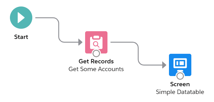
datatableV2 is a Flow Screen Component that allows you to configure and display a datatable on a flow screen. All you need to do is drag it onto the flow screen in the Flow Builder and give it a collection of records and a list of field names. The field label, type, and numeric formatting will default to what is defined in the object. Lookup fields are supported and will display the referenced record’s name field as a clickable link. The data being displayed can be filtered on a column by column basis. The user can manually resize the columns, wrap or clip text, and sort the rows by most any column.
Starting in Summer ’20 the Salesforce Object is specified at the time of configuration allowing just one version of this component to be used for all Salesforce Objects. I have also added support for user created Apex-Defined objects as well. See Flow and Process Builder List View with Batch Delete for an example.

Additional Optional Functionality
Even though the component can be very simple to use in its basic format, you have a tremendous amount of flexibility and capability when you take advantage of some of the numerous optional attributes that are available.
- Rows can be selected and passed back to a collection variable in the flow
- A collection of pre-selected rows can be passed into the component
- The selection column can be multi-select (Checkboxes), single-select (Radio Buttons), or hidden
- The results can be filtered by column values
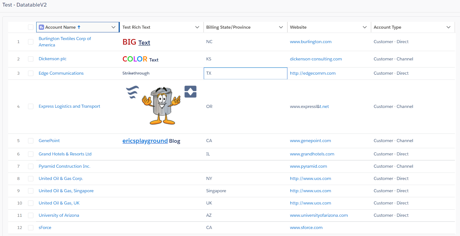
- Rich Text is supported
- Formulas for Links and Images are supported
- The Standard object Name field and Lookup fields can be displayed as clickable links
- Inline editing is supported with just the records with changed values passed back to the flow
- Output parameters include # of selected records, SObject and SObject Collection variables
- The maximum number of rows to display can be set by the user
- You can make record selection Required
- You can add an Icon and Header to the datatable
- The datatable height and border can be customized
- Optional attribute overrides are supported and can be specified by list, column # or by field name, including:
- Cell Alignment
- Inline Editable
- Column Header Icon
- Column Header Label
- Initial Column Width
- Custom Cell Attributes with nested values {name: {name:value}}
- Custom Type Attributes with nested values {name: {name:value}}
- Other Custom Column Attributes with nested values {name: {name:value}}
Object Support
Summer ’20 now supports Dynamic SObject attributes at time of configuration.
User defined Apex-Defined Object variables are supported.
Restrictions
NOTE: Inline editing of Picklist and Lookup fields is not supporterd yet.
NOTE: There is currently a Salesforce bug that does not allow the component to be used with any object that contains geolocation fields.
NOTE: When editing percent fields you are restricted to whole numbers.
REFERENCE
Input Attributes – Required
| ATTRIBUTE | TYPE | NOTES |
|---|---|---|
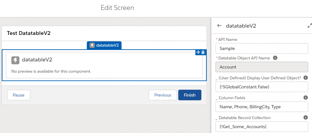
| Datatable Object API Name | Salesforce Object Picklist | Specify the Salesforce Object to be displayed. Note: You must select an object even if you will be providing a User Defined object. |
| Column Fields | Comma Separated List | Comma separated list of field API Names to display in the datatable. |
| Datatable Record Collection ± | SObject Collection Variable | Record Collection variable containing the records to display in the datatable. |
| Datatable Record String (User Defined) ± | String | Serialized String of Apex-Defined object records |
| ± Only one or the other of these is required |
Input Attributes – Optional
| ATTRIBUTE | TYPE | NOTES |
|---|---|---|
| (User Defined) Display User Defined Object? | Boolean | Set to True if you are providing a Serialized String of Apex-Defined object records instead of a Datatable Record Collection |
| Column Alignments | Comma Separated List* | Comma separated list of ColID:Alignment Value (left,center,right) |
| Column Edits | Comma Separated List* | ‘All’ or a Comma separated list of ColID:True or False Some data types cannot be edited in a datable (lookup, picklist, location, encrypted, rich text, long text area). |
| Column Field Types (For User Defined ONLY) | Comma Separated List* | Comma separated list of ColID:Field Type (boolean, currency, date, datetime, number, email, id, location, percent, phone, time, url, text(default)). |
| Column Filters | Comma Separated List* | ‘All’ or a Comma separated list of ColID:True or False Some data types cannot be filtered in a datable (location, encrypted) |
| Column Icons | Comma Separated List* | Comma separated list of ColID:Icon Identifier EXAMPLE: 1:standard:account (Display the first column with the Account icon) See https://www.lightningdesignsystem.com/icons/ for a complete list of available Icons |
| Column Labels | Comma Separated List* | Comma separated list of ColID:Label (These are only needed if you want a label that is different from the field’s defined label) |
| Column Scale Values (For User Defined ONLY) | Comma Separated List* | Comma separated list of ColID:Scale (The number of digits to display to the right of the decimal point in currency, number and percent fields (default = 0)) |
| Column Widths | Comma Separated List* | Comma separated list of ColID:Width (in pixels) |
| Special: Column CellAttributes | Semicolon Separated List** | Semicolon Separated List of ColID:{…};ColID:{…};… EXAMPLE: FancyField__c:{class: ‘slds-theme_shade slds-theme_alert-texture’, iconName: {fieldName: IconValue__c}, iconPosition: left} |
| Special: Column Other Attributes | Semicolon Separated List** | Semicolon Separated List of ColID:{…};ColID:{…};… EXAMPLE: Description:{wrapText: true, wrapTextMaxLines: 5} |
| Special: Column TypeAttributes | Semicolon Separated List** | Semicolon Separated List of ColID:{…};ColID:{…};… EXAMPLE: DateField__c:{year:’numeric’, day:’2-digit’, month:’long’}; NumberField__c:{minimumFractionDigits:4} |
| Configuration Mode? | Boolean | Default=False, Display the Field API Names, Labels and the Column Widths in a box below the table. This parameter is designed to be used by the Datatable Configuration Flow. |
| Hide Checkbox Column? | Boolean | Set to True to hide the row selection column. NOTE: The checkbox column will always display when inline editing is enabled. |
| Key Field | String | This is normally the Id field, but you can specify a different field API name if all field values are unique. |
| Match Case on Column Filters? | Boolean | Set to True is you want to force an exact match on case for column filter values. Default is False. |
| Maximum Number of Records to Display | Number | Enter a number here if you want to restrict how many rows will be displayed in the datatable. The component is currently hardcoded for a maximum of 1000 rows. |
| Pre-Selected Rows | SObject Collection Variable | Record Collection variable containing the records to show as pre-selected in the datatable when the screen first displays. |
| Pre-Selected Rows (User Defined) | String | Serialized String of Apex-Defined object records |
| Single Row Selection (Radio Buttons)? | Boolean | When set to True, Radio Buttons will be displayed and only a single row can be selected. The default (False) will display Checkboxes and allow multiple records to be selected. |
| Suppress Cancel/Save Buttons during Edit Mode? | Boolean | Cancel/Save buttons will appear by default at the very bottom of the table once a field is edited. When hiding these buttons, field updates will be applied as soon as the user Tabs out or selects a different field. |
| Suppress the Link on the Object’s ‘Name’ Field | Boolean | Suppress the default behavior of displaying the SObject’s ‘Name’ field as a link to the record |
| Table Border | Boolean | Display a border around the datatable (Default: True) |
| Table Height | String | CSS specification for the height of the datatable. If you leave this blank, the datatable will expand to display all records. (Examples: 30rem, 200px) The default value of “calc(50vh – 100px)” creates a table that is 50% of the available vertical height of the container less 100 pixels to allow for a header and footer. |
| Table Icon | String | Icon to display on the Table Header. Example: standard:account |
| Table Label | String | Label to display on the Table Header |
Output Attributes – Optional
| ATTRIBUTE | TYPE | NOTES |
|---|---|---|
| Output Edited Rows ± | SObject Collection Variable | Record Collection variable to contain only the records that were edited in the datatable. NOTE: To write these edits back to the Object, you will need to do a Record Update in the Flow. |
| Output Edited Rows (User Defined) ± | String | Serialized String of Apex-Defined object records |
| ± Only one of these is provided based on the value of (User Defined) Display User Defined Object? | ||
| Output Number of Selected Records | Integer | Total count of the number of selected records |
| Output Selected Row (Object) | SObject Variable | Record Object variable that contains the single record that was selected in the datatable. NOTE: This is only provided when just a single record is selected. |
| Output Selected Rows (Collection)±± | SObject Collection Variable | Record Collection variable to contain only the records that were selected in the datatable NOTE: These records may not contain any of the edited values. |
| Output Selected Rows (User Defined) ±± | String | Serialized String of Apex-Defined object records |
| ±± Only one of these is provided based on the value of (User Defined) Display User Defined Object? |
Comma Separated List*
These optional attributes can be specified as a comma separated list of Column Identifier:Value pairs. The Column Identifiers can be either the column number or the field API name. Keep in mind that if you use column numbers instead of the field API name, you will have to update the identifiers if you insert, remove or change the order of the columns.
Another option is to omit the column identifiers and just provide a comma separated list of values. If you choose this method, you must provide a value for every column (A,B,,D would be invalid) and you can’t use this method with attributes that already contain a ‘:’, such as Column Icons (standard:account).
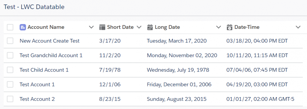
These Column Widths attributes would all work the same for setting the initial column widths of the sample table at the top of this page.

- Name:300, Phone:150, BillingCity:140, Type:120
- 1:300, 2:150, 3:140, 4:120
- Name:300, 2:150, BillingCity:140, 4:120
- 300,150,140,120
Semicolon Separated List**
These optional attributes can be specified as a semicolon separated list of Column Identifier:Value pairs. The Column Identifiers can be either the column number or the field API name. Keep in mind that if you use column numbers instead of the field API name, you will have to update the identifiers if you insert, remove or change the order of the columns. Another option is to omit the column identifiers and just provide a semicolon separated list of values. If you choose this method, you must provide a value for every column.
The reason for these attributes is to give the user more control over how their datatable is formatted. I included predefined options for standard attributes like Label, Alignment, and Width. These additional options allow the user to manually add in other standard attributes like WrapText, CellAttributes like appending an icon to column data, and TypeAttributes to fine-tune how different data types (like dates) are displayed. See the Salesforce Datatable Documentation for details.
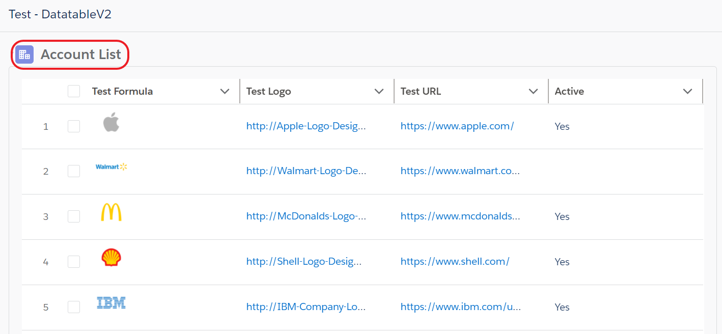
Example #1: Column Icons, Column Widths & Special Column TypeAttributes
Column Icons
1:standard:account, 2:utility:builder, 3:utility:date_input, 4:utility:date_time
Column Widths
200, 120, 200, 200
Special: Column TypeAttributes
2:{year: 2-digit, month: numeric, day: numeric}; 3:{year: numeric, month: long, day: 2-digit, weekday: long}; 4:{year: 2-digit, month: 2-digit, day: 2-digit, hour: 2-digit, minute: 2-digit, time-zone-name: short}
Example #2: Column Labels, Special Column CellAttributes & Special Column Other Attributes
Column Labels
Name:Account Name, dt_Text__c:Field Value Used as Attribute, FancyField__c:Icon Value from a Different Field, IconValue__c:Icon Value
Special: Column CellAttributes
dt_Text__c:{class: {fieldName: dt_Text__c}}; FancyField__c:{class: slds-theme_shade slds-theme_alert-texture, iconName: {fieldName: IconValue__c}, iconPosition: left}
Special: Column Other Attributes
3:{wrapText:true}

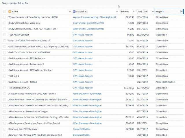
Example #3: Column Filtering (Opportunity Object)
Column Labels
Name, AccountId, Amount, CloseDate, StageName
Column Icons
1:standard:opportunity, 2:standard:account
Match Case on Column Filters?
{!$GlobalConstant.False}
ADDITIONAL RESOURCES
Read my 4-part Blog series for some ideas on how you can take advantage of datatables in your Flows. I write about how I used the original datatable component to do things like dynamic record presentation and selection, how to select and act on a collection of records, displaying formatted interactive tables and how to inline edit a group of records.
Part 1 – Use a Datatable to present a dynamic choice for record selection in a Flow.
Part 2 – Use a Datatable in a Flow to select and act on a collection of records.
Part 3 – Use a Datatable to display a formatted, interactive table in your Flow.
Part 4 – Use a Datatable to inline edit a group of records.
How to use Apex-Defined Objects with the Datatable
New 07/02/20 – How to use both the Selected and the Edited records in a Datatable

New 09/20/20 – Now Display Rich Text and Custom Links and Images in Datatables
New 10/07/20 – Read about the latest additions to the Datatable component
VideosDatatable Overview
Formatting and Customizing
Summer ’20 Configuration
Custom User Defined Object
INSTALLATION
NEW INSTALLATION METHOD:
Use the Deploy to Salesforce button found here – https://github.com/ericrsmith35/DatatableV2
10/14/20 – Eric Smith – datatableV2 – v2.47
Bug Fix:
Display correct icon for Table Header (was always showing standard:account icon)
Version History
10/7/20 – Eric Smith – datatableV2 – v2.46
Updates:
Added new Output Parameter for the # of Selected Records
(this can be used for conditional visibility on the same screen as the datatable)
New Selected Record Output Parameter – Returns an SObject record if just a single record is selected
New Required? Parameter – Requires the user to select at least 1 row to proceed
New option to suppress the link for the object’s standard Name field
New optional Table Header with Table Icon and Table Label Parameters
Switched DualListbox to the fbc version
Added spinners while sorting & filtering data
Allow case insensitive field API names
Allow custom field API names w/o the __c suffix
Bug Fixes:
Display Picklist Labels instead of API Names for Picklist and Multipicklist fields
Added a Clear Selection button for tables with just a single record
9/22/20 – Eric Smith – datatableV2 – v2.45
Bug Fix: Fixed inability to edit some field types (introduced by v2.44)
9/20/20 – Kevin Hart – datatableV2 – v2.44
Updates: Added ability to display Rich Text fields
Bug Fix: Eric Smith – Fixed error when selecting column action of WrapText or ClipText
8/26/20 – Eric Smith – datatableV2 – v2.43
Bug Fix: Update Percent Field Handling and set Formula Fields to be Non-Editable
8/26/20 – Eric Smith – datatableV2 – v2.42
Bug Fix: Update Time fields with the User’s Timezone Offset value so they display as intended
Bug Fix: Fix field type so Datetime fields display correctly
8/14/20 – Eric Smith – datatableV2 – v2.41
Bug Fix: Fixed issue with time and date-time fields being displayed as a day earlier
8/11/20 – Eric Smith – datatableV2 – v2.40
Updates: Added attribute to allow the suppression of the record link on the SObject’s ‘Name’ field
Bug Fix: Fixed code so the ‘Name’ Field column now sorts correctly
7/31/20 – Eric Smith – datatableV2
v2.39 – Updates: Added Datatable Configuration Helper Flow
REQUIRES: Flow Base Components (https://unofficialsf.com/introducing-flowbasecomponents/)
REQUIRES: Dual List Box (https://unofficialsf.com/duallistbox/)
REQUIRES: Remote Site Setting (Setup)
7/31/20 – Andy Hass – datatableV2
v2.38 – Updates: Added support for Checkbox Field Type
7/7/20 – Eric Smith – datatableV2
v2.37 – Bug Fix: Fixed issue with the date being displayed as a day earlier
7/1/20 – Eric Smith – datatableV2
v2.36 – Updates: Now displays the primary “Name” field as a Link (textWrap = true)
Added button in Config Mode to round off Column Width values
v2.35 – Updates: Extended Configuration Mode to handle Column Alignments, Labels, Widths, Allow Edit & Allow Filter
Added Configuration Mode buttons to select all columns for Edit and/or Filter
Selecting an attribute string now copies the contents into the system Clipboard
6/24/20 – Eric Smith – datatableV2
v2.34 – Bug Fix: Fixed issue with column widths resetting when filtering
Updates: Added Datatable Configuration Helper Flow
(Requires transferMetadata LWC @ https://unofficialsf.com/retrieve-and-deploy-metadata-with-flow-using-transfer-metadata-as-a-screen-component/)
6/19/20 – Eric Smith – datatableV2
v2.33 – Updates: Removed default value for Table Height
Bug Fix: Fixed issue with lookup fields being blank in the first record
6/9/20 – Eric Smith – datatableV2
v2.32 – Fixed error when editing multiple columns on the same row while Cancel/Save buttons were suppressed
Unmanaged v2.32 (Production/Developer)
Unmanaged v2.32 (Sandbox)
6/4/20 – Eric Smith – datatableV2
v2.31 – Initial release for Summer ’20 orgs
Unmanaged v2.31 (Production/Developer)
Unmanaged v2.31 (Sandbox)
Prior versions of the datatableLwcFsc can now be replaced by datatableV2 starting in Summer ’20 orgs
4/22/20 – Eric Smith
v2.0 – NOTE: Summer ’20 pre-release orgs only – Unmanaged v2.0 (Developer Org)
4/15/20 – Eric Smith
v1.1 – Added the ability to filter a datatable by individual columns, cleaned up some error handling.
Unmanaged v1.1 (Production/Developer)
Unmanaged v1.1 (Sandbox)
4/2/20 – Eric Smith
v1.0 – Initial Release – Includes versions for Account, Asset, Campaign, Case, Contact, Contract, Lead, Opportunity, OpportunityLineItem, Product2, User
Unmanaged v1.0 (Production/Developer)
Unmanaged v1.0 (Sandbox)
The original datatableFSC component is a Lightning Aura Component that supports up to 10 columns. It can be found here.