
Banner Component for Custom Property Editors
Created by Eric Smith – November 2020
This Post was most recently updated on: 11/28/20
ABOUT
The fsc_flowBanner component is designed to be used in a Custom Property Editor. It provides a way to create sections and add separation between different functional areas of a Custom Property Editor LWC.
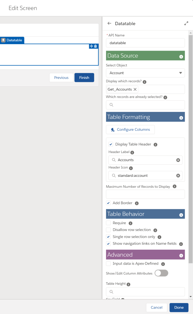
The component also supports a link to informational or help text for the section.

Using Flow Banner
The component is added to the HTML file of the Custom Property Editor. The developer can specify the Colors for the Banner and Modal Header, the Label and the contents of the information modal.
    <c-fsc_flow-banner
        banner-color={defaultBannerColor}
        banner-label={sectionEntries.tableFormatting.label}
        banner-info={sectionEntries.tableFormatting.info}
        modal-header-color={defaultModalHeaderColor}
    ></c-fsc_flow-banner>
Attributes
bannerColor – Color of the banner (default: #4C6E96)
modalHeaderColor – Color of the information modal header (default: #657B96)
bannerLabel – Text to appear in the banner
bannerInfo – Contents for the information modal body. It needs to be passed to the component as an array of objects consisting of a label and helpText
    @api bannerInfo =
        [
            {label: 'Attribute #1 Label', helpText: 'Attribute #1 Helptext'},
            {label: 'Attribute #2 Label', helpText: 'Attribute #2 Helptext'},
        ];
bannerClass – Formatting of the banner text (default: slds-text-color_inverse slds-text-heading_medium)
bannerMargin – Spacing around the banner (default: slds-m-top_small slds-m-bottom_xx-small)
bannerPadding – Determines the thickness of the banner (default: 0.3rem)
Icon Attributes – These default values can also be overridden by the calling CPE
@api bannerIcon = 'utility:info';
@api bannerIconSize = 'medium';
@api bannerVariant = 'bare-inverse';
@api bannerTitle = 'Info';
@api bannerAltText = 'Help Text Info';
Installation
This component is part of the Flow Base Packs package libraries.
View Source
The source code can be found as part of the Flow Screen Components Base Pack.