
Icon Picker for Flow Screens and Custom Property Editors
Icon Picker for Flow Screens and Custom Property Editors
This Post was most recently updated on: 6/9/21 – Eric Smith
Current Version: FlowScreenComponentsBasePack v2.3.5
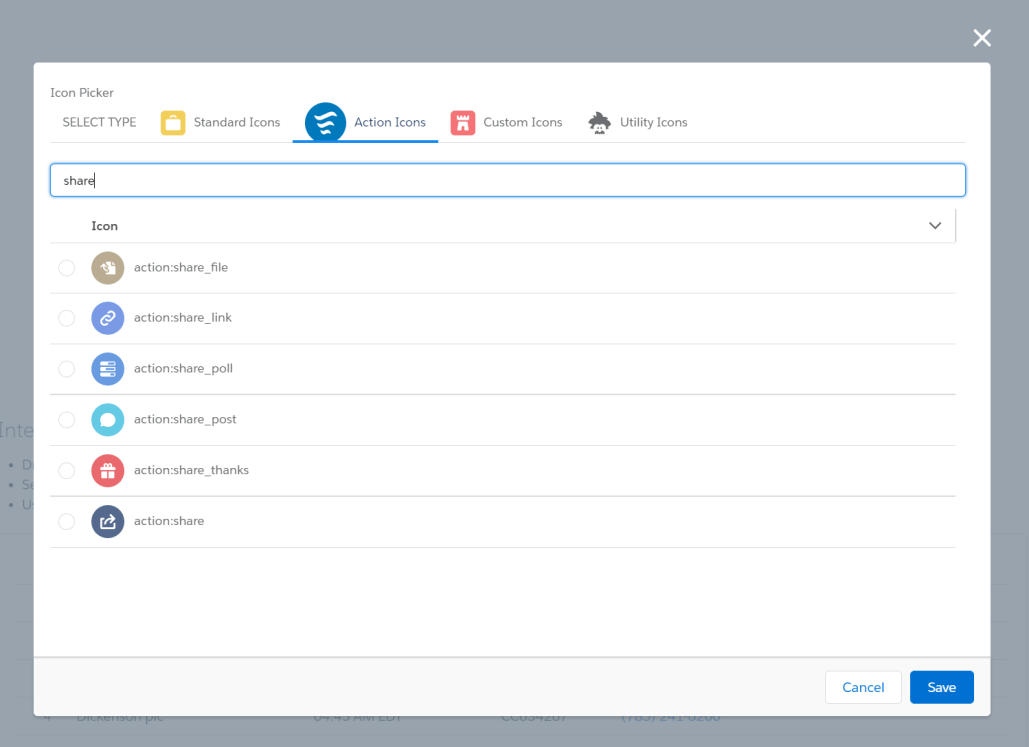
Components like Datatable allow the user to select a Salesforce Icon from the Lightning Design System but up until now you had to know the exact name and formatting for the icon. Examples: standard:account or utility:color_swatch
With the new fsc_pickIcon component, you can add a visual icon picker to your Flow Screen and developers can include it in a Custom Property Editor or other Lightning Web Components. This component is based on some code from the Salesforce Labs AppExchange app Activity Timeline.
The user starts by selecting the Icon Type (Standard, Action, Custom or Utility). One can further narrow down their choices by entering a search or filter term in the box above the icon list.
Tab Mode
Accordion Mode
ComboBox Mode

Usage
Drag the custom component Pick an Icon onto a Flow Screen. Use the Output Parameter iconName to reference the icon selected by the user.
Parameters
Input
| Attribute | Description | Type | Default |
| hideStandardIcons | If set to true, Standard icons are not included/displayed | boolean | FALSE |
| hideCustomIcons | If set to true, Custom icons are not included/displayed | boolean | FALSE |
| hideUtilityIcons | If set to true, Utility icons are not included/displayed | boolean | FALSE |
| hideActionIcons | If set to true, Action icons are not included/displayed | boolean | FALSE |
| iconCategories | A list of strings containing the icon categories to be included. Valid values are: ‘standard’, ‘custom’, ‘utility’, and ‘action’. Any of those categories not present in the list will be hidden. This is an alternative way of setting the available categories instead of using the individual hide[Category]Icons properties. | String[] | |
| iconName | Name of the pre-selected icon in the format of type:name | String | |
| mode | Determines the display mode of the icon list. Valid values are: ‘combobox’, ‘accordion’, and ‘tab’. If left blank, an error will be displayed. | String | |
| label | The text to be displayed above the component. | String | Pick an Icon |
| accordionMode | DEPRECATED. This is a legacy property and not recommended for future use. | boolean | FALSE |
Output
| Attribute | Description | Type | Default |
| iconName | Name of the pre-selected icon in the format of type:name | String |
Installation
This component is included as part of the FlowScreenComponentsBasePack Version 2.1.2 or later.
6/4/21 – Eric Smith
Added additional Icons from Lightning Design System Release 2.15.8 – May 27, 2021
6/2/21 – David Fromstein
Updates:
Added a new ComboBox input method with a Search capability
Added a CPE for ease of configuration for Flow Screens
04/10/21 – Eric Smith – Version 1.1.0
Updates:
Added an option to hide the Actions Icons
Added an option to display sections in accordion mode (default is in tab mode)
Note: Accordion looks better in a CPE but takes longer to load
12/30/20 – Eric Smith – Version 1.0.0
Developer Notes
Use in a Custom Property Editor

When referencing the Icon Picker in your CPE HTML file, the only attributes you need to specify are the mode and the oniconselection handler.
<c-fsc_pick-icon
    mode="combobox"
    oniconselection={handlePickIcon}>
</c-fsc_pick-icon>
In your JavaScript file, the selected icon name will be passed in event.detail.
handlePickIcon(event) {
    let changedAttribute = 'tableIcon';
    this.inputValues[changedAttribute].value = event.detail;
    this.dispatchFlowValueChangeEvent(changedAttribute, event.detail, 'String');
}
Use in a Lightning Web Component

This example shows the Icon Picker exposed in a Modal window. In addition to specifying the oniconselection handler, you can specify the height in pixels for the first (SELECT TYPE) tab. At least 100 is recommended so narrow windows can display all of the other tab names in a drop-down without having to scroll.
<!-- Input dialog for entering Column Icon values -->
<template if:true={isOpenIconInput}>
    <div style="height: 400px;">
        <section role="dialog" tabindex="-1" aria-labelledby="modal-heading-00" aria-modal="true" aria-describedby="modal-content-id-0" class="slds-modal slds-fade-in-open">
            <div class="slds-modal__container">
                <header class="slds-modal__header slds-modal__header_empty">
                    <button class="slds-button slds-button_icon slds-modal__close slds-button_icon-inverse" title="Close" onclick={handleCloseIconModal}>
                        <lightning-icon icon-name="utility:close" alternative-text="close" variant="inverse" size="small"></lightning-icon>
                        <span class="slds-assistive-text">Close</span>
                    </button>
                </header>
                <div class="slds-modal__content slds-p-around_medium" id="modal-content-id-0">
                    <c-fsc_pick-icon
                        first-tab-height="100"
                        oniconselection={handlePickIcon}>
                    </c-fsc_pick-icon>
                </div>
                <footer class="slds-modal__footer">
                    <button class="slds-button slds-button_neutral" onclick={handleCloseIconModal}>Cancel</button>
                    <button class="slds-button slds-button_brand" onclick={handleCommitIconSelection}>Save</button>
                </footer>
            </div>
        </section>
        <div class="slds-backdrop slds-backdrop_open"></div>
    </div>
</template>
Your handler can reference event.detail to get the name of the selected icon.
handlePickIcon(event) {
    this.selectedIcon = event.detail;
}