https://unofficialsf.com/wp-content/uploads/2022/09/largeUCSF-300x133.png00Alex Edelsteinhttps://unofficialsf.com/wp-content/uploads/2022/09/largeUCSF-300x133.pngAlex Edelstein2023-12-20 21:18:482023-12-20 21:18:54From Munawirrahman: Avoid Governor Limit in Salesforce Flow by Checking the Limit before Hitting the Limit
Here’s what you can look forward to this February!
Repeaters Make it Easy to Create Lists in Screen Flows (Beta)
You can create a form and let the user decide how many to fill out:
The basic concepts behind repeaters are that 1) You can assemble any form you want and 2) Once the user is done filling out their forms, you’ll need to assign their data to a matching collection resource like a collection of Accounts, and then save the collection. More specifically:
Add a Repeater component to your screen.
Drag other components into the repeater and configure them.
Add a Loop to your flow to map the resulting collection data into the right data structure, such as a CRM object or Apex-define type for external services.
Use Create Records or an external callout to commit the data you collected in the Repeater component.
Choices: Picklist, Multi-Select Picklist, Radio Buttons, Checkbox Group
Feature support in “child components” (components dragged into a Repeater):
Not supported: Conditional Field Visibility, Help Text, Input Validation
Reactivity: Child components can react to changes in screen-level components (ones that are not inside of a repeater) but they can’t react to other child components.
The scope of this feature is focused on use cases for creating new data, not updating existing data. Pre-populating with existing data isn’t supported (planned for future release).
Limit Removed: You No Longer Are Limited to 50,000 Paused Flows
Not much to say about this beyond: Good riddance.
Reactivity Added to Display Text and Long Text
You can insert references to the output of other screen components into your Display Text now. Use this to create responsive notices like the ‘You have completed X% of the form’ message shown here:
In the above example, a formula is being used to calculate the percentage of inputs that have a value. This feature requires that your flow be running on API version 59 or higher, so make sure to resave old flows with the current API number if you want to turn on reactivity. Note that references from components that output a record (like Data Table’s firstSelectedRow output) are not formatted with currency symbols, decimal scales, or date formatting. You must place the record’s field in a formula resource with the data type you need to get the right formatting.
Below is an example of how you can use reactivity to insert a dynamic header into a Long Text component:
In the above example, a text template is used (with Plain Text mode selected).
Reactivity is the most powerful thing we’ve done with screen flows in years. Here are some paths to more resources:
Transform Element Gains Several New Features (Beta)
The Transform element continues to march towards release. The new features this release include:
You can calculate an Aggregate (such as a COUNT or a SUM) from a collection and map it to a target field
You can combine data from multiple input sources to populate a target
You can define a static value using a formula
Notes on Static Mapping: You’ll have to map the target field first, add field transform to the mapping, then replace merge field in formula editor with a static value.
Here are the current considerations for using Transform:
Source data doesn’t support global variables
The Transform element is available for only autolaunched, screen, and triggered flows
Collection Choice Set, Picklist Choice Set, and Record Choice Set are treated like strings
Support only 1 level of nested collection
read only fields are hidden on the target side
no traversals for sobjects
only support automatic output
no collection transform yet (join, filter, sort, etc)
10 nested levels max
Data Table Row Selections are Now Maintained When you Search
Previously when a customer needed to search across records within a Data Table, any selections made previous to the search would be lost. Now selections are maintained across record searches.
New Flow Orchestration Features – Standard Reports, Notification Controls, and Controllable User Context
Standard Reports
Go into Reports>Public Reports and select one of our Sample Orchestration object report, you can add filters and use them in dashboards.
Notification Controls
You can now disable automatic email notifications in Process Automation Settings and create your own background step to notify users about work items assigned to them.
‘Run As’ Context Control
You can now run a background or Mulesoft step as a selected user or opt to run the step as a user specified by a resource at run time.
There’s also a new permission that allows a user to reassign a work item.
New deployments and new enhancements for the new resource picker
The new resource picker is now available additionally in Update Records, Delete Records and Get Records. In addition, it has added a couple of new features:
Expanded Friendly Grouping incorporates automatic outputs for a more complete experience:
Improved Resource Selection causes the selected value to be clearly marked with a checkbox:
Draft Save and Panels Rollout Continues
All elements except for Screen and Action now are panelized and support Draft Mode save capability. This means that you can save your flow without having to finish configuring or resolving errors. When you save, warnings display with what to fix before you can activate your flow.
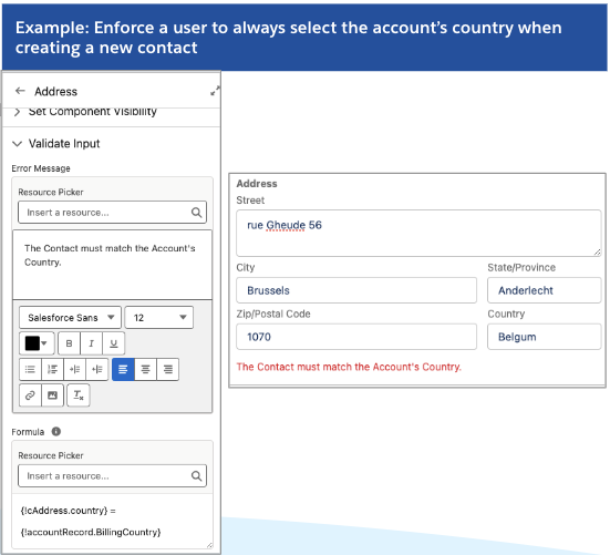
Improvements to Input Validation
The Validate Input Section has been added to Custom components and additional Standard components including Name, Address, Email and Data Table
Validate Input provides an easy way to apply formulas to the values input by the user, and deliver a custom error message:
To surface translated error messages, reference a translated custom label in the Error Message input.
Technical Note: Previously this feature had only been implemented for the ‘native’ screen components, which are applied in Flow screens using a proprietary interface. Later Out-of-the-box components like Data Table use the same interface that custom components do. This is good for standardization but we never brought the validation feature forward to these newer components.
Speedups!
Invocable Action List Loading
If you have an org with a lot of invocable actions, you should see a noticeable time reduction on the order of 83-89% when you add an Action to the canvas and try to view the list of available actions:
Packaging of Flows
We found a substantial opportunity to speed up the time packaging takes when flows are involved, reducing that time between 57 and 69%.
New Release Update: Stricter rules for flow URL redirection
When this is turned on, some URLs that previously were accepted as redirect targets for flow launched from a Custom Button will no longer be allowed. Note that you can always add trusted URLs to your list in Setup.
Custom Buttons are (embarrassingly) the only way built into the product to carry out a redirect at the end of a screen flow. This site has a couple of extensions you can use.
It’s Easier to Import Mulesoft Endpoints as Flow Actions
There’s a new Setup experience for connecting to Mulesoft that substantially reduces the number of steps required:
Add Flows to your Einstein Prompt Templates
You can embed Template-Triggered Prompt Flows into a Prompt Template to dynamically provide the Prompt Template with information generated by the flow. Note that Prompt Templates are expected to GA slightly later than Spring ’24.
Data Cloud and Flow: Debug Flows Triggered By Data Cloud
If you have Data Cloud, you can start a flow on a Data Cloud data change event. These flows can now be debugged in Flow Builder.
Marketing Cloud and Flow: Wait until an Event in a Schedule, Segment-Based Flow
If you have the new Marketing Cloud Growth Edition, you can use Flow to trigger on a schedule and then process a Data Cloud segment as a batch. You can send emails or SMS messages to all of the segment’s members and then have the flow wait until the recipients respond to those messages before continuing.
Marketing Cloud and Flow: Introducing the New Flow Manager App
If you have Marketing Cloud Growth installed, you’ll be one of the first to see the new Flow Manager. It’s a Lightning App that provides full Lightning support to the management of flows. If you don’t have that particular product, look for this game-changer to become available to all Admins in Summer ’24. The most immediate benefit for most admins will probably be the ability to search your flows quickly and easily.
Marketing Cloud and Flow: Flow Access Control lets you give controlled builder capabilities to non-admins
Flow now makes permissions available in Permission Sets to enable a User to use specific Flow elements for orgs that have Marketing Cloud Growth installed. This is an alternative to the traditional Manage Flows permission that provides full access to Flow Builder. With these new granular permissions, you can enable a User to, for example, create flows that can do Get Records but not Delete Records. In Spring ’24, this ability extends to flows triggered by a specific set of marketing-oriented Flow triggers: Scheduled, Segment-Based trigger, Data Cloud Data Change trigger, and Form-Submitted trigger. In the future other trigger and process types will be available for this citizen enablement. Note that all such enablement is 100% opt-in: orgs that do not use this functionality will continue to operate as before, with the Manage Flows permissions providing universal access to selected admins.
Migration Tools from Process Builder: Additional PB flows can be partially migrated
Check the Migrateable column of the Migrate to Flow tool on processes – it will now say ‘Partially’ for certain criteria. After migration, the tool will let the user know which parts of the migrated flow will need additional configuration.
Migrate less common actions from Process Builder using the migration tool, and then further configure them in Flow to finalize the migration. This can be especially helpful if you want to use the Migration tool capabilities to migrate pending scheduled actions to scheduled paths, but they previously contained an unsupported action such as Post to Chatter.
See which Flows are using an Email Alert
Find in Setup under Process Automation / Workflow Actions / Email Alerts. Select a specific email alert and there is a new list called “Flows Using This Email Alert.” This will work on existing orgs, no additional configuration needed
ISV Support: Delete Workflow Rules from Managed Packages
Developers with managed packages that contain Workflow Rules need to migrate their solutions to Flow, but they were unable to delete the workflow rules when they were no long needed. This can now be done. See the Partner Community for more information.
https://unofficialsf.com/wp-content/uploads/2022/09/largeUCSF-300x133.png00Alex Edelsteinhttps://unofficialsf.com/wp-content/uploads/2022/09/largeUCSF-300x133.pngAlex Edelstein2023-12-19 22:47:332023-12-21 09:22:17Sneak Preview: Salesforce Flow Features Coming in Spring ’24
There are a couple of new updates to the Collection Processors package. My co-worker, Derek Camp, created a component to meet a particular use case he had where he wanted to get a random selection of records from an object. The other addition adds a component that can convert back and forth between a delimited string and a text collection. I also added this action to my collection of reactive invocable actions screen components to meet a use case where someone wanted a picklist to be reactive on the same screen to the values from a multi-select picklist field.
https://unofficialsf.com/wp-content/uploads/2022/09/largeUCSF-300x133.png00Eric Smithhttps://unofficialsf.com/wp-content/uploads/2022/09/largeUCSF-300x133.pngEric Smith2023-12-14 14:13:402023-12-14 14:13:45New Additions to the Collection Processors Package
If you package a flow in a 2GP package, it’s possible to update it via Patch releases. You can’t change the input or output shape of the flow in a Patch release, however. It is not possible to modify a flow in a Patch release at all if the flow is in a 1 GP package. Kudos to James Quinn for experimenting and clarifying this.
There is a brand new component and a few new updates to the Quick Choice component in the latest Version 3.3.0 of the FlowScreenComponentsBasePack.
Jodi Nemser-Abrahams came across an issue recently where even though formulas are reactive in screen flows, they cannot be used to control the conditional visibility of other components on the same screen. To solve this problem, I created a new screen component that takes the value of a boolean formula and returns the same value back to the flow. Because this new component is reactive, it can then be used in the conditional visibility criteria for other component on the same screen. The name of the new component is ReactiveConditionalVisibility and it is included in the latest release of the FlowScreenComponentsBasePack. See this Trailblazer Community Thread for more information and a video of the component in action.
Quick Choice (v2.42) has been updated for this release as well.
Clear the currently selected value if the options change on a reactive screen
Allow “Add a ‘None’ Choice” option for all valid picklist methods
Added clarification to an error message that could appear if the component has conditional visibility on a screen that can be revisited.
Fixed the “Need a valid Input Mode. Didn’t get one.” error introduced in the prior release.
https://unofficialsf.com/wp-content/uploads/2022/09/largeUCSF-300x133.png00Eric Smithhttps://unofficialsf.com/wp-content/uploads/2022/09/largeUCSF-300x133.pngEric Smith2023-12-08 14:01:432023-12-08 14:01:49What’s new in the Flow Screen Components Base Pack?
I’ve added 4 new Collection Processor Actions as Reactive Screen Components. The original actions were Extract Field to Collection and Calculate Field Summary. The latest additions are Filter Collection, Find Common and Unique Records, Join Collections and Sort Collections.
This means you can now do multiple types of collection processing without having to leave the flow screen. And the amazing thing is that these components are all reactive to each other and any other flow screen components that support reactivity.
Read this article to see different use cases for these actions and to get the installation links to install them in your own org.
https://unofficialsf.com/wp-content/uploads/2022/09/largeUCSF-300x133.png00Eric Smithhttps://unofficialsf.com/wp-content/uploads/2022/09/largeUCSF-300x133.pngEric Smith2023-10-23 06:34:442023-10-23 06:34:53Four New Collection Processor Actions added as Reactive Screen Components
I’ve come up with a generalized method to actually make any existing Invocable Action available to a Flow as a Reactive Screen Component. I’ll be showing the results of this Wednesday morning in the Breakout Session I’m presenting with Michelle Hansen and Adam White, When Is It Best to Be Reactive? When You’re a Screen Flow.
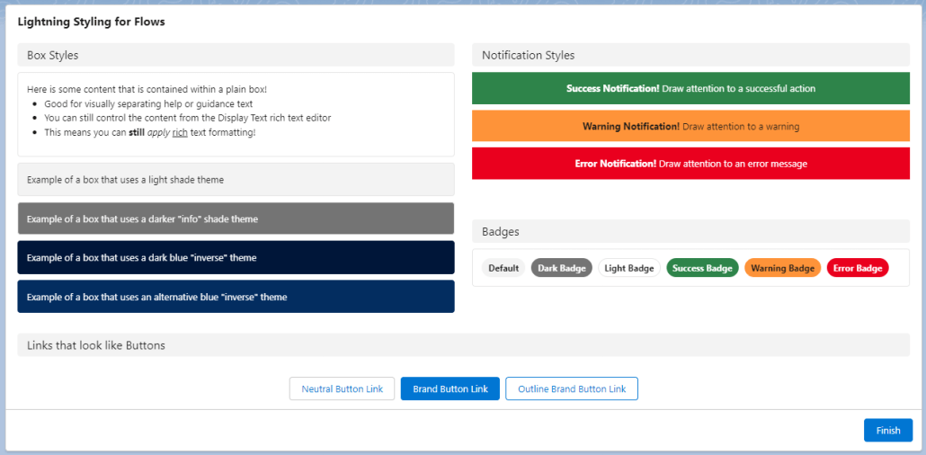
Screen Flows have become an indispensable tool for Salesforce admins and developers to quickly construct guided wizards, prompts, input forms, and more without writing code. However, when it comes to look and feel, the default styling for displaying things has limited options and may not match user expectations. Many developer and third party hours have been spent building custom components or packages to help fill this styling gap instead of helping tackle more complex problems. But what if we could customize the appearance of screen flows without having to write or install any custom components?
The answer is the Salesforce Lightning Design System (SLDS), a collection of design guidelines, resources, and code samples that help you create consistent and beautiful user experiences across the Salesforce platform. The design system is intended to help developers build user interfaces that can seamlessly integrate across the platform by providing a set of styling keywords (CSS classes) that you can apply to elements to change their style, layout, and behavior. Here’s the thing: its not just for developers and designers anymore! You can take advantage of this design system directly in your Screen Flows, and its a lot easier than you might be imagining. The best part is worth repeating: this is all without building or installing any custom components.
Is this too good to be true? What if I told you that the below screenshot was built entirely using out-of-the-box configuration in a screen flow?
Look, Ma! No Code! An array of elements styled with the Lightning Design System using the Display Text Screen Flow component
In this post, we’ll walk through how SLDS CSS classes can be used directly in Screen Flows to style your screen flows in a few simple steps.
The trick that makes this work (hint: Display Text and Data Table are your friends)
How to make it easy to incorporate and use across any Screen Flow (hint: Custom Labels are your new best friend)
Some examples of my favorites
Good news: you don’t have to be an expert in HTML or CSS to use this to your advantage. Better news: the more you learn about it, the more you do with it!
For this post, I will provide all of the “markup” you need to get going right away on your own, as well as a repository of examples you can use for reference, but I encourage you to learn more, because there is a lot more that is possible than what I have space to show you here.
How it works: HTML Markup in Display Text
I’ll try to keep this post light on the nitty-gritty details of how HTML works, but it’s important to give some context as to what’s going on. There are three key facts that work together that allow us to lightning-ify our Screen Flows:
At its core, the standard Display Text component is really an HTML editor plus a mechanism at runtime to display that HTML after the Flow engine resolves any references to Flow resources you’ve included. When you build some formatted content in the rich text editor for the Display Text component, under the hood it is saving it as styled HTML. This means that when a Screen Flow runs and has a Display Text component, all it really is doing is rendering that HTML in the same way that HTML is rendered anywhere else on the platform.
One of the things that the Display Text component does under the hood is that it accepts Flow Resource references, such as a field value from a record, or the result of a Flow Formula resource. Before a Screen renders, these references are resolved using the most current values in the Flow. If the resolved value of one of those Flow resources includes HTML markup elements, that markup gets treated the same as any other markup that gets displayed on the page!
The CSS classes that make up the Salesforce Lightning Design System are loaded into the browser in almost every context that you might be running a Screen Flow, and any HTML elements on the page can use those classes to define how it is styled and displayed. (there are some exceptions to this: Screen Flows in Slack and Screen Flows in Classic come to mind)
With these three facts taken together, we can see that we can use Display Text to include Lightning Design System styling by simply including the HTML markup that uses SLDS classes merged in from a Flow Resource, like a variable, formula, or text template.
If you’re a bit lost at this point, don’t panic! You don’t have to understand this part, and if you keep following along, you’ll see how easy it is to use, whether you understand why or not. Let’s start with a basic example: let’s put an SLDS box around some text.
The Basics with Box
If you have a Screen Flow that includes some instructional text, how nice would it be to draw users’ attention to it by using SLDS’s Box utility?
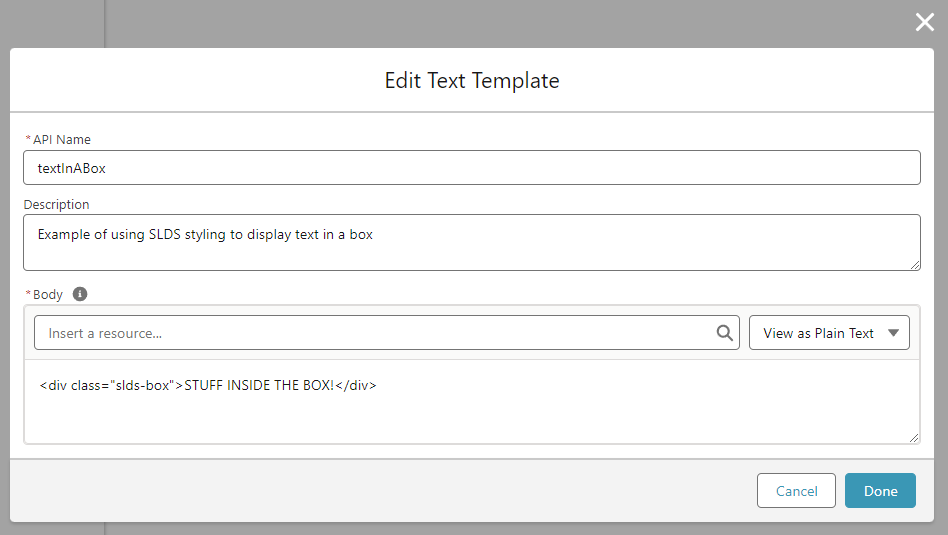
The SLDS box is pretty simple, you can see the markup for it is just:
<div class="slds-box">STUFF INSIDE THE BOX!</div>
How can we use this in Screen Flows without installing VS Code, firing up the Lightning Web Component Trailheads, and building a custom component? Let’s start by creating a Text Template called textInABox that has this example in it.
Important: use “Plain text” as the type of Text Template for this!
Add a Screen, and in that Screen, add a Display Text component. In that Display text component, add your textInABoxresource.
Now, if you save your flow and use “Debug” to see it in action, you should see a nice rounded box with padding around the text “STUFF INSIDE THE BOX!” like this:
You can even place this inside a section’s column to constrain it to a smaller size!
Pretty cool stuff already! There are a two extra steps I think are important to really make this a practical reusable technique for use in the real world.
Reusability
But if you stop here and only use what I’ve shown above, you’d have to build a separate Text Template for each lightning-styled text that you want to display, and if you want to edit the content, you’d have to find which text template has the content and go edit that. Not very reusable or maintainable. We can do better by taking advantage of a quirk of how Display Text components show HTML markup. You’ll notice that our little HTML snippet starts with <div ...> and ends with </div>. Those are what’s known as opening and closing tags. If HTML markup for an element has an opening tag, but doesn’t have a closing tag, that’s what’s known as malformed HTML and it doesn’t show up right in the page! Luckily for us, the engineers at Salesforce are very smart people and understand that just a little bit of malformed HTML could mess up the whole page, so as part of rendering the HTML from a Display Text component, they automatically look for and add closing tags for any HTML that is missing them! In fact, this is expected because Display Text uses the lightning-formatted-rich-text base component, which has this behavior documented here.
How does this help us? This means that all we need in our Text Template is the opening tag, then we can put our content inside the Display Text after the Text Template, and the closing tag gets automatically added when we run the flow!
Let’s try our example now with an updated boxTemplateText Template that has just <div class="slds-box"> without its corresponding </div>
Now when we add it to a Display Text component, we can add the content immediately after the boxTemplateresource (I like putting a line break between them for readability, it won’t affect the results)
And when we run the Flow, you’ll see it displays inside the box, just like before, even though we didn’t properly close the tag:
This enables us to reuse that boxTemplateresource wherever we need to in this Flow!
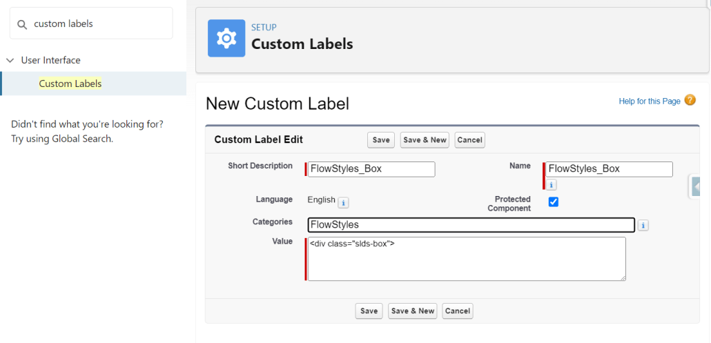
Getting pretty cool, right? There’s still one more step to go to really become practical in terms of reusability and maintenance. With what we’ve got so far, we can reuse the boxTemplate resource within this Flow, but we can’t use it in other Flows. That one last thing we need to make this reusable across Flows in our org: Custom Labels. If we add a Custom Label to the org with that HTML markup, we can reference it from any Flow, and Display Text will treat it just like it does any other resource! We can add each SLDS “blueprint” that we want to use just once now, and simply reference them where we need them. I like adding the prefix “FlowStyles_” to each Custom Label, and at the bottom of this post I’ll link you to a resource that has all my favorite reusable FlowStyles as custom labels.
To try this out, in Setup -> Custom Labels, add a new Custom Label
Using Custom Labels in a Flow is exactly the same as other resources, you’ll find them under the $Label global resource in the resource picker.
So there it is!Reusable lightning styling without building a custom component or installing a package!
What else can we do with this? I’d love to hear how this technique can be used with all the creative Flow builders out there. I’ll show a couple more examples below, and link to a resource where you can download a custom labels file that has a bunch of prebuilt SLDS blueprints ready for you to use.
Examples
Notification Messages
Wouldn’t it be nice to show success, warning, and error messages in a way that’s familiar and expected to users? You can do that with the SLDS Scoped Notification blueprint!
In Summer 22, Sections got an upgrade to allow you to display a Header Label with the Section. It’s been a great feature. But there are a few limitations in its current state:
If you provide a label, it will be collapsible, with no option to disable the collapsibility.
You can only apply the header label across the entire section, not within a column of a section.
The label is static, meaning it can’t be derived from an “upstream” variable reference from the Flow.
With our SLDS in Flows technique (I like the word “technique” better than “trick”, don’t you?), we can have non-collapsible, dynamic Section Headers that can be placed within a single column of a Flow Section (or spread the entire width if that’s what you need)
Here’s the markup for a Custom Label we’ll call FlowStyles_SectionHeader
Many screen flow use cases end up with a need to provide users with a link to a record, page, or external website. A plain old hypertext link simply does not capture the attention of users in the way that the use case often demands. A common way to address this is to use custom navigation components to, for instance, navigate the user to a record page when they click “Finish”. Not even that will help much if you need to give the user more than one option or place to go.
But what if we could simply style those plain old hypertext links to look like buttons? Our little SLDS technique can do just that.
Note: This example can’t really leverage (easily) the same $Label reusability, because you can’t just stick the content at the end. You’ll see what I mean.
This time, instead of a Text Template resource, let’s try using a Formula resource in the Flow. Let’s say you have a record variable in your flow called NewRecordand on a Screen after creating that record, you want to provide the user a button/link that will open the record page for that newly created record. You could create a Formula Resource like the following:
Now when you place that formula resource into a Display Text component…. voila! …. you’ve got a link that is styled just like a button.
Some notes:
The “View Record” part is the label- change that to whatever you want the label for this “button” link to be
If you want to have the link open in a new browser tab, replace target="_top" with target="_blank"
If you want a different style of button, you can replace slds-button_brand with other button styles, like slds-button_outline-brand or slds-button_neutral
The stuff with LEFT() and Partner_Server_URL_580? That helps construct the base url dynamically so that this will work just as well in a community or in lightning experience or wherever you need to use it.
A really neat use case for this for presenting a button to generate a Conga document.
Data Table cells
Until now, this post has focused on using the Display Text component as the “host” for our SLDS styling. There is one other component that we can leverage for this technique: Data Table! If the field for a given column in the Flow Data Table component supports rich text, it will render HTML in the same way that Display Text does. Better yet: it considers text formula fields as supporting rich text! This means we can add a formula field to an object that constructs HTML using SLDS styling, add that field as a column using Flow’s Data Table, and it will render each cell for that column as user-friendly, lightning styled goodness.
You could, for example, rework the above “Link as Button” formula into a Formula Field on an object, then display a button/link for each row in a Data Table:
In the upcoming Winter 24 release, Display Text becomes one of the next Flow Screen components to achieve reactivity. Imagine all of the beautiful, reactive user interfaces that can be built by combining the lightning design system with the dynamism of reactivity! To give you a taste of the kind of power that reactive Display Text can bring to Screen Flows, I was able to make a (basic) game with just out of the box components:
Wrap It Up
The examples here are really just the tip of the iceberg in terms of what can be done with this technique, but I will leave you with a word of caution. I urge everyone using this technique to keep it light and simple. It may be tempting to try to use some of the more advanced design system blueprints, or attempt to gain very granular control over styling, but that comes at the cost of increased likelihood of messing it up, or increased maintenance overhead. Take the same approach you would take to building anything: consider balancing delivering for your users today with being able to deliver updates for them in the future.
Have fun spreading a serious user interface glow-up to your users, and be sure to share any cool things you’ve built or questions you have in the comments section below.
Below is a link to a GitHub repo that contains a preconfigured Custom Label file with these example labels, and example Flow that you can use as reference , and later there will be a follow up post that dives further into using SLDS styling with Display Text reactivity in Winter 24!
https://unofficialsf.com/wp-content/uploads/2022/09/25.09.2022_18.55.29_REC.png6241271Jeff Kranzhttps://unofficialsf.com/wp-content/uploads/2022/09/largeUCSF-300x133.pngJeff Kranz2023-08-17 17:35:202024-03-01 15:02:15Build Lightning Styled Screen Flows that Users will Love
Here’s a preview of what’s coming to Flow in the next couple of months!
The Rollouts Begin: Panels
With this release, the conversion of property editors from modals to panels picks up momentum. The first panelized property editors showed up in Flow Orchestration, and more were seen in the Flow-based marketing features that started to roll out in Summer ’23 Starter edition. In Winter ’24 panels will show up in mainstream elements: Create Records, Wait, Start, Update Records elements at all times and Action & Subflow elements and Custom Property Editors when in edit mode.
Panelized property editors have a couple of useful benefits besides look more modern and feeling more fluid. They allow the user to see and manipulate the canvas while configuring the property editor and they are a key technology needed to enable Draft Mode (with modals, you can’t really leave things partially completed, which is the whole point of Draft mode).
The Rollouts Begin: Save as Draft
This feature lets you save flows that are missing required features. In Winter ’24, it’s only going to be present in Create Records and the Start element of flows with a Record-Change trigger.
Draft Mode is fundamentally intended as a usability feature to make Flow easier to work with. You don’t have to have all of your ducks in a row.
The Rollouts Begin: Fourth Generation Merge Field Picker
The team has been hard at work on an overhaul of the merge field picker. This component is a wolf in sheep’s clothing. It’s extremely complicated because of its need to not only support a wide range of data types but also dynamically show just the appropriate types in different contexts. The current merge field picker has served Flow well since its creation 5 years ago but there are a lot of overdue enhancements that required a full reworking.
In Winter ’24 you’ll encounter the new picker in just one place, the Create Records element. You’ll see some of the immediate enhancements, like the clickable breadcrumbs shown above. More enhancements are on the way along with a broader rollout. Developer Note: This component has been designed to be made available in the Public namespace for use in custom property editors, although the release date for that is TBD.
HTTP Callout is GA and supports the full range of HTTP methods.
Transform Data with the new Transform Element (Beta)
Transform is probably the most powerful, complex element we’ve yet created. It provides the ability to declaratively shape and mold data. It’s particularly well-paired with the HTTP Callout element because of its ability to extract useful data from the complex response structures returned from typical web calls.
The beta implementation includes. the ability to map collections from JSON structures to collection resources:
You can also apply a formula to data to shape it:
Your transformations are also supported in the debugger:
Note the following considerations on Winter ’24:
Source data doesn’t support global variables.
The Transform element is available for only autolaunched, screen, and triggered flows.
Packaging not supported yet
Primitive collection not supported yet
Collection Choice Set, Picklist Choice Set, and Record Choice Set are treated like strings
Support only 1 level of nested collection
Read only fields are hidden on the target side
No traversals for sobjects
Only 1 input source will show on UI
Manual output mapping not supported
No built-in aggregation yet (count, sum, exist, first, etc)
No collection transform yet (join, filter, sort, etc)
10 nested levels max
Reactive Screens – GA with Formula support and Reactive Choice Selections
Reactive Screens is finally GA with this release. This feature fundamentally allows the creation of single-page applications and forms, reducing the amount of ‘Next’ clicking and enabling a more dynamic and satisfying visual experience.
This release brings several enhancements that flesh out the Reactive Screen toolset. Display Text is reactive (this component has been deemed Beta for Winter ’24. Note that that means you have to enable the ‘Opt in to Reactive Display Text Beta’ checkbox in Setup -> Process Automation Settings for this particular feature). That allows easy implementation of text that updates based on inputs:
The above example also leverages the new ability to use formulas reactively. That means that if you create a formula in a flow that references an input that changes, like the text fields in the example above, the formula will immediately recalculate, and anything else on the screen that makes use of that formula will update.
Choice Selections also react to changes on the screen. In this example, one set of choice settings change based on a value selected in another radio button group:
Select a Radio Button Based on Another Radio Button
Auto-select an Opportunity Stage from a Data Table
Here, you can see how it’s done, with a formula that is used to set the default value:
Formulas can mix values provided by the user with Custom Settings, Profile data and other Global Variables, as shown in this example:
Other improvements:
Screens will now apply reactive updates when a screen first loads.
Formula support has been extended to SUBSTITUTE, ^, ADDMONTHS, and ISPICKVAL.
Screen Readers will now announce reactive changes.
You can surface Custom Error Messages when a Record-Triggered Flow detects a problem with a user’s actions
Record-triggered Flows in many ways provide a great toolset for custom validation checking, but have always had an inability to surface an error right to where the user is taking action. You can now choose to either surface a custom, dynamic error message as an inline field error or as a pop-up window.
Two New Wait Elements Provide Extra Delay Control
Extended Support for Revisitation Controls
A pair of radio buttons was added a couple of years ago to enable builders to control the behavior of screen components when the user returns to a screen. This was necessary because there are a bunch of valid use cases where you want the component to recalculate with updated values and other equally valid use cases where you want the component to remember what the user last provided. These slides are from a 2021 RRL where we described the new control, which was then released for Lightning Components in screens.
In Winter ’24, support for Revisited policy has been extended to Choices, Text, Number, Currency, Long Text Area, Date, and DateTime components:
Values are now remembered when going back to a previous screen.
Reactive Steps Enhance Flow Orchestration
You can now trigger a step to start or end with an expression that will set up a record-change listener. That means that an active stage can have multiple steps all waiting for different data changes.
Additionally, Flow Orchestration Objects now support Custom Fields and lookups.
Trigger Flows when Data Cloud events are generated
New List View Column: API Version
You can choose to view the Api Version in the Flow list view in Setup.
Editor’s Note: UnofficialSF is pleased to enable commercial creators of products that use Flow like Pimly to introduce their products and demonstrate useful use cases. One of our goals is to see a rich tier of commercial solutions in addition to the many free extensions that will continue to be available.
The Pimly CEO, long time Salesforce leader Mike Milburn, published a post describing how Pimly leverages flow:


