https://unofficialsf.com/wp-content/uploads/2022/09/largeUCSF-300x133.png00Alex Edelsteinhttps://unofficialsf.com/wp-content/uploads/2022/09/largeUCSF-300x133.pngAlex Edelstein2021-01-24 19:44:082021-04-23 08:26:10Easy PDF Viewing in Flow
Sometimes the user requirement calls for the person running the flow to be able to hop between screens at will, moving from any screen to any other screen. Our general advice has always been: you can do it but you need to built a navigtional button bar that looks something like a path component. I finally found some time to build one that can simply be installed as a package.
Here’s a flow screen that makes use of this DirectNavigationHeader component:
Here’s a video explanation:
Clicking on any of the path chevrons at the top takes the user directly to the target screen. This is done using a central Decision element that serves as a router each time a screen transitions:
As you can see, the entire flow has to be designed around this navigation partner, with each screen transitioning to the same routing Decision.
How It Works
Building a Direct Screen Access flow requires several elements:
You need a navigational button bar that displays all of the screens that can be targeted. When the user clicks on a button, the button bar triggers an immediate forward transition.
You need a decision element in your flow that acts as a central routing hub. Every screen routes to this Decision element, and the Decision element uses the information provided by the button bar to determine which screen to route to next.
(Optional) If you want to let users navigate the ‘normal’ way with Next and Previous buttons, you need to provide them via a custom footer (essentially a second custom button bar), so that the user gets the right behavior when they click Next or Previous (because navigation is handled by that central Decision element, you need to ‘pack’ the Next or Previous clicks with target information that the Decision element knows how to use)
Here’s a look at one of the screens from the demo flow above. You can see I’ve added the directNavigationHeader on top and the directNavigationFooter on the bottom:
The above property editor is for the header component. The upper red section shows the two options for providing labels to the visual button bar. You can provide a simple comma-separated list, as shown here, or a string collection. These labels will be visible and will also be the values passed out of the component when the user transitions. The selected value (the one the user clicked on) is output as the ‘Selected Target’. In the example above, you can see that I have created a manual string variable called targetLabel to store the Selected Target. This is necessary because you’re going to have these directNavigationHeaders in each of your screens, and they all have to set the same single variable, because the Decision element is going to need a single thing that it can check.
Here’s the check that’s done:
Because each of the screens updates the same targetLabel variable, the job of the decision element is simple. It checks the value and routes the flow to the appropriate Outcome path. This scales to effectively any number of screens.
You don’t need to have a Next/Previous navigation at the bottom of the screens, because these header components are doing all the work. However, if you want Next and Previous, use the included directNavigationFooter. As described above, it replicates the Next and Previous buttons but allows the navigation to be stored in the same targetLabel value. Here’s an example:
The two fields shown in red allow the Next and Previous targets to be hard-coded, which is usually what you want if you have a standard linear pathway and just want to provide an optional direct access.
User munawirrahman over on Medium posted a neat Invocable that makes use of the ‘FuzzyWuzzy’ algorithm to compare the similarities between two text strings in Flow.
https://unofficialsf.com/wp-content/uploads/2022/09/largeUCSF-300x133.png00Adam Whitehttps://unofficialsf.com/wp-content/uploads/2022/09/largeUCSF-300x133.pngAdam White2021-01-15 09:11:452021-01-15 09:11:47Compare text with the FuzzyWuzzy algorithm invocable
Jodie Miners has written another excellent review covering some new Flow features in the Spring 21 release. This time she explains how to use the Prior Value feature in triggered Flows.
Jodie Miners has written about all the ways Formula fields can be referenced in Triggered Flows in the Spring ’21 release.
As of Spring ’21 sandbox testing:
Formulas CAN be used in trigger conditions on before save flow triggers
Formulas CAN be used in trigger conditions in after save flow triggers
Formulas CAN be used in decisions in before save flow triggers IF the Resource uses the Prior Value (eg {!$Record__Prior.IsActive__c}). But you can NOT use formula values from the newly changed record.
Formulas CAN be used in decisions in after save flow triggers
Formulas CAN be used as the source value in Assignment Updates in before save flow triggers IF the Value uses the Prior Value (eg {!$Record__Prior.IsActive__c}). But you can NOT use formula values from the newly changed record.
Formulas CAN be used as the source value Update records elements in after save flow triggers
Vibhor has a great site called Accidental Coder – A Salesforce Blog. Here are two recent posts to help you learn new ways to debug flows and to work with multi-select picklists.
https://unofficialsf.com/wp-content/uploads/2022/09/largeUCSF-300x133.png00Eric Smithhttps://unofficialsf.com/wp-content/uploads/2022/09/largeUCSF-300x133.pngEric Smith2021-01-08 13:59:412021-01-08 13:59:46Learn how to Debug Triggered Flows and Parse Multi-Select Picklists with these New Posts from Vibhor Goel
Components like Datatable allow the user to select a Salesforce Icon from the Lightning Design System but up until now you had to know the exact name and formatting for the icon. Examples: standard:account or utility:color_swatch
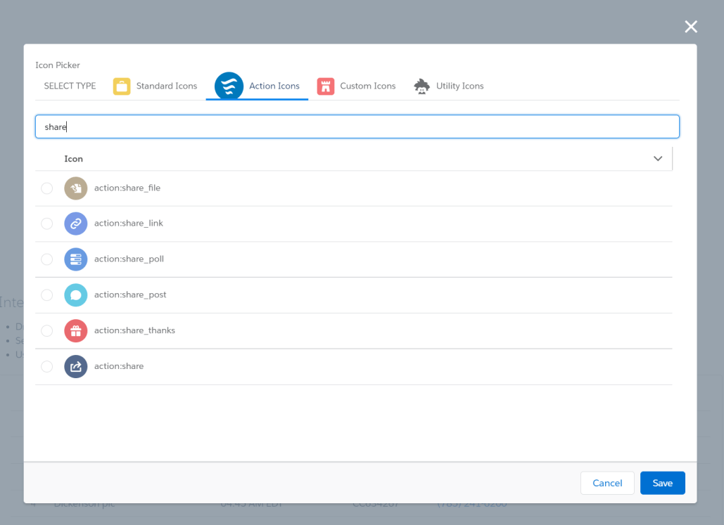
With the new fsc_pickIcon component, you can add a visual icon picker to your Flow Screen and developers can include it in a Custom Property Editor or other Lightning Web Components. This component is based on some code from the Salesforce Labs AppExchange app Activity Timeline.
The user starts by selecting the Icon Type (Standard, Action, Custom or Utility). One can further narrow down their choices by entering a search or filter term in the box above the icon list.
Tab Mode
Accordion Mode
ComboBox Mode
Usage
Drag the custom component Pick an Icon onto a Flow Screen. Use the Output Parameter iconName to reference the icon selected by the user.
Parameters
Input
Attribute
Description
Type
Default
hideStandardIcons
If set to true, Standard icons are not included/displayed
boolean
FALSE
hideCustomIcons
If set to true, Custom icons are not included/displayed
boolean
FALSE
hideUtilityIcons
If set to true, Utility icons are not included/displayed
boolean
FALSE
hideActionIcons
If set to true, Action icons are not included/displayed
boolean
FALSE
iconCategories
A list of strings containing the icon categories to be included. Valid values are: ‘standard’, ‘custom’, ‘utility’, and ‘action’. Any of those categories not present in the list will be hidden. This is an alternative way of setting the available categories instead of using the individual hide[Category]Icons properties.
String[]
iconName
Name of the pre-selected icon in the format of type:name
String
mode
Determines the display mode of the icon list. Valid values are: ‘combobox’, ‘accordion’, and ‘tab’. If left blank, an error will be displayed.
String
label
The text to be displayed above the component.
String
Pick an Icon
accordionMode
DEPRECATED. This is a legacy property and not recommended for future use.
boolean
FALSE
Output
Attribute
Description
Type
Default
iconName
Name of the pre-selected icon in the format of type:name
Updates: Added an option to hide the Actions Icons Added an option to display sections in accordion mode (default is in tab mode) Note: Accordion looks better in a CPE but takes longer to load
This example shows the Icon Picker exposed in a Modal window. In addition to specifying the oniconselection handler, you can specify the height in pixels for the first (SELECT TYPE) tab. At least 100 is recommended so narrow windows can display all of the other tab names in a drop-down without having to scroll.
While coding in Apex, you can use SOQL to retrieve information about the Flows in an organization. We touched on this while describing the Flow Picker, but never really focused on it.
https://unofficialsf.com/wp-content/uploads/2022/09/largeUCSF-300x133.png00Alex Edelsteinhttps://unofficialsf.com/wp-content/uploads/2022/09/largeUCSF-300x133.pngAlex Edelstein2020-12-25 07:29:422020-12-25 07:29:42Developer Note: Retrieving Information About the Flows in an Org or About a Single Flow