Flow Button Bar: new and improved!
Overview
The new and improved Flow Button Bar (FBB) builds on the existing “Custom Flow Navigation Buttons” component, which is:
“a simple, lightweight tool that gives Flow builders the ability to present users with customizable navigation choices that go beyond the standard ‘Next/Finish’ and ‘Previous’.”
FBB brings a more user-friendly interface, new features like icons and vertical buttons, and now offers two distinct “modes” of Flow functionality: Navigation Mode and Selection Mode.
Features
Navigation Mode
Navigation Mode covers the functionality provided by the existing component, and is used to replace and extend the functionality of the native Flow navigation buttons (Next/Finish and Previous). It allows Flow admins to add one or more Lightning buttons to a Flow screen that, when clicked, return the value associated with that button and navigate to the next (or previous) Flow element. This value can then be handled by a Decision element to route the user accordingly. Buttons in Navigation Mode can be styled with different variants, and the button bar can be oriented horizontally or vertically. In horizontal orientation, the buttons can be aligned to the left, right, or center, and in vertical orientation an optional Description Text value can be displayed.

Example of Navigation Mode (horizontal) 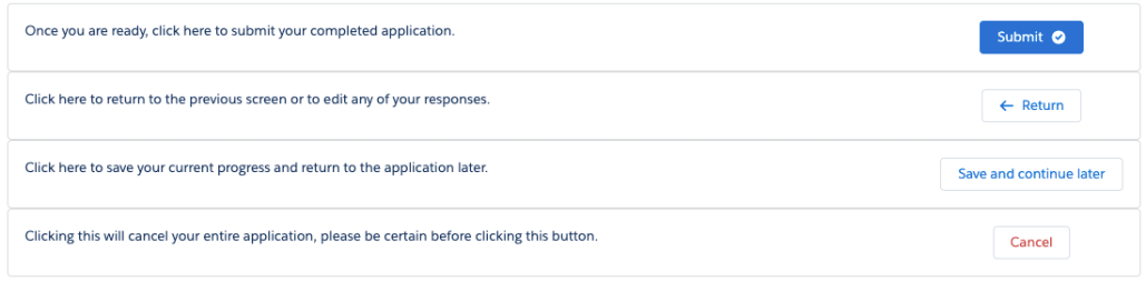
Example of Navigation Mode (vertical) 
Example of Flow logic in Navigation Mode 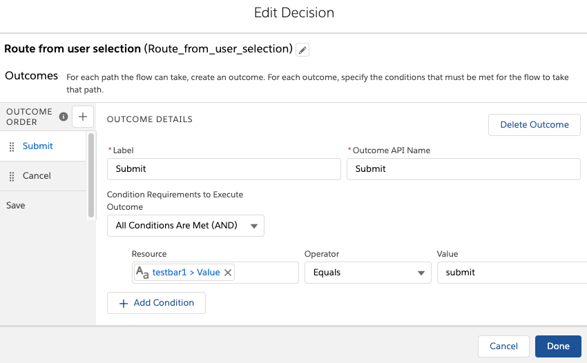
View of a Decision element using the output from a Flow Button Bar to guide navigation.
The Flow Button Bar (FBB) component is shown on Decision Screen in the example above. When the user clicks one of the buttons, their selected value is stored in the component’s ‘value’ property, and the user is navigated to a decision element where they can be routed based on their selection.
Selection Mode
Selection Mode is used to present users with a grouped set of buttons each representing a different selectable option. Selection Mode is comparable to other input elements like radio buttons or picklists, but uses a button group UI and allows for both single- or multi-select. Clicking a button in Selection Mode does not cause navigation within the Flow. In Selection Mode, the component returns two properties:
values[]- list of strings with zero or one elements, or more if
multiselectis enabled, containing any selected values in the FBB component. In single-select button bars, the list will contain a maximum of one element.
- list of strings with zero or one elements, or more if
value- String used for single-select button bars. Returns the first element in
values[]. Used for convenience and to conform to the format of the standard components. - Setting this value resets
values[]to a list of one,[value], thereby removing any other selected values.
- String used for single-select button bars. Returns the first element in
For selections with more than a handful or so of options, it’s probably better to use a checkbox group or radio buttons instead.
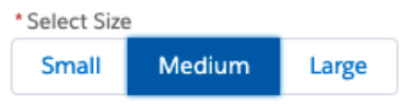
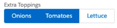
Example of FBB in Selection Mode (multi-select, not required)
Common Features
Both Navigation Mode and Selection Mode have the following properties, all of which are optional:
label- Text to be displayed as a label above the button bar
showLines- horizontal lines below and/or above the button bar to visually separate it from other screen components
help text(coming soon)
Settings & Configuration
A major upgrade in Flow Button Bar is that it is now configured through a Custom Property Editor, giving far greater control over the look and feel of the configuration panel than previously possible.


Configuration Panel using the new Custom Property Editor UI in Navigation Mode
The configuration panel contains two sections: Buttons and Button Bar Settings.
Buttons
This section is used to add, delete, and reorder the buttons in your button bar. Click “add new button” to open the Button Builder modal (see below) and create a new button. Click an existing button, or the pencil icon beside it, to open the modal and edit its settings. The trash icon deletes an icon, and the order of the icons can be changed by dragging and dropping them into the desired position. You can also see a preview of your button bar to make sure everything looks right, but note that the preview is at present notperfect and you’ll still need to test some features in debug.
Button Bar Settings
These are the configurations that apply to the overall button bar, as opposed to the individual buttons. They include:
- Label: label text to be displayed above the button bar.
- Action mode (required): choose between Navigation or Selection, as described above.
- Required (Selection Mode only): does not allow user to unselect all options once selected. Also used to communicate validation requirements.
- Multi-select (Selection Mode only): allows user to select more than one of the options in the group.
- Orientation (Navigation Mode only): controls whether the buttons are laid out horizontally or vertically.
- Alignment (horizontal orientation only): controls whether the button bar is aligned to the left, center, or right of the Flow screen.
- Display horizontal lines: optionally adds lines visually separating the button bar from the rest of the components on the Flow screen. Options are: Neither, Above, Below, Both
Button Builder
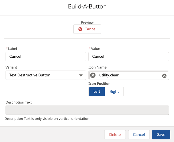
Clicking on an existing button in the list, or clicking “Add new button”, opens up the button builder modal:
- Label (required): the text on the button that will be displayed to end users.
- Value (required): the value that will be returned by the button upon selection. Defaults to be the same as Label, and has no requirements around formatting, but admins may find it useful to distinguish between values and labels.
- Note: If the button value is set to ‘Previous’ (not case-sensitive), the Flow navigation action that will get executed is Previous. In all other cases, the Flow navigation action is Next, or Finish if on the final element.
- Variant: dropdown list used to control the style of the button. Options are: Neutral, Base, Brand, Outline Brand, Destructive, Text Destructive, and Success.
- Icon Name: dropdown list used to add an icon to the button.
- Icon Position: controls whether the icon (if present) appears on the left or right side of the button.
- Description Text (vertical orientation only): Text to be displayed horizontally in line with vertical buttons.
Setup & Instructions
- Install the Flow Base Packs, following the instructions here.
- In Flow Screen Builder, drag the “Flow Button Bar” component onto a Flow screen.
- Like all Flow elements, give it a unique API name—you will use this to refer to the user’s selected value(s) downstream in your Flow.
- Add up to 5 buttons by clicking “Add new button” and using the Button Builder to configure each button.
- Choose an Action Mode: either Navigation or Selection.
- Complete any other optional or required configuration settings.
- If you want to replace the standard Flow navigation, remember to hide the standard footer(use the
showLinesattribute to add a horizontal line above the button bar and mimic the standard UI).
You can then incorporate the button bar’s selected value(s) into your downstream Flow logic, e.g. in Decision elements, formulas, or for conditional visibility.
Installation
This component is part of the Flow Screen Components Base Pack package library. Click the link to learn more and install.
For developers
FBB was built to be used not only by Flow admins using the CPE UI to configure the settings, but also by developers who are building CPEs or other Flow screen LWCs (or non-Flow LWCs, for that matter). The component in Selection Mode is intended to be closely interchangeable with some of the standard input components like lightning-combobox, lightning-radio-group and lightning-radio-group. The component takes the following values:
- options (required): a list of label-value pairs, the same that you’d pass into one of the standard components.
- actionMode: determines the functional “mode” of the button bar. Valid values are
selection(default) andnavigation. - alignment: determines horizontal alignment if in horizontal mode. Valid values are
left(default),center, andright. - orientation: determines vertical alignment if in Navigation Mode. Valid values are
horizontal(default) andvertical. - showLines: controls the optional display of horizontal lines above and/or below the button bar. Valid values are
neither(default),above,below, andboth. - label: optionally displays label text above the button (generally used in Selection Mode, less so in Navigation Mode).
- helpText: optionally displays help text in a lightning-helptext component that follows the label.
- multiselect: if set to any non-falsey value, allows for the selection of multiple values. If falsey, selecting any option automatically deselects any other selected options.
- required: if set to any non-falsey value, displays a required indicator before the component’s label. Also intended to used in validation logic.
- errorMessage: optionally displays a red error message underneath the component.
When any button in the bar is clicked, the buttonclickevent is dispatched. Parent components must listen for this event. The event contains event.detail.values, the list of the values of any selected buttons (used for multi-select button bars) and event.detail.value, which is simply the first element of values(used for single-select button bars).
View Source
Main component (fsc_flowButtonBar) source code
Custom Property Editor (fsc_flowButtonBarCPE) source code