Much like last month’s ‘Flowcast’ – I highlight a bunch of components, articles, and actions featured here on UnofficialSF – check it out in the link below!
The description in the video has links to each of the articles mentioned – enjoy!
https://unofficialsf.com/wp-content/uploads/2022/09/largeUCSF-300x133.png00Adam Whitehttps://unofficialsf.com/wp-content/uploads/2022/09/largeUCSF-300x133.pngAdam White2021-04-06 16:37:102021-04-06 18:10:13March Community Video ‘Flowcast’
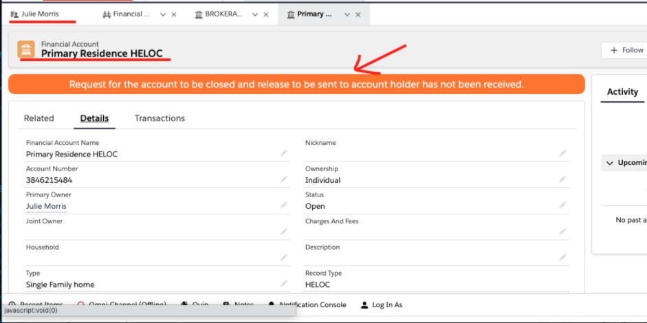
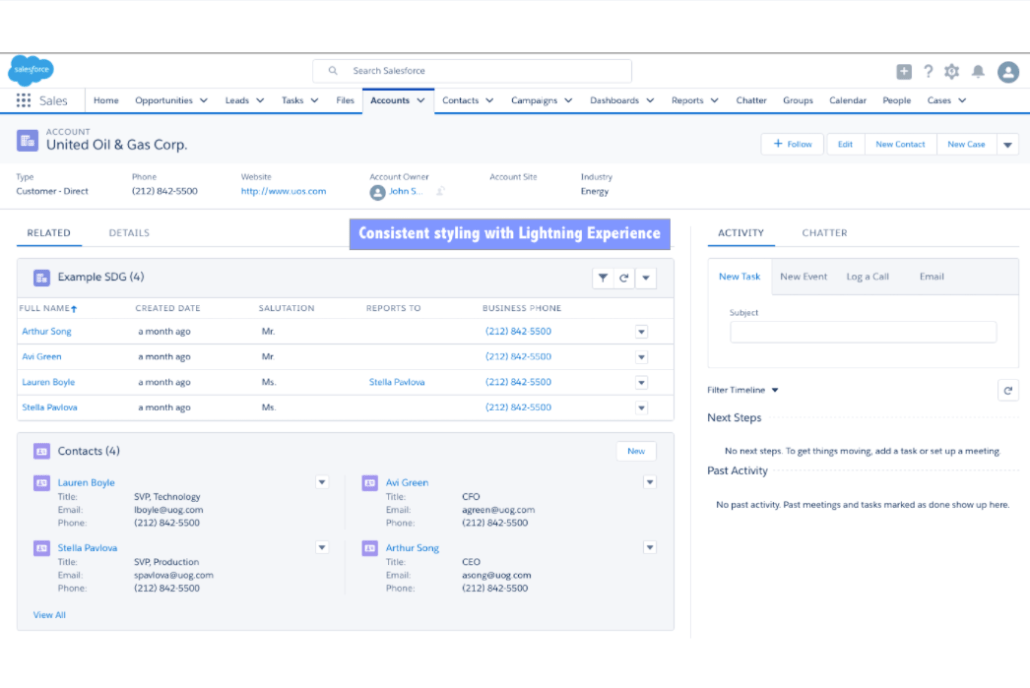
In need of making your flows looks more like a Salesforce Standard Page Layout? OR Simply want to display customizable headers with icons, text, links, etc. in communities, home/record pages? This Flow extension allows you to display customizable headers in flow screens but also works anywhere on Salesforce platform.
What Features does this component have?
Full control over text-color, font, background-color, section border, text alignment, etc.
Ability to display text (with/without) icon
Ability to use Lightning-icons or custom image stored as a static resource
Display hyperlink
Use as a Line/Page Break
Ability to use the same component multiple times in a screen to ensure consistency or to get variety
and more…..
Where can I use it? The Customizable Header/Banner works with-
App Page
Home Page
Record Page
Flows
Communities
Usage Examples
1) Insert Section headers
Scenario- Users have always wanted their flow screens to resemble like Standard Salesforce page layouts.
Use Case: Lightning Scheduler has a default review screen with countless fields. Create a custom version with headers. Optionally, add images (either lightning icons or static resources).
2) Insert horizontal rule/line
3) Formatted Banners
In Community
In Record Page
4) Reuse the component with different styling
Considerations
To use image from static resource
After package installation, check to see if there exists a static resource by the name of ‘customHeaderImages’. If yes, Skip the next step.
Create a static resource by the name- customHeaderImages, set Cache Control to ‘Public’
Create a zip file with the name as ‘customHeaderImages’ containing your desired images. Upload the zip file to above Static Resource
When setting up the LWC, enter image name and check ‘is Image a Static Resource?’ to true. Additionally, select either of the options to display image and text
NOTE: Make sure that you are not compressing a folder when zipping the images. Only select the image(s) you want to use and NOT the folder in which that image is.
In terms of preference (if more than one option is selected)- ‘Is header text only?’ > ‘Header has text (left aligned) and image (right aligned)’ > ‘Header has image and text (with image on left of text)’
Important When using within a Lightning Flow, remember to create a variable for each value you would like to pass
Important When using within a Lightning Flow, remember to re-enter values for boolean fields which are supposed to be true, for example- ‘Is header text only?’ will by default be populated as True- ‘{!$GlobalConstant.True}’- clear the field and re-enter ‘{!$GlobalConstant.True}’
Input Variable
Description
Default
Notes
Display for Record Id?
Only appears on record page. To show the banner for a particular record, update the field value with recordId (from URL). Else, leave it blank to display the banner for all records.
Display as horizontal line?
Check to use as a page break or underline a header
FALSE
If selected it gets the highest priority and the header is displayed as a horizontal line. Once selected, control the display using Banner Height and Banner Background-color fields
Is header text only?
Use when the text is not accompanied by an image- lightning icon/static resource
TRUE
Banner Text
Text to display inside of the banner
Banner Text Goes Here
Banner Text Alignment
Use to align the banner text. Valid inputs: left, center, right
center
Display text as hyperlink?
Check when the text is a link to a webpage,article,etc.
FALSE
Once selected, be sure to fill out the URL to redirect field with a valid URL
URL to redirect
Enter a valid url for the user to be redirected to when the text is displayed as a hyperlink
Remove text-decoration for the link?
Check when displaying the text as URL and you want to remove the text-decoration, ex-underline under the hyperlink.
FALSE
Open link in new window?
Check when displaying the text as URL and you want the link to open in a new window
FALSE
Order Number
When using this component more than once on the same screen, be sure to provide a unique order number to each of the component to ensure that styling(CSS) from one component does not interfere with that of the other. Example, when using the component twice on a screen, give one component an order number of 1 and the other as 2.
Image Name
When displaying image along with text, use this field to provide the image name. To use a lightning icon, enter name as ‘utility:add’ or ‘custom:custom1’. To use image from static resource, follow step#1 aobe and create a static resource. Once created, simply provide the image name.
utility:add
Is image a Lightning Icon?
Check when using a lightning icon.
FALSE
Gets priority over- ‘Is image a static resource’ if both are selected
Lightning Icon Size
Valid inputs: xx-small, x-small, small, medium, or large.
medium
Icon Margin
Provide margin to include space between icon and text-useful when the icon is left aligned and text follows the icon
0px 7px 0px 0px
Is image a static resource?
FALSE
Banner Height
Use to define banner height in %. Also controls the banner thickness when using as a page break
10
Banner Background Color
To define banner background color, use any- #hexcode or RGB(0, 0, 0) or color name
rgb(243, 242, 242)
Banner Text Font Size
Valid inputs: xx-small, x-small, small, medium, or large.
Banner Border
When wanting to have the banner border radius, include width, style (required) and color, example- 0px 0px 5px 0px dotted red;
Font Weight
If the Bold checkbox is checked, you can choose a font weight. If a font-weight is not set, the font weight will be set to bold. Anyone using this component and updates won’t break as this is current functionality. Once you set a weight, you won’t be able to undo a weight. A normal bold is 700. Available in version 1.0.1+
700
Static Resource Setup-
Configuring the Component In a Flow
Problem With Literal Values
Currently there are some problems providing literal values, so at this time you should only pass in variables. This is being investigated. Example- create a text variable ‘bnrBrdrRds’ for Banner Border Radius with value equals to 12px and use {!bnrBrdrRds} instead of simply typing in 12px in the input field- see below image.
Note#2: Remember to re-enter values for boolean fields which are supposed to be true, for example- ‘Is header text only?’ will by default be populated as True- ‘{!$GlobalConstant.True}’- clear the field and re-enter ‘{!$GlobalConstant.True}’
When using within a community, record/home page-
Any limitations that I should be aware of?
At present, header takes up the space of a single column in case of a 2-column flow layout.
https://unofficialsf.com/wp-content/uploads/2022/09/largeUCSF-300x133.png00Sharad Maheshwarihttps://unofficialsf.com/wp-content/uploads/2022/09/largeUCSF-300x133.pngSharad Maheshwari2021-04-06 08:26:152022-10-23 12:21:52From Sharad: Style Your Flow with Headers, Banners, Rules, Formatting and More
Fixes issue with required flag not working and some other performance improvements
File Upload Improved is a custom screen flow component that improves upon the basic File Upload screen component in Salesforce Flow. It adds a number of capabilities. Most notably, it allows the user to interact with their file that they have just uploaded.
We have packed File Upload Improved with many features. We are actively developing the component, so feature requests are welcome either in the comments or on GitHub.
View files after being uploaded;
Render existing files that have already been uploaded to a particular record;
Specify accepted file types;
Restrict users from uploading multiple files, or alternatively allow users to upload multiple files;
Require users to upload at least one file before proceeding, and prompt them with a custom message if they do not;
Delete files immediately in the UI;
Allow community users to upload files to records that are not shared with them;
Set the file name of uploaded files;
Control whether files are visible to all users;
Full control over most aspects of the UX; and
an Invocable Apex Action to create ContentDocumentLinks downstream in your flow.
Permission Set
After installing File Upload Improved, it is important that admins assign the File Upload Improved Permission Set to EACH user that will be using the component in a screen flow. We repeat, every user that uses the component in a screen flow MUST have the File Upload Improved permission irregardless of if they are an internal user, an authenticated community user, or an unauthenticated guest user.
If a user receives the error message, “You do not have access to the Apex class named ‘FileUploadImprovedHelper’.”, admins need to assign the permission set to that user.
Sharing Rules and Without Sharing
The File Upload Improved Permission Set gives users access to the Apex Class FileUploadImprovedHelper. It is important for admins to understand that this Apex Class runs in a WITHOUT SHARING context, which means that users can potentially interact with files related to records that they can’t normally access.
In the most basic configuration, users will be able to upload files to records that they can’t access. The component was specifically designed this way to address the need for community users (authenticated and unauthenticated) to be able to upload files to a record that they can’t access. As explained in the File Upload LWC documentation:
“By default, guest users can’t upload files and don’t have access to objects and their associated records.
To enable guest users to upload files, enable the org preference Allow site guest users to upload files. However, even if you enable this setting, guest users can’t upload files to a record unless guest user sharing rules are in place.”
Salesforce provides components a way to publish an optional bypass for the sharing rule restriction, but Without Sharing is required: at a high level, we are encrypting the Related Record Id and passing it into the File Upload component via the file-field-name and the file-field-value. onuploadfinished the class is querying the newly created ContentVersions, decrypting the Related Record Id which has been populated in Guest_Record_fileupload__c, and creating ContentDocumentLinks from the uploaded file to the record.
Now, a more advanced configuration of the component will allow admins to render existing files in addition to allowing the user to upload new files. This too runs in a Without Sharing context, so the user can potentially see and delete files that are related to a record that they can’t normally access. Admins should test their configurations by logging in as a variety of different users to ensure that they are not exposing sensitive files inadvertently.
{!$Flow.InterviewGuid}
When configuring the component in the screen flow, admins will notice a field with this label: {!$Flow.InterviewGuid}. Even though it is not marked as required, admins should ALWAYS populate this field. This field serves as a key to temporarily cache the files in the browser using sessionStorage so that they don’t disappear if users hit a validation error, and are there for users if they come back to the screen.
Because it’s being used as the key, the value in the field must be unique. If there is only one component in the flow with a definitive start and end to the flow, then admins can use {!$Flow.InterviewGuid} which is the unique identifier for the interview.
If there are multiple components in the flow with a definitive start and end to the flow, admins will have to append {!$Flow.InterviewGuid} to make it unique.
If there is a single component in the middle of a loop, admins will have to use a flow formula like…
… and then use that formula in the field.
There’s really no wrong way to do this – it just HAS to be unique. What happens if it’s not unique? Users will resurface unwanted files from the cache at the wrong time. If a user ever sees files that are rendering that shouldn’t be, it is quite likely that the value in this field isn’t unique, and admins need to make it unique!
Invocable Apex Action
File Upload Improved (and the standard File Upload Screen Component for that matter) ask for the Related Record Id by the time the component renders. In other words, in order to upload files to a particular record using either component, the record must already exist in Salesforce prior to getting to the screen with the File Upload component.
What happens if the record (and Related Record Id) doesn’t yet exist? Let’s say you have a Screen Flow to allow users to submit Cases to your team for support. You’d like the option for those users to upload files to provide additional context – maybe a screenshot of an error message?
Unique identifier for this field. You can start by using {!$Flow.InterviewGuid}. If you have multiple of this component type in the same flow, you’ll have to prepend {!$Flow.InterviewGuid} with something else like ‘1’ or ‘2’ to make each component unique. When using the version with a Custom Property Editor this will need to be stored in a string variable and referenced in the combobox in the CPE since global variables are currently not supported in fsc_flowcombobox.
Accepted Formats
String
v1.0
The accepted file types. Enter a comma-separated list of the file extensions (such as .jpg) that the user can upload.
Allow Multiple Files
Boolean
v1.1 – initial commit v1.5 – component disables if not true and a file has been uploaded
Allow the user to upload multiple files. If this is not TRUE, then once the user uploads one file, the file upload component will not allow any additional files to be uploaded.
Deprecated
N/A
v1.3.1
This input is deprecated. Any value set here will no longer impact the function of the component. As of v1.5, the field formerly known as Bypass Community Sharing Rules has been deprecated.
Disable File Deletion
Boolean
v1.8
When this is TRUE, clicking the ‘X’ next to the Files will simply remove them from the UI and the output list, but the Files will NOT be deleted.
Embed on External Website
Boolean
v1.7
If this flow is being embedded on an external website (like WordPress, for example), set this to TRUE. Otherwise, this should almost always be empty of FALSE.
From a technical perspective, this switches the component from lightning-file-upload to lightning-input type="file". This allows us to bypass some of the dependencies the former has on One.app so that it is externally embeddable. But it comes with certain tradeoffs, most notably the max file size is 3.5 MB though there may be others.
You can read about when you might set this to TRUE here >>.
Help Text
String
v1.8
The message that will be displayed in the help text popup.
File Upload Label
String
v1.0
The text on the file upload button.
Icon
String
v1.0 – initial v1.3.1 – the system will now automatically display the correct icon depending on the file type
We suggest you leave this blank. The default LDS Icon that will be displayed next to each uploaded file. Options here: https://www.lightningdesignsystem.com/icons/#doctype. Prepend icon name with ‘doctype:’, ie ‘doctype:word’. Leave blank and the system will display the icon based on the extension type.
Overridden File Name
String
v1.5
The file name of the uploaded files defaults to the actual name of the file. If you’d prefer to override the default file name, you can specify the new file name here. You can do funky things here like using a Text Template (remember to View as Plain Text) or even using a Flow Formula
Related Record Id
String
v1.0
The Id of the record to associate the files with. Be aware that sharing rules are NOT enforced, so the user could be uploading files to a record that they wouldn’t normally have access to. If this field is blank, then the file uploads, but no ContentDocumentLinks are created and the file isn’t related to any records.
Required
Boolean
v1.3.1
Require the user to upload at least one file.
Required Validation Message
String
v1.3.1
The validation message displayed if the user has not uploaded at least one file. The default message is ‘Upload at least one file.’
Set Visibility to All Users
Boolean
v1.5
By default, when an internal user uploads a file, the file is only visible to other internal users (meaning community users can’t see it). If you’d like to make the uploaded file visible to all users, set this to TRUE. When a community user uploads a file, the file is already visible to all users. From a technical perspective, this sets ContentDocumentLink.Visibilty = AllUsers.
Show Existing Files Related to Record Id
Boolean
v1.5
If you’d like to show the existing files associated with the Related Record Id (in addition to the ones that the user may upload), set this to TRUE. Be aware that sharing rules are NOT enforced, so the user could see files that they wouldn’t normally have access to.
Show Files Below the File Upload Component
Boolean
v1.5
By default, the files will show above the File Upload Component. If you’d prefer they be shown below the component, set this to TRUE.
Uploaded File List Label
String
v1.3.1
We suggest you leave this blank. The text on the list of files uploaded. You might find that you prefer to leave this blank, as the UX is obvious.
Outputs
The outputs can be accessed via manual assignment or by referencing the component via the API name directly.
Property Name
Data Type
Introduced
Description
Content Document Ids
Text Collection
v1.0
The Ids of the uploaded files. Store this value in a text collection variable. This collection returns empty for community users – authenticated and unauthenticated.
Content Version Ids
Text Collection
v1.3.1
The Version Ids of the uploaded files. Store this value in a text collection variable.
Uploaded File Names
Text Collection
v1.3.1
The names of the uploaded files. Store this value in a text collection variable.
Developer Notes
We have had a few inquiries on the component not working in Experience Cloud Sites that use Lightning Web Runtime. The standard lightning-file-upload component is not currently supported in LWR due to it being wrapped in Aura as of the Spring 23 release of SF however to get around this you can mark Embed on External Website as true and it switches the component to use lighting-input as the file upload method when doing this you are restricted to the 3.5 MB file size limit but does give you an option for file upload in LWR.
Install
IMPORTANT: This package includes a permission set named “File Upload Improved”. Make sure to assign it to any users to whom you want to grant this upload capability.
Version 2.0.2 6/25/25 ProductionSandbox Fixes issue with required flag not working and some other performance improvements
This Post was most recently updated on: 9/1/23 Updated package links Current Version: 1.0
At the moment Datetime and Business Hours are not particularly well supported in Salesforce Flows. The intent of this code is to be a gap filler until such time as Salesforce delivers more functionality. The way this code works is simple – Salesforce provides much more support in Apex for Datetime manipulation and Business Hours calcs, so the class included here simply serves to provide access to a subset of those Apex Datetime, Date and Business Hour class methods. 48 in total so there is something there for everyone. While some of these functions are probably possible using formulas, in a lot of cases here you can manipulate the result into different timezones and formats – not something I’d personally want to be doing with formulas if there is a ready built capability to be found on the platform.
Datetime support
The Datetime capabilities available to Salesforce Developers can be found here.
The following subset of capabilities or ‘methods’ provided by Salesforce are enabled in Flow through this simple class. To call Datetime specific methods prefix the method with ‘Datetime.‘. For example, to use the Datetime addDays method use the methodname attribute ‘Datetime.addDays’.
addDays
addHours
addMinutes
addMonths
addSeconds
addYears
day
dayGmt
format
formatGmt
formatLong
getTime
hour
hourGmt
millisecond
millisecondGmt
minute
minuteGmt
month
monthGmt
now (exists in Flow however I included this to enable formatting and timezone controls)
second
secondGmt
time
timeGmt
year
yearGmt
Business Hour support
In addition it made sense to extend this class to also provide five methods for Business Hours calculations.
The Business Hours capabilities enabled are described in more detail here.
To access these methods from the action, prefix the method you want to use with ‘BusinessHours.‘. For example, to use the diff method you’d populate the action attribute ‘methodName’ with ‘BusinessHours.diff’.
add (add business hours time to a starting datetime)
addGmt (add business hours time to a starting datetime and return in Gmt)
diff (return difference in milliseconds between two datetimes, only considering business hours)
isWithin (confirm if a datetime is within business hours)
nextStartDate (confirm next closest date that is within business hours)
Date support
Was on a role by this stage so figured best to expose the Date Class methods as well.
More information on Date Class methods can be found here.
To access the following Date Class methods, prefix the method you want to use with ‘Date.‘. For example, to use the dayOfWeek method you’d populate the action attribute ‘methodName’ with ‘Date.dayOfWeek’.
addDays
addMonths
addYears
day
dayOfYear
daysBetween
daysInMonth
format
isLeapYear
isSameDay
month
monthsBetween
today
toStartOfMonth
toStartOfWeek
year
Using the classes from within Flow
Once installed just reference the DatetimeUtility or DateUtility class from within Flow Builder Action to access Datetime and BusinessHours methods, or DateUtility class from a Flow Action to access the Date methods.
Once selected, you’ll want to configure some attributes. There are 3 to 4 attributes to populate depending on which method you wish to call. If its not intuitive enough let me know and I’ll expand the documentation.
Utility Method attributes
The following attributes can be configured once you’ve created the action using either of the DatetimeUtility or DateUtility Classes
methodName. This is mandatory and if not valid the logic will error out with an invalid method name error at runtime. The method names used in the class are exactly as they’re documented in the formal Salesforce documentation, just without the brackets. So where Salesforce calls a method ‘addDays()’ you’d just use ‘addDays’.
dateTimeString. This is mandatory and is the Flow datetime variable you want to manipulate. Typically from a datetime input field for example. The format of a Flow datetime string is like this ‘1/1/2021, 3:47 pm’ or the pattern ‘dd/mm/yyyy, hh:mm:ss a’.
increment. This is populated with a number when using the addSeconds, addDays etc. Any method where you’re needing to pass in a numerical value.
returnFormat. This is optional on all method calls, allowing you to manipulate the format of the returned result. The expectation is that you’re passing in a string describing a java simple date format pattern. See more on this here.
timeZone. This is optional on all methods and assuming you provide a valid timezone code you can have the resulting datetime value returned to you in the timezone provided.
secondDateString. This is only used when performing a BusinessHours.diff calculation. The method will thrown a runtime error if this second datetime is not provided.
Response attributes
The Utility returns a response that has a number of attributes you can use as you wish
errorOccured. This is a boolean that if true means something went wrong during processing.
errorMessage. If errorOccured is true, then there is likely a message provided in this attribute to describe what it was that went wrong.
result. This is a string containing the result of the method call. Its worth noting that to keep this consistent ALL results are in string format, including what would normally be expected as an integer or long datatype i.e. the result from ‘day’ or ‘time’ method calls. Sorry about that but I figured trying to accommodate different data types in the result might confuse more than it’d help. Can extend the result class easily enough if you’d prefer more result attributes.
Praxis Solutions has created a great component to work with Salesforce Lab’s Enhanced Lightning Grid. It can be used to launch flows in a pop-up modal from a row or list button. Visit the unofficialsf.com Applications & Utilities page for more information.
This Post was most recently updated on: 3/27/23 Current Version: 1.1.1
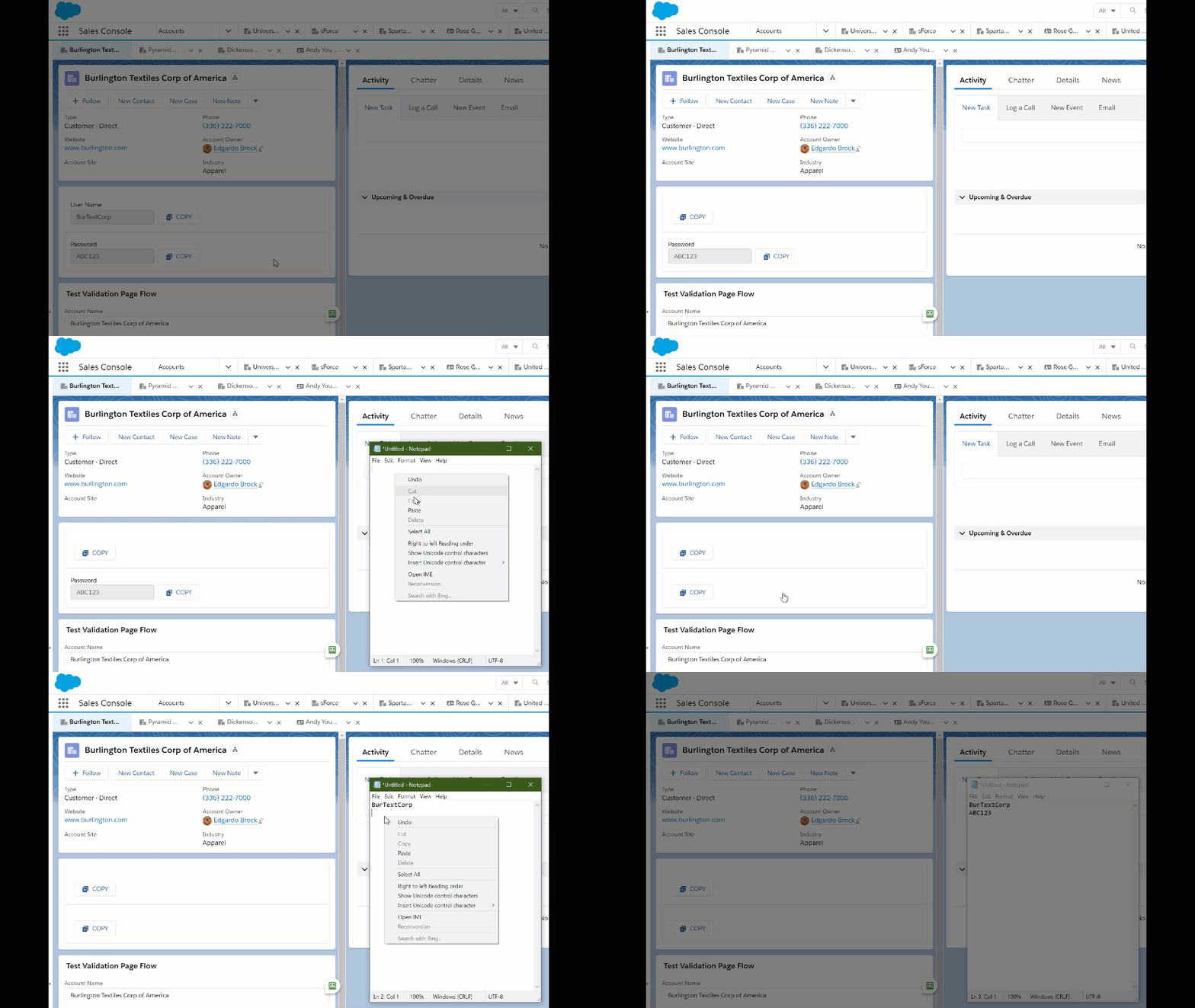
This Flow Screen Component lets you add a button to your flow screens to copy any provided content into the system clipboard. It provides an easy way to allow a user to copy and then paste the provided data elsewhere on their computer.
Usage
To use this component, add it to a Flow Screen and provide the content you want to make available to be copied to the clipboard.
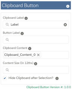
In this example I’ve created a Flow that shows the contents of 4 different fields from a Contact record. Once activated, I can place it on the Contact record page.
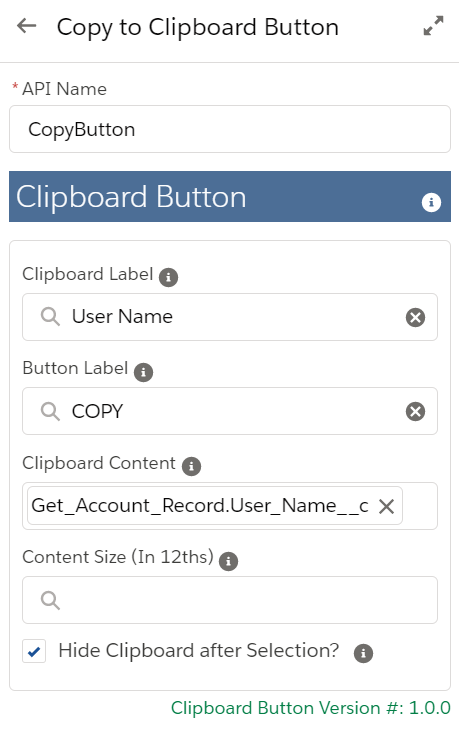
In this example, I’m adding some text to the button and I’m clearing the clipboard display once it has been selected.
Attributes
Attribute
Type
Notes
INPUT
Clipboard Label
Text
Label to appear above the Clipboard contents box (Optional)
Button Label
Text
Label to use on the button (Optional)
Clipboard Content
Text
Set this to the value to pass into the Clipboard
Content Size (In 12ths)
Integer
Set the size of the contents box in 12ths of the total container width (Optional)
Hide Clipboard after Selection?
Boolean
Set to True to remove the clipboard contents display from the screen once the button is clicked
Installation
Step 1
This component requires that you first install the Flow Base Packs
Melody from Salesforce Flowsome has done it again with a fantastic pair of posts that cover a few different ways to select and mass update records from a list view. These well written articles are easy to follow and present step-by-step how you can implement this functionality using Flow.
https://unofficialsf.com/wp-content/uploads/2022/09/largeUCSF-300x133.png00Eric Smithhttps://unofficialsf.com/wp-content/uploads/2022/09/largeUCSF-300x133.pngEric Smith2021-03-26 05:37:322021-03-26 05:37:37Mass Update Records from a Related List
The Flow Carousel allows you display a set of slides in a continuously running carousel within a screen flow it’s useful if you want to put a flow on a lighting record page or run something cast to a screen at an event and allow a remote user to update specific information. There are 4 text collection properties that will build the slides in your carousel. You are limited to max 6 slides (this is a lightning design limitation).
Input
The component only has a handful of properties
Image URL’s: This is a text collection holding the image urls for your slides.
Headers: This is text collection containing the Headers for each slide.
Descriptions: This a text collection of short paragraphs/descriptions for each slide.
Alternate Text: This a text collection the alternate text behind each image this also needs to be unique for each slide as the component uses this to differentiate each slide”
Slide Style: Use this string property to control the slide styling i.e. slds-text-align_center slds-size_x-large this uses standard Lightning Design System attributes. Without styling the default will be aligned left and it will scale all slides to the largest image you have so keep in mind if you use this or not.
Carousel Title: This string property adds a title to your component.
Hyperlink URL’s: This is a text collection holding the hyperlink url’s for your slides.
Slide Duration: Integer that controls how long each slide stays on the screen default is “5”.
The Generate Collection Report component is very useful when needing to show a list of records or for an input into outbound emails (using Send Better Email). It has now been enhanced to:
1) display field labels instead of field names in column headers and
2) allow the display of fields from related parent records.
This will work for standard or custom objects and fields and supports many relationships.
Below is a sample output leveraging a multilevel relationship:
How it Works
When specifying your display fields in the ‘shownFields’ input, use dot notation to specify related fields:
https://unofficialsf.com/wp-content/uploads/2022/09/largeUCSF-300x133.png00Jeremiah Dohnhttps://unofficialsf.com/wp-content/uploads/2022/09/largeUCSF-300x133.pngJeremiah Dohn2021-03-23 08:29:192021-03-23 08:29:26From Jeremiah Dohn: Generate Collection Report now displays parent relationship fields and field labels
Melody over at Salesforce Flowsome wrote up a helpful article summarizing all the various governor limits that come into play when creating Flows and turned them into plain English.