There are multiple custom buttons and navigation tools on unofficialsf.com, each with unique advantages. Here are a few of your options, and when you might consider each one:
Description: Similar to the Bonus suggested usage above, but (1) launches in a modal, which is often very useful, and (2) is a separate component from the Flow being launched
Benefits:
Does exactly what it says on the label!
Downsides:
None, really—this is a pretty niche component that does one thing and does it well.
Description: this is the mac daddy of custom Flow buttons. It has a ton of functionality, and can do things like open records, navigate to URLs, launch quick actions, and more.
Benefits:
Tons of functionality, lots not covered by the above buttons. If you need more advanced navigation, this is the one for you.
Downsides:
With great functionality comes great responsibility configuration. Much less lightweight than alternatives.
To my knowledge, doesn’t currently support launching in modals.
https://unofficialsf.com/wp-content/uploads/2022/09/largeUCSF-300x133.png00David Fromsteinhttps://unofficialsf.com/wp-content/uploads/2022/09/largeUCSF-300x133.pngDavid Fromstein2021-04-22 13:50:232021-04-22 14:09:24Which navigation button is right for me?
UPDATE 5/31/2021: This component has been replaced (and upgraded) by Flow Button Bar, which contains all the functionality available here plus some significant new features, and also includes a much more user-friendly configuration panel. I recommend using Flow Button Bar going forward.
Overview
Custom Flow Navigation Buttons is a simple, lightweight tool that gives Flow builders the ability to present users with customizable navigation choices that go beyond the standard “Next/Finish” and “Previous”.
The Problem
Standard Flow navigation options are very limited: Next/Finish and Previous. This means Flow builders often have to resort to radio buttons to drive navigation logic, which can feel clunky to the end user and are time-consuming to build:
The Solution
This component enables Flow builders to add their navigation buttons to Flow screens. This gives users a more intuitive, modern interface, and is faster and easier for Flow admins to build!
Features
Add as many buttons as you want, all as a single component
Place anywhere on your Flow screen
Choose from four button colours: red, green, blue, and grey (default)
Select position of the buttons: left, center, or right (default)
Show or hide a horizontal separator line above the buttons
Buttons labelled “Next” or “Previous” automatically perform their standard navigation for convenience
Bonus suggested usage
If you want to place a Flow on a page in Salesforce but not have it auto-launch, give the Flow an initial screen with just a custom nav button on it labelled “Launch” (or whatever you want to call it)
In Flow Builder, drag the “Nav Button Set” component onto a Flow screen.
Like all Flow elements, give it a unique API name
Add desired button labels in the order you’d like them to appear in a comma-separated list
Optionally, set colours for the buttons (from the listed options) in a comma-separated list
Select the position (left/center/right) of the buttons and whether you’d like a horizontal dividing line, or just leave the defaults
Hide the standard footer! Or don’t, I guess, but it looks weird
The label of the clicked button is saved to the component’s “selectedValue” output value, and can then be referenced in a Decision element to route the user accordingly. “selectedValue” is updated whenever one of the buttons in the set is clicked.
Screenshots
Adding the component to the Flow screen:
Using the output from the button set to route the user to the next step in the flow:
Please see this document for a breakdown of the various navigation buttons available on UnofficialSF and which one is right for your use case: Which button is right for me?
Earlier this week, the publication of the Summer ’21 Preview enabled us to break our single-day views record here at UnofficialSF.com, surpassing 5000 page views for the first time.
As you can see, this comes on top of the milestone we hit in March of more than 100,000 page views in a month and the mega-milestone of 1 aggregate million page views that we hit some time in January.
This makes UnofficialSF one of the largest Salesforce-related websites, if not the largest.
I want to give a shout out of appreciation to all of the community participants who have contributed to the growth of this site.
Big appreciation and credit to:
Eric Smith, who has put enormous energies to work, continually refining Datatable, but also delivering major improvements and modernizations to components like Lookup and QuickChoice, and a constant slew of additional innovation. Jack Pond, who has tamed the wild Send Better Email and is currently doing advanced explorations of webhook-to-flow technology. Adam White, who coordinated the construction of some very useful components and eventually made himself so useful that Salesforce hired him. Lately he’s been creating new value like his monthly summary Flowcast.
We actually have almost 50 different code contributors at this point. Josh Dayment cranked out a new, improved File Upload in record time, and then followed that up with a FlowCarousel component. And Josh teamed with Karan Pant to create the great new Flexcard component.
It’s great when someone creates a brand new component, but frankly an enormous amount of the aggregate value to the community is generated when members improve existing components. There’s Jeremiah Dohn, who added great features to Generate Collection Report,
We’ve had some great drop-ins by Salesforce architects and engineers like Mohith Srivastava, Ryan McConnell, and Brian Hayes, and M Hamza contributed on Custom Metadata, Evan Ponter on Navigation, Sharad Maheshwari with his Custom Header, datapharmer with contributions to Datatable, and many more.
I think this is just the start of We’re always looking for contributions and help. If you can write code, we’ve got components that need upgrading and if you don’t code there are still numerous ways you could contribute to the development of the site’s content. Post a comment here if you’d like to participate but aren’t sure how to start.
For custom picklist fields you’ve created yourself, you can Activate and Deactivate picklist values but you can’t delete them.
For standard picklist fields, you can’t do anything.
This feature set is something of a disappointment. When we set out to add bulk picklist management we hoped to be able to carry out Activate, Inactivate, Delete on all picklists. Unfortunately some of the combinations are not yet supported by any of the public APIs. Still, we hope that the ability to do mass activation and deactivation of custom picklist fields will prove useful!
As far as I’m concerned, the community can never have too many intro videos. One reality is that the product evolves and existing tutorials become out-of-date. For example, the intro videos I recorded when Flow Builder launched two years ago gained high praise, but they spend a lot of talking about Manual Variables. While manual variables are still in use, I wouldn’t use them in an intro video now that we have the much simpler Automatic Output Handling.
So a new 40 minute intro video that makes no assumptions about the user is always appreciated. Extra points for the smooth jazz background music.
https://unofficialsf.com/wp-content/uploads/2022/09/largeUCSF-300x133.png00Alex Edelsteinhttps://unofficialsf.com/wp-content/uploads/2022/09/largeUCSF-300x133.pngAlex Edelstein2021-04-16 07:13:092021-04-16 07:13:14From Adam Foyston: A New Intro Video for Flow Builder
I have released Version 3.1.1 of the Datatable component. Please note that you will first need to update to the latest versions of the FlowActionsBasePack and the FlowScreenComponentsBasePack.
Updates:
Moved the “Display ALL Objects for Selection” choice in the CPE from Advanced to Data Source
Added an attribute to hide all column header actions such as Sort, Clip/Wrap Text and Filters
If Multi-Currency is enabled, convert currency field values to the User’s currency (Thanks to Novarg1)
Bug Fixes:
Text formula fields will now wrap correctly
Display ALL Objects for Selection attribute is now persistent
Input data is Apex-Defined attribute is now persistent
The number of pre-selected rows will now not exceed the Maximum Number of Records to Display attribute value
Don’t require the key field to be explicitly listed in the Column Edits attribute for Apex Defined Objects
The Clear Selection button will no longer appear on single row tables when Disallow row selection is checked
The Clear Selection button will clear the Output Selected Rows (User Defined) attribute for Apex Defined Objects
Fixed the column filtering on Checkbox Fields when the filter value is ‘false’
Fixed the vertical alignment of the table header text
https://unofficialsf.com/wp-content/uploads/2022/09/largeUCSF-300x133.png00Eric Smithhttps://unofficialsf.com/wp-content/uploads/2022/09/largeUCSF-300x133.pngEric Smith2021-04-16 05:06:452021-04-16 05:06:50Datatable – New Version Release Notes
This version includes a popular ask from the community; the ability to hyperlink the slides. There are also a few bug fixes with the styling parameter that were included with this release as well.
There is now a new property for Hyperlink URL’s this is a Text Collection Variable of urls that sit behind each slide in your carousel.
Thanks to vijayignatius, we have a new option for the Lookup component. He has provided a new attribute that lets you pick a field other than the Display field to be used as the the field to search on. Read on for his excellent overview of why and how you can use this new feature.
By default the search term entered by the user will be searched against the field configured in “I2_Display Which Field?”. While this should be sufficient for most of the use cases as “I6_Filter on which field?” and “Where Clause” will provide additional flexibility to make the query more selective, in some cases, you may want the flexibility for the user entered search term to be searched against a different field than the “I6_Filter on which field?” which is what the new “I8_Search this Field instead of Display Field” provides.
As an example, consider a scenario where you have 50M Accounts and some users have access to all 50M Accounts. You have the Account External ID( say master data management id) stored as “External_ID__c” in Salesforce and you need the “I2_Display Which Field?” to be a formula field which is a concatenated value of “Name + External_ID__c + BillingStreet” but want the search term to be searched against the “Name” field. In this case, you would configure the Lookup FSC component as below:
“I2_Display Which Field?” → Name_ExtId_Address__c ( which is a formula field)
“I8_Search this Field instead of Display Field” → Name
This will ensure that the user entered search term is searched against the “Name” field and not the “Name_ExtId_Address__c” field. The result of which will be displayed as follows:
In the above example, you can also configure “I8_Search this Field instead of Display Field” to search against “External_ID__c”, the result of which will be displayed as follows:
If you would like to provide a even more better user experience, you could use 2 UnofficialSF – LookUp component, one configured to search against the “Name” field and another against the “External_ID__c” and use a toggle to dynamically show/hide the relevant search component so that the user can either search by “Name” or “External_ID__c” as in the below screenshots.
https://unofficialsf.com/wp-content/uploads/2022/09/largeUCSF-300x133.png00Eric Smithhttps://unofficialsf.com/wp-content/uploads/2022/09/largeUCSF-300x133.pngEric Smith2021-04-15 07:05:512021-05-27 19:33:24New Option for the Lookup Component
Always a pleasure to divulge the next functionality that will be available to Flow users and builders!
Scheduled Paths in Record-Triggered Flows
The ability to schedule delayed activity that keys off of an initial trigger, known as Scheduled Actions in Process Builder, comes to Flow in the form of Scheduled Paths.
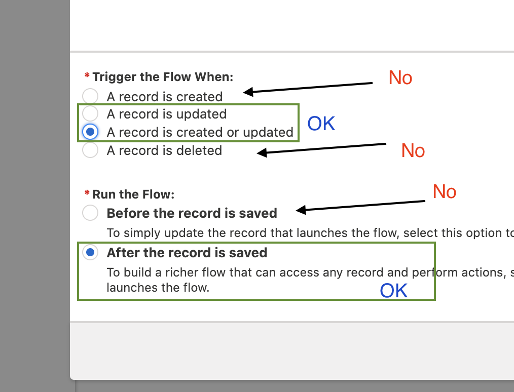
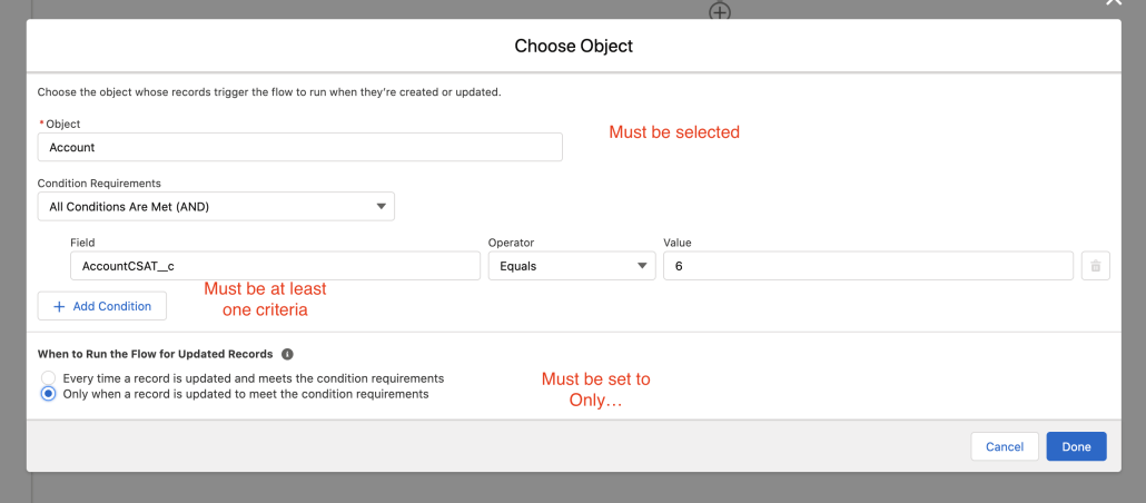
To create a Scheduled Path, you can now use either Autolayout or Freeform mode, but you need to get everything lined up properly:
It must be a Record-Triggered Flow
It must be set to After Save, and not Before Save
You must have already picked your Object
You must have ‘Create or Update’ or ‘Update’ but not just ‘Create’
Multicolumn Screens are now Generally Available
Each section can be divided into up to 4 columns, and its visibility can be controlled dynamically.
Built on SLDS, sections are responsive by default. In small mobile devices, they stack vertically.
Customers can use sections to create multicolumn layouts on their screens, and then embed whatever screen components they like in those components. Or they can use a section to apply the same visibility rule to a group of components.
Automatic Fields
This is the initial beta of a feature that may have as big an impact as Multicolumn Screens. You are now able to start dragging object fields onto screens. You will always be able to drag a rich set of components onto the Screen, but we wanted to provide an automatic way to simply pick an object and grab its fields.
The initial Beta only support some of the basic field types, and it requires the presence of a record variable. Create or use an existing manual variable or reference an upstream output. If you want to use these fields to create new records, provide a manual variable and later pass it to a Create Records element.
In future releases, we’ll support picklists, lookups, compound fields like Name and other field types. We’ll also add automatic output handling so you can more easily support ‘New Record’ use cases: You’ll be able to drag fields onto a screen and have them automatically grouped for subsequent Create Records calls.
232 Supported Data Types
Checkbox Text Date Date/Time Number Text Area Text Area (Long)
Choiceapalooza Enhancements
Choiceapalooza is the internal project name for a large list of improvements that make it easier to work with choices and choice questions. In Summer ’21, these changes are in effect:
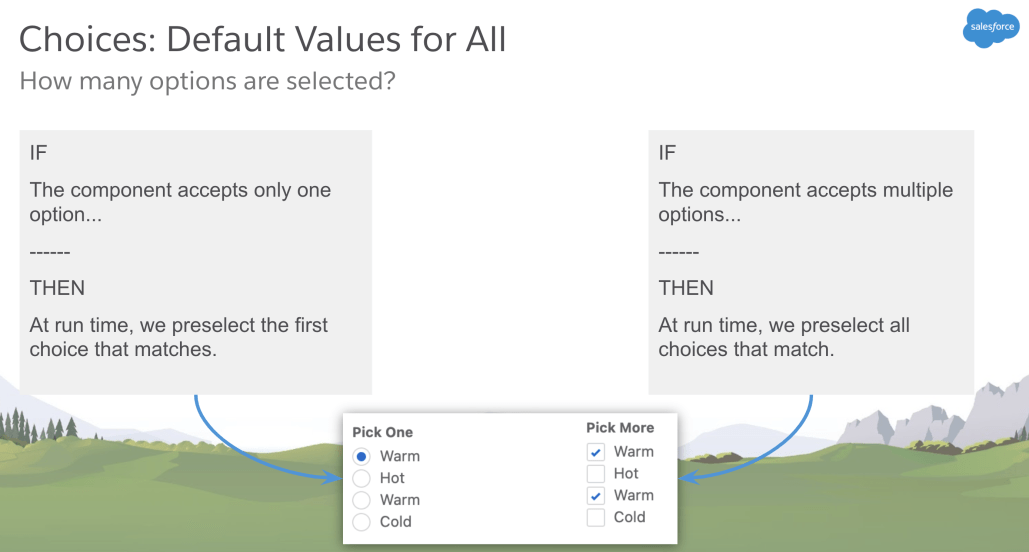
Customizable Default Values
Previously, the only way to set preselect an option for a choice component was to use a static choice resource. There was no elegant option if you wanted to select a default from a picklist or record choice set.
Now, you can select an upstream flow resource or manually enter a value that should be selected by default.
Matching Rules
Rule 1:
IF
Default Value is a static choice
AND
that static choice is included in the list of choice options for the component
——
THEN
At run time, we preselect choice options by matching the choice option’s API name.
Rule 2
IF
Default Value is a static choice
AND
that static choice is NOT included in the list of choice options for the component
——
THEN
At run time, we resolve the Value of the Default Value choice, and preselect any of the choice options whose value matches.
Rule 3
IF
Default Value is not a choice.
manually entered value
reference from a Get Records, action, or component
another upstream reference
——
THEN
At run time, we resolve the reference in Default Value, and preselect any of the choice options whose value matches.
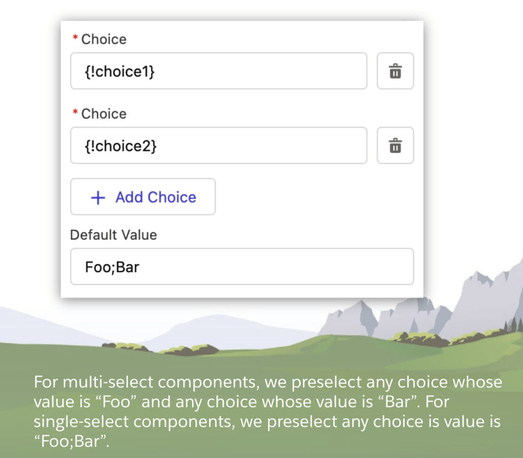
Rule 4 (Multiselect)
IF
Default Value resolves to a value with semicolons included.
AND
You’re using a multi-select component.
——
THEN
At run time, we treat that value as multiple defaults, and we preselect any of the choice options whose value matches any of the strings between the semi-colons.
* Caution: Make sure none of the values in your choice options have semicolons in their value. For record choice sets, we recommend setting Value to the record ID.
Improved Picklist Requirement Control
Admins can now control whether a picklist is required or not. This comes in the form of two enhancements:
Picklist now includes a Required checkbox
Picklists now automatically include a prepended –None– option*
Previously, picklists were always required, and if no default was provided, the first option in the list was selected. Which meant the picklist was required but an option was selected for the user.
* To get this behavior, upgrade your flow’s API Version for Running the Flow to 52.
Switch Components Without Starting Over
From the property editor of an existing choice component, change how the choice options are displayed at runtime by changing the compone type.
Let Users Select Multiple Options determines which components are supported
Component Type is used to change to the target component
Improved Component Preview
Many more standard components now preview in the canvas when you’re building a screen in Flow Builder.
Address
Call Script
Dependent Picklist
Display Image
Email
File Upload
Lookup
Name
Phone
Slider
Toggle
URL
How It Works
We attempt preview if all required attributes have values set.
The Address component has no required attributes, so it immediately previews.
Because the flow isn’t running, we can’t resolve references. If an attribute has a reference instead of a manually-entered attribute, like {!myVar}, we don’t pass that value into the preview. Those attributes are ignored. This means that if a required attribute is set to a reference, we don’t attempt preview.
Detect Conditional Visibility
In Flow Builder, we now identify which components have conditional visibility applied by:
adding an icon to the component on the canvas
opening the Set Conditional Visibility section by default when a rule is defined
New Sort Collection Element
A new element has joined Flow Builder! With the Collection Sort element, you can reorder the items in a collection variable. You can sort a collection of values, a collection of records, or an Apex-Defined collection. You can also limit the number of items that remain in the collection variable after the sort.
With the Collection Sort element, you can reorder the items in a collection variable. You can sort a collection of values, a collection of records, or an Apex-Defined collection. You can also limit the number of items that remain in the collection variable after the sort.
Select a collection variable (1). If it’s a record collection variable or an Apex-defined collection variable, enter the field to sort the collection in Sort By (2). Click Add Sort Option (3) to add up to two additional sorting fields. If the collection variable contains a single list of values, Flow Builder automatically sets and hides the Sort By field.
All text-based fields, including picklists, are sorted alphabetically. Boolean fields are sorted as false first if Sort Order is set to Ascending, or sorted as true first if it’s set to Descending.
Mulesoft Actions for Flow and Bots (Developer Preview)
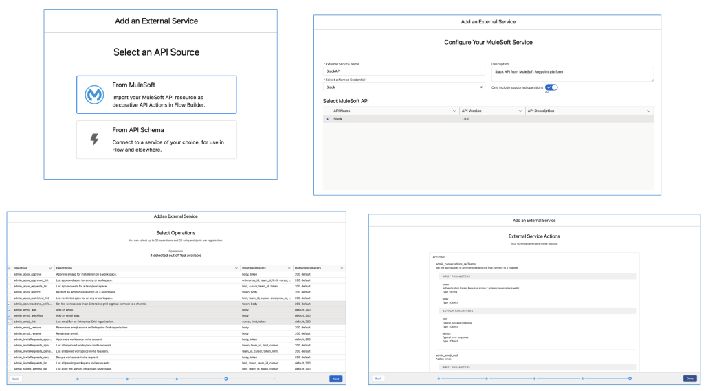
Import your MuleSoft Anypoint Platform APIs in a few clicks with External Services Enhancements for MuleSoft. Select your MuleSoft Name Credentials and let Salesforce do the heavy lifting of importing your endpoints and converting them into actions immediately available in Flow Builder.
Developer Tools: Access Errors from Custom Flow Components
As part of the existing onStatusChange action, developers can now access an errors object that includes both error messages and error codes.
Developers can add code in their wrapper that reacts to particular errors in a flow. For example, when the running user doesn’t have access (error code FLOW_ACCESS_RESTRICTED), hide the flow component.
Flow Orchestrator (Pilot)
Orchestrator is the biggest thing Salesforce Automation has done in many years. The pilot will get a post of its own.
Among the powerful things that can be built on Orchestrator: Approval Processes. Here’s a simple two stage approval process implemented with just a few clicks:
Points of note:
Each step is assigned to specific workers
Each Work Step has an associated screen flow that gets run by the workers after they get notified. Orchestrator will be a paid product but licensing and pricing won’t be announced for some time.
Join the pilot by asking your Account Executive. (This is a Salesforce policy, unfortunately. If you don’t have an AE, you’ll have to wait a little longer, but beta will be coming in September).
Next Best Action Flows (Pilot)
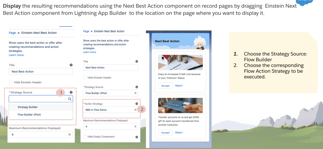
Our existing Next Best Action decisioning service is being extended to run on the Flow engine. This allows NBA strategies to be built in Flow Builder as flows, providing powerful platform features such as Templates, Versioning, Packaging 2.0 support, Sub Strategies, Debugging enhancements. Flow Builder will be home to low code AI driven Recommendation, OOTB Reporting and analytics and other cutting edge decisioning elements.
Support for ISCHANGED, ISNEW, and PRIORVALUE
We continue to march down the list of Process Builder features and implement them in Flow Builder.
Record-triggered flows for new and updated records now support the ISCHANGED, ISNEW, and PRIORVALUE formula functions. You can copy your Process Builder or workflow rules formulas containing these functions into record-triggered flows. When copying formulas containing ISCHANGED and PRIORVALUE from Process Builder into record-triggered flows, use the $Record global variable instead of the object. For example, to use ISCHANGED(account.x) in a record-triggered flow formula, change it to ISCHANGED($Record.x). The ISNEW formula function requires no changes because it has no parameters.
You can also use the new Is Changed operator in your condition logic for Start elements and Decision elements in record-triggered flows. With the Is Changed operator, you can define conditions that check whether certain field values on the record have changed in the current transaction. If the conditions are met in the Start element, the flow is triggered to run. If the conditions are met in the Decision element, the flow executes the outcome in the flow path.
The Is Changed operator isn’t available for flows that are triggered when a record is created or deleted. When you edit the Start element and configure the trigger, select the A record is updated or the A record is created or updated option for when the flow is triggered, and select the After the record is saved option for when the flow runs. When you set up the condition for the object, use the Is Changed operator with fields of the selected object. If the condition with the Is Changed operator is True, then the flow is triggered to run when the field value is changed. If the condition is False, then the flow is triggered to run when the field value is not changed.
Salesforce Flow Accessibility Enhancements
This release, accessibility enhancements are centered on focus management when users attempt to navigate to another screen. If there’s an error on the current flow screen, the focus is set to the first field with an error. If there aren’t any errors on the current flow screen, using Previous or Next displays the appropriate screen and the focus is set to its first focusable field. Also, screen readers are now able to read labels associated with more components, including Currency, Multi-Select Picklist, Name, Number, Picklist, Radio Buttons, and URL.
Autolayout Canvas is 5x Larger
We increased the auto-layout canvas limits, so you can stretch out your flows and avoid errors for exceeding canvas limits. The new canvas is over five times larger, designed to accommodate your largest flows. Give it a try by converting your largest flow to Auto-Layout!
Faster Field Updates in Record-Change Triggered Flows
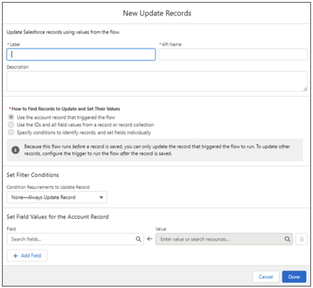
We’ve enhanced the Update Records element for record-triggered flows. A new option lets you directly update the record that triggered the flow. Instead of a Decision element, you can use the Update Records element to set filter criteria for the triggering record. The Update Records element only displays fields you can update, and it’s available in all record-triggered flows. These changes mean you can now easily switch between record-triggered flows that run before or after the record is saved.
Before this release, the Update Records element was only available in record-triggered flows that ran after a record was saved. In record-triggered flows that ran after the record was saved, you used the Update Records element to query for the record that triggered the flow. But if you wanted to change that flow to occur before the record was saved, you couldn’t use the Update Records element. You had to use Decision elements to do conditional updates and the Assignment element to set field values.
Add an Update Records element to your record-triggered flow. While all three options for How to Find Records to Update and Set Their Values are displayed, only the first option is selectable for before-save record-triggered flows. In this example, we’re setting up a before-save record-triggered flow for accounts.
When using the first option, you can only update fields on the record that triggered the flow. To update fields on related records in after-save record-triggered flows, select one of the other options.
Note: To use the Is Changed operator in a flow triggered when a record is updated, set condition requirements in the Start element.
The Debugging team continues to hammer out new improvements, starting with a list view that shows failed flow executions (interviews).
Failed flow interviews for these flow types are saved and available to open in Flow Builder from the Failed Flow Interviews list view.
Screen flows
Record-triggered flows
Schedule-triggered flows
Autolaunched flows that aren’t triggered
When you select list view filters for Interview Status in Classic, you see Running, Paused, Completed, and Error values. Only flow interviews that have the interview status of Paused or Error can appear in the list view. The Paused Flow Interviews component shows the Paused or Failed Date column, but the component shows only paused flow interviews.
From Setup, enter flow in Quick Find box, and then select Paused and Failed Flow Interviews. The default list view is Paused Flow Interviews.
Debugging Improvements: Debug Flows that have Pauses
Now you can continue to debug a flow even after a Pause element is executed. If the pause conditions are met, you can choose a pause configuration that resumes the flow. Only pause configurations that run when a specific time occurs are supported. Previously, you couldn’t resume a flow after a Pause element when you debugged a flow in Flow Builder.
Debugger Improvements: View Transaction Changes
Schedule-triggered flows and autolaunched flows that have no triggers can now show debug details for transactions that are committed or that are rolled back due to an error. If a flow fails, you can debug the flow to see whether record changes were permanently saved to the database via committed transactions before the failure.
Debugger Improvements: Debug Visually in Autolayout Mode
Considerations to keep in mind when you debug flows built in auto-layout:
While you debug flows in auto-layout, you can’t add or delete elements.
If you have unsaved changes when you debug, we don’t show highlighting for them.
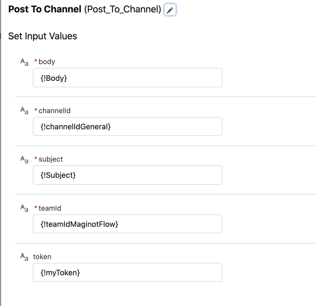
The only Teams inputs we will support in this first version are Subject and Body. They should be string inputs on the action. Verify that rich text entered into a Flow Text Template can be passed by reference into the Body of this action and the formatting is retained in the posting on Teams.
If an error is returned extract the most readable part of the error text and return it in the ErrorText output attribute
setting up authentication to make calls to the Microsoft Graph API (which is what MS Teams relies on)is challenging but anyone who administers Teams will probably be familiar with the process. Currently, the only tokens we’ve tested this with are developer tokens that last for 1 hour and have to be refreshed, and the tokens are generated through a complex process involving HTTP and a rig like Postman.
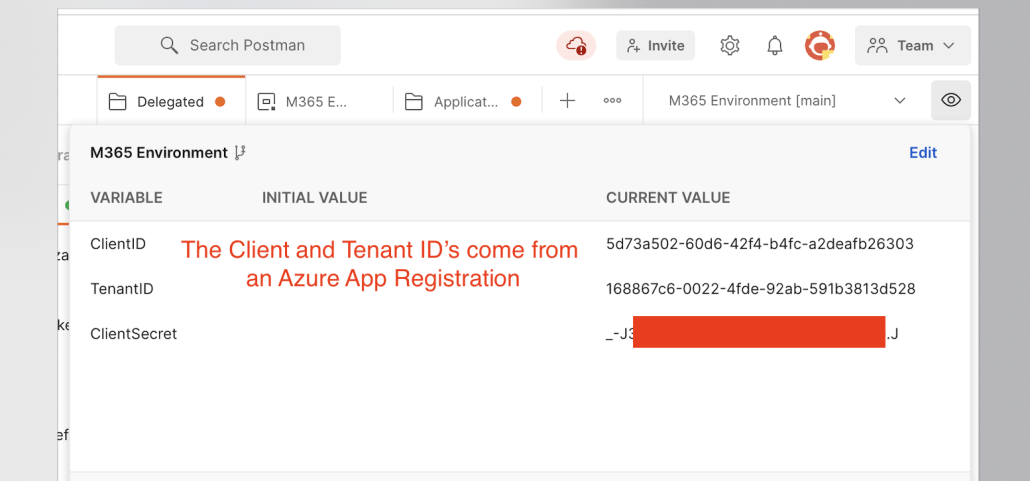
Here’s the Postman configuration that I use to generate valid auth tokens:
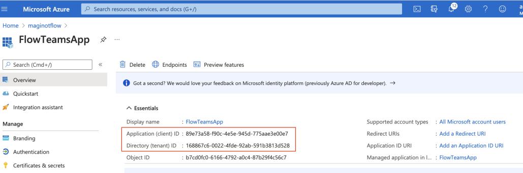
All access to Teams starts with an Azure App. This produces the clientID and TenantID
You combine that app id info with a client secret to create an environment that you use to get a temporary access token:
You can generate Client Secrets from the Azure App management UI:
This gives you the access token. Teams actions also usually require IDs for the Team and Channel:
You can generally extract these values from the URLs found in Teams:
However, you have to watch out for the encoding. In the example above, the channelID that Flow would expect is
19:c44259973e3a444ebcb82aeb0d5b272f@thread.tacv2
and the teamsID is referred to here as the groupID and Flow would expect;
cc3f17a9-b923-468b-96bf-4fb29057976a
There is certainly a better way to extract these ID’s! This is an area where I’m sadly ignorant, and Teams experts are encouraged to comment on this post with improvements to these docs.
https://unofficialsf.com/wp-content/uploads/2022/09/largeUCSF-300x133.png00Alex Edelsteinhttps://unofficialsf.com/wp-content/uploads/2022/09/largeUCSF-300x133.pngAlex Edelstein2021-04-13 08:20:562023-12-09 16:56:33Use Flows to Post Messages to Microsoft Teams