If you want to import a CSV file, you can use this existing invocable action. It has a good feature set, but there are some limits on the file size that can be imported that stem from backend Salesforce limits. Andy Haas has provide a complementary Flow Screen Component that also allows CSV imports. This version processes files on your local computer, and can work with larger files. This component will automatically navigate to the next screen when the parsing has been completed.
Use Cases
The CFO at a large company has come to you with a request to allow end users to import a CSV file from their merchant companies each month. He doesn’t want to have to call you each month or learn another platform to import these records. He tells you that they partner with many different merchant processor companies and the files will stay the same each month; he wants the process to be as simple as possible for the end users. You ask him for the CSV files to create an object and fields corresponding to the file.
You sit down, open the CSV file the CFO sent to you, and create the object with the appropriate fields. You then open up a new Screenflow, drag the Convert CSV to Records – LWC Version to the screen, and set up the component’s configuration.
After you have set up the component, you test drive it out and see how quick and simple this will be. You schedule a meeting with the CFO and show him the progress; he is amazed at how well this works.
In the above use case, we talked about utilizing the component for a monthly import that the CFO has to do; this can also be used with a one-time import or a multitude of different use cases where the user is importing a file. If a user is not initiating the import, the existing invocable action will be the correct action to use.
Setup
Add the Convert CSV to Records – LWC to the screen.
Inputs
The inputs consist of 4 required inputs and a large list of optional advanced features. The underlying PapaParse library provides advanced features and is documented in the PapaParse documentation.
Input Name
Default Value
Description
API Name
The name of the component.
Input Object
This is used to get the field definition.
File Import Label
The label for the file input field.
Auto Navigate Next
If true, the flow will automatically navigate to the next screen after the component has been initialized.
Delimeter
,
The delimiting character. Leave blank to auto-detect from a list of most common delimiters, or any values passed in through delimitersToGuess.
New Line
The newline sequence. Leave blank to auto-detect. It must be one of \r, \n, or \r\n.
Quote Character
"
The character used to quote fields. The quoting of all fields is not mandatory. Any field which is not quoted will be correctly read.
Escape Character
"
The character used to escape the quote character within a field.
Transform Header
A function to apply on each header. The function receives the header as its first argument and the index as second.
Dynamic Typing
If true, numeric and boolean data will be converted to their type instead of remaining strings.
Encoding
UTF-8
The encoding to use when opening local files. If specified, it must be a value supported by the FileReader API.
Comments
A string that indicates a comment (for example, # or //). When Papa encounters a line starting with this string, it will skip the line.
Fast Mode
Fast mode speeds up parsing significantly for large inputs. However, it only works when the input has no quoted fields. Fast mode will automatically be enabled if no ” characters appear in the input.
Transform
A function to apply on each value. The function receives the value as its first argument and the column number or header name when enabled as its second argument. The return value of the function will replace the value it received. The transform function is applied before dynamicTyping.
Delimiters to Guess
An array of delimiters to guess from if the delimiter option is not set.
Please note that the following PapaParse inputs will be set within the component and can not be changed. Keep this in mind if any conflicting inputs will error out.
PapaParse Name
Value
Description
Header
TRUE
The first row of parsed data will be interpreted as field names.
Skip Empty Lines
TRUE
Lines that are completely empty (those which evaluate to an empty string) will be skipped.
Column Headers
The header columns are compared against the objects fields, and if the header column is a custom field and the header isn’t labeled that way, the component will rename the header and assign the custom field.
Example
Input Object: Account
CSV Headers: Name, Description, Active
The component will convert the above CSV Headers to the following:
Name, Description, Active__c
Outputs
Output Name
API Name
Description
Parsed Results
outputValue
An sObject of the parsed results.
Is Error
isError
Will be marked true if an error has occurred when attempting to parse the CSV file.
Error Message
errorMessage
Will output the value of the error that had occurred.
Implementations
Implementing this component can be as simple as creating records right after parsing like so:
Or you can be more complex with loops and filters as the output is an SObject allowing manipulation of the imported data.
With Spring ‘23 and the added ability for reactive screens, you can use this component to preview the data uploaded before creating records.
Install Link
Production/Dev
V1.0.1 1/14/23 ProductionSandbox Fixed setting the selected object in CPE
Old Versions
V1.0 12/29/22 ProductionSandbox 1st version hosted on FlowComponents
https://unofficialsf.com/wp-content/uploads/2022/09/largeUCSF-300x133.png00Alex Edelsteinhttps://unofficialsf.com/wp-content/uploads/2022/09/largeUCSF-300x133.pngAlex Edelstein2022-12-29 15:44:232023-01-18 18:20:10From Andy Haas: A high-volume Convert CSV To Records screen component
You can only approve or reject but cannot add an approval comment.
I wanted to see if I can improve on that by using a screen flow in Slack. This blog will not cover the initial setup and connection of Salesforce to Slack. You can find details on how to do this in the official documentation.
My solution was inspired by two blogs
Alex Edelstein created an invocable action for processing approval requests that includes sending an approval comment
Yumi Ibrahimzade demonstrated how to copy an approval comment from the approval history related list to a field on the record
In order to send a screen flow to Slack you have to create two separate flows that will work together.
A screen flow – this is what will surface to the user in Slack and process the user inputs there. This flow has to be marked as available in Slack. Marking a flow as ‘Available in Slack’ generates a separate ‘launcher’ invocable action that can be used in other flows
A record triggered flow – This flow will act as a dispatcher and will use the launcher action, we created in step 1, to send the screen flow to Slack when record conditions are met. Slack actions can only be processed asynchronously, after the record is saved.
To test this, I setup a simple one step approval process, with simple actions that update an approval status picklist field on the record
I then created my screen flow which has only one screen. The screen displays an approval request to the user, along with some record details, and captures the responses. The flow will then use those responses to process the approval using the invocable action, and update the record with the approval comment. The flow has some input variables that will get their value from the dispatching flow. I marked this screen flow as available in Slack. I was not successful in passing a record link to the screen flow. Slack uses a special markup language to format links, which works well when sending a Slack message using the “Send Slack Message” core flow action, but it did not work when sending in the screen flow action.
The next step was to create the record triggered flow that will send to Slack. My trigger was based on a custom Approval status field set to submitted, when a user will submit the record for approval. This will work well for a single step approval process but if you have a multi step process, additional conditions may be needed to determine the current approval step. This flow gets the most recent approval process instance, work item, and approver userId for the triggering record and passes this information, along with the record Id, to the screen flow action.
When both flows are combined, I was able to send an approval request to Slack, process the response, and update the record with the most recent approval comment. Here is a short video of the complete process.
This is a simple use case for a single step approval process with a single approver. It can be enhanced to handle more complex approval processes.
If there are multiple approvers, the dispatching flow will need to get a collection of all the work items and loop through to send the screen flow to all of them.
If a queue is set as the approver, the the dispatching flow will need to get a collection of all members of the queue to find their userId
The screen flow can be updated to add a recall action
https://unofficialsf.com/wp-content/uploads/2022/09/largeUCSF-300x133.png00Tamar Erlichhttps://unofficialsf.com/wp-content/uploads/2022/09/largeUCSF-300x133.pngTamar Erlich2022-12-27 06:09:362022-12-27 06:09:40Process approvals using a screen flow in Slack
Editor’s Note: UnofficialSF is pleased to enable commercial creators of Flow extensions like Common-Unite to introduce their products and demonstrate useful use cases. One of our goals is to see a rich tier of commercial solutions in addition to the many free extensions that will continue to be available.
Content provided by Common-Unite
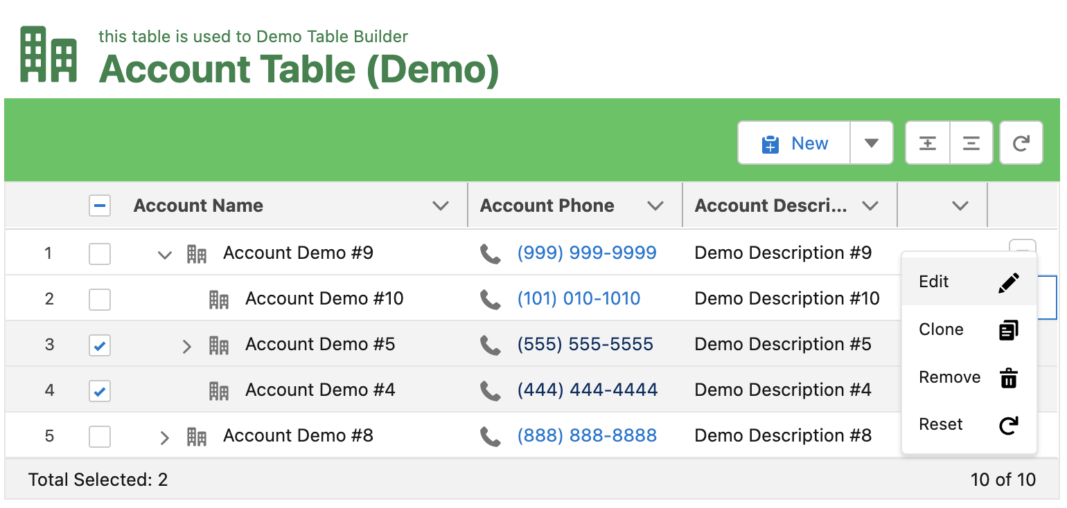
The Flow Took Kit (Form and Table Builder) app is a 100% Salesforce native tool that enables you and your team to create custom Flow Screen components declaratively, with clicks, not code. These custom components leverage the power of Flow, instead of Apex, to control your component’s processes and actions. By combining Flow and the Flow Tool Kit, your team can create advanced interfaces, forms, surveys, or wizards for both internal and external users. Reducing your team’s development time, cost, or reliance on external form builder solutions.
What sets the Flow Tool Kit apart?
The Flow Tool Kit is 100% built to leverage the power of Salesforce Flow. Our custom components and features, such as live formula recalculation, modular/reusable components, and the Form (Repeater), will allow your team to move out of custom code and into a declarative Flow solution. The Flow Tool Kit is built upon the idea of modular components. Just like LWC’s or Visualforce Components, we provide your team with tools to create modular, reusable Flow Screen components. These components are configured within a custom interface outside of Flow, which allows for the decoupling of complex Flow logic from ever-changing front-end design requirements. This means that System Admins or Super Users without Flow proficiency can own and manage components without ever needing to open or edit a Flow.
Build Modular/Reusable Flow Screen Components
There is a concept that developers adhere to when writing code “Don’t Repeat Yourself” (DRY). The idea is simple, try not to duplicate code. Instead, write it once and ensure that other solutions can reference and reuse the same code if needed. With this principle, when a change needs to be made, a developer only has to update the code in one place instead of multiple locations. This reduces both initial development time, as well as future administration. We love Flow, and Flow provides tools such as subflows and invocable flows to allow logic and processes to be reused. However, when considering Flow Screens, no standard feature is provided to reduce duplicated form design and visibility logic. This often leads to duplicative configuration. This is administrative debt!
The Flow Tool Kit enables your team to create modular/reusable Flow screen components with clicks, not code. Each component contains its own set of fields, styling, and conditional logic. Admins and Developers can add these components to one or many flow screens. If something in your business logic changes, update the component, and all Flows that reference your component are instantly updated, Magic! Furthermore, our form components can be reused throughout the Flow Took Kit. Please look at ourForm (Repeater) andForm (Table) elements, as well as our Shopping Cart and Survey extensions.
Decouple complex back-end processes from fluid front-end design
Everything is moving to Flow, but Flow sometimes does require a developer’s eye to design and maintain efficient back-end business processes. With the Flow Tool Kit, we decouple the front-end UX from the complex back-end processes handled by Flow. This means that your team can pass the task of field arrangement, styling, customizing labels, and other ever-changing front-end requirements to System Admins that do not currently have the skill set needed to manage a Flow. This pattern is equivalent to how Developers implement fieldsets within Visualforce and Lightning Components.
Leverage the power of Salesforce Flow
The Flow Tool Kit was designed to leverage the power of Flow. With Salesforce Flow, your team will have few, if any, limits when it comes to building out complex solutions. If you do find a limit, Flow can be extended with custom code to handle your unique business requirements.
Salesforce Flow is powerful when it comes to pre-processing and post-process handling. However, Flow has many gaps when working with Flow screen solutions. These gaps are what the Flow Tool Kit (Form and Table Builder) app was designed to fill.
Key Features | Flow Tool Kit (Form and Table Builder)
Form Builder Interface
The Form Builder Interface is a standalone app where users create custom Flow Screen components. The interface includes a live preview window that is always visible. Each change updates the live preview so your Users can see what their component will look like when dropped into a Flow. Adding input fields to your component is equivalent to the new GA Flow Fields feature within a Flow screen. Add the field to your component, and the fields data-type, label, help-text, and requiredness are loaded as your starting point. Unlike the Flow Fields feature, you can override the system defaults with custom labels, help text, prompt messages, requiredness, and more. The fields added to your component stay synced with the field’s API names. Therefore there is no need for field mapping within the Flow.
Display Picklist fields as Radio Options or Radio Buttons (define the number of columns)
Display Multiselect Picklist as Multiselect Checkboxes (define the number of columns)
Display Boolean/Checkbox Fields as Picklist and provide alternative labels such as: “Active, Inactive,” “Yes, No,” “Valid, Invalid,” etc.
Override default Labels
Append and Prepend Text
Change the Label’s Position (Stacked, Inline, or Hidden)
Add Placeholder Text
Add or Override Inline Help Text
Disable/Hide Inline Help Text
Require or Disable Input Field
Min and Max length for Text Inputs
Min and Max Values for Date, DateTime, Time, and Number fields
Set the Height of RichText and TextArea Fields
Each form component can be styled with custom themes. Conditional logic is also configured and packaged within your custom form components. Conditional logic is used to show, hide, require or disable fields and sections within your component. Conditional logic is triggered via field updates and/or pre-filling input fields within Flow Builder. See how it works.
Form Components can include and display the values of calculated Formula Fields. These formulas can also be configured to recalculate in real time within your Flow screen. As users change field values, your formulas will be recalculated, displaying the updated result. Use these formula results to trigger conditional logic, hiding and/or showing fields and sections based on the updated formula value.
Table Builder Interface
The Table Builder Interface functions just like the Form Builder Interface. Declaratively add and arrange table columns, override header labels, and customize display properties. As you make changes, the table is updated within the preview window, allowing you to track how your table will look within a flow.
Table components can be reused within multiple flows. Simply add your table component to a flow screen and pass in a record collection to populate the rows. Within Flow, you define how Users interact with the table records by enabling users to create, update, select or delete records. Adding or updating records within a table functions like a quick action on a standard record page. Admins pass in Form components to the table, as well as an optional pre-fill record template. When a user clicks the “New” or “Edit” button, a modal opens, displaying the fields defined within the form component. Users can edit field values for a record even if not displayed as a table column. Tables can also be configured to display as a hierarchy tree.
Flow Screen Components and Flow Actions
Modular form components, built with the Form and Table Builder interfaces, can be weaved together with standard flow screen components and custom and third-party components to create advanced forms and interfaces.
The “Form” screen component is what an administrator uses to add form components to Flow screens. Our form screen components communicate, passing field and visibility updates between components. This allows you to easily weave together components across objects as well as standard and custom Flow screen components. The custom property editor allows admins to assign record type options, hide headers, override the theme, or collapse form sections within accordions.
Dynamic Form Component Assignments
Form Components can be explicitly added to a Flow screen with a “hard-coded” reference. Alternatively, Form Components can be assigned to your Flow screens dynamically. This is powerful! Consider our free Survey extension app. We leverage a single Flow, with one screen, to handle and create Survey_Reponse__c records. We pass into our Flow a Campaign Id. The related Campaign stores a reference to a Survey form component. Each Survey component can be configured with custom Survey questions and branding. This allows us to dynamically change the fields displayed within the Flow based on the related Campaign. Allowing a single Flow screen to handle an unlimited combination of survey questions. This pattern, “Data-driven screen flows,” is a recommended best practice. Check out this UnofficialSF article for additional considerations: Scaling to Thousands of Screens with Lightning Flow.
The Form (Repeater) component allows users to create and/or edit multiple records within a single Flow screen. Admins can pass a form component to the (Repeater) and a collection of records if the component requires a pre-filled form. Users can then add more records by clicking the ‘New’ button. The repeater adds a new record to the screen with the same input fields packaged within the form component. In addition, admins can customize the repeater within flow screens by enabling a User to Create, Clone, Select or Delete records within the repeater.
The custom buttons within the Flow Tool Kit allow you to configure as many buttons as your solution requires within a single Flow screen. Easily customize each button’s label, icon, branding, or action with our intuitive property editors. Confirmation modals can also be enabled for any button. When enabled, the user is presented with a custom message and a confirmation button that must be clicked to move the Flow forward. Additionally, buttons can be configured to bypass field validation as well as trigger Google reCaptcha validation. You also control how and where your buttons are displayed, such as within docked footers or grouped drop-down menus.
Loops add complexity to flows and can degrade the user experience. Therefore, the Flow Tool Kit includes two features, theForm (Repeater) andForm (Table), which allow users to add, update, delete or select multiple records within a single flow screen. These components return output collections (e.g., Insert Collection, Update Collection, Delete Collection, Selected Collection). As a User interacts with records within these components, the records are sorted and added to the appropriate output collections. These output collections could then be passed right into DML elements (Create, Update, Delete) within your Flow. You can also predefine field values for new records created within these components with a record template. This is useful for setting values such as RecordTypeId or related lookup Ids that should apply to all new records.
Eliminate Field Mappings
Form Components maintain a direct reference to your Object schema. This allows your field labels, help text, picklist values, and field API names to stay in sync with your object. Changes made are instantly visible within your Form Components and the Flows that reference them. This also means that there is no need for field mappings within your Flow. Instead, our Form Components pass back a “record” variable with all field values added or updated by your users mapped to the referenced field API names. Simply pass this “record” output into a DML element for processing. For some Flow solutions, this could mean most changes happen within the Form Builder with no need to open and update the related Flows, just like Field Sets. Magic!
Next Steps
Try out the latest release of the Flow Tool Kit by visiting our site commonunite.force.com or through the AppExchange. We have two versions of the Flow Tool Kit, “Free” and “Unlimited.” The Free version includes all features but will limit your org to the following objects: Account, Contact, Case, Lead, and our custom Survey object. The Unlimited version is sold as an org-wide license and allows for any object Custom or Standard. Nonprofits with ten Users or fewer can purchase the Unlimited license for $30 per month. All other orgs can purchase the Unlimited license for $150 per org per month. You can contact us for custom pricing considerations. Visit our Vimeo showcase for how-to videos and demos.
Follow us on LinkedIn for product updates and demos. Or contact support@common-unite.com with any questions.
If you are building a survey or a feedback form, you can use number or selection input components to get a rating from the user. Even though they will store the answer, they won’t look like the surveys that we are familiar with. However, you can use this custom Star Rating Component that lets the users select a star and stores the number of selected stars.
How to Use
Add the StarRatingComponent to the screen and give it a name.
There are 3 input parameters that you can provide to the component.
Maximum Number of Stars This is the number of stars that the component will display to the user. It is required to enter a value.
Read Only This is a boolean parameter to make the component read only. By default, the value is false. However, you can enter {!$GlobalConstant.True} to make it read only.
Value This parameter stores the number of selected stars. If you provide a value as an input, Star Rating Component displays it as the default number of selected stars.
At the end, Value parameter stores the selected number of stars as an output.
Example
Read this post to see a customer satisfaction survey built with the Star Rating Component.
Experience Builder Considerations
This component works fine in the developer edition environments. However, it may not be able to load the star icons when it is used in an Experience site connected to a production/sandbox environment. In these cases, you have to override the css directly from the Experience Builder.
In this case, URL of the background image should be “/ExperienceSiteName/resource/fivestar/stars.svg” instead of “/resource/fivestar/stars.svg”.
Go to the Experience Builder and click Edit CSS from the Theme.
Do you want to try the component before installing it? You can use this link to test the component!
https://unofficialsf.com/wp-content/uploads/2022/09/largeUCSF-300x133.png00Yumi Ibrahimzadehttps://unofficialsf.com/wp-content/uploads/2022/09/largeUCSF-300x133.pngYumi Ibrahimzade2022-12-13 18:37:462022-12-14 07:40:14From Yumi: Add a Star Rating Component to your screens
The Salesforce to Slack integrations are many and there are some really great post-to-Slack actions out of the box but the biggest gap is when you have rich text/HTML markup you are entering in a screen flow and posting that message to Slack it doesn’t translate the HTML into Slack Markdown so it displays all of the HTML markups in your post maybe there is a scenario at the end of your screen flow where you need to bold a specific text that was entered in a screen. You now have that option with Text Area Plus! In this release, there is limited support for HTML to Slack Markdown. Text Area Plus! is currently supporting everything from the general editor in Slack except for Code Block and Numbered lists (it is on the roadmap for full support along with image support) for a full list of what you can do visit this help article on Slack.
Before Text Area Plus
After Text Area Plus
For download and full details visit the original post here.
https://unofficialsf.com/wp-content/uploads/2022/09/largeUCSF-300x133.png00Josh Daymenthttps://unofficialsf.com/wp-content/uploads/2022/09/largeUCSF-300x133.pngJosh Dayment2022-12-12 06:29:122022-12-12 06:29:15Send rich text messages to Slack using Text Area Plus!
I have recently been working often with file uploads in screen flows and of course, find myself using File Upload Improved to provide the best User Experience and get the best functionality out of the file uploads. As rich as it is in features setting it up could be a little painful and trying to get new developers and admins up to speed on what needs/should be filled out in the property editor was time-consuming. So I decided to hopefully make it easier for everyone and created a Custom Property Editor for File Upload Improved and made a few updates to the Flow Banner component that is included in the Flow Screen Components Base Pack as well. As you can see in the images of the before and after below the Custom Property Editor gives a cleaner and easier setup process for File Upload Improved.
Also included as part of this development was a minor change to the Flow Banner component it has been updated to allow for rich text so that we can provide better information and clear instructions on the components a developer builds. As an example, I included hyperlinks for resources pointing to the post here on unoffocialsf for File Upload Improved along with a resource link just to the file upload lightning component for those that want to dig in and learn even more.
For further details and installation instructions visit the original post here.
https://unofficialsf.com/wp-content/uploads/2022/09/largeUCSF-300x133.png00Josh Daymenthttps://unofficialsf.com/wp-content/uploads/2022/09/largeUCSF-300x133.pngJosh Dayment2022-12-12 06:05:372022-12-12 06:07:23File Upload Improved Now Includes a Custom Property Editor
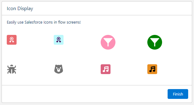
Claire Crabtree has created a nice flow screen component that you can use to display any Salesforce icon.
This LWC will display a Salesforce Icon in a screen flow. You can set the icon type/name, as well as foreground and background colors, if desired!
Icon with no color changes
Set the iconType to the type of Salesforce icon. (Standard, Utility, Custom, DocType, Action) Set the iconName to the name of the icon. (Messaging_conversation, clone, etc.)
Icon with Hex color changes
Set the foreground and background colors using hexcodes
Icon with Standard color changes
Set the foreground and background colors using regulard color names
It seems like just yesterday I was at Dreamforce chatting away about Winter ‘23 and we’re already at the Spring ‘23 release!
The Flow team continues to deliver the goods and continue the trend of shipping amazing new features to you all! Let’s dive in – I will highlight the big ones here at the top then dive into specifics below.
I am so happy to announce that the dreaded ‘ITERATION_LIMIT_EXCEEDED’ error is now gone! This was a Flow-specific limit that triggered when your flow hit 2,000 ‘elements’ across the Flow interview – typically seen with larger loops.
For a long time the limit existed to protect orgs from runaway flows, but over time we built in more governor limit awareness into the flow engine. We now feel confident that it is no longer needed, which is great news for you loopers!
Note: For your Flows to take advantage of this, you’ll need to ensure you’ve updated the Flow’s API version.
Easy HTTP Callout Builder(Beta)
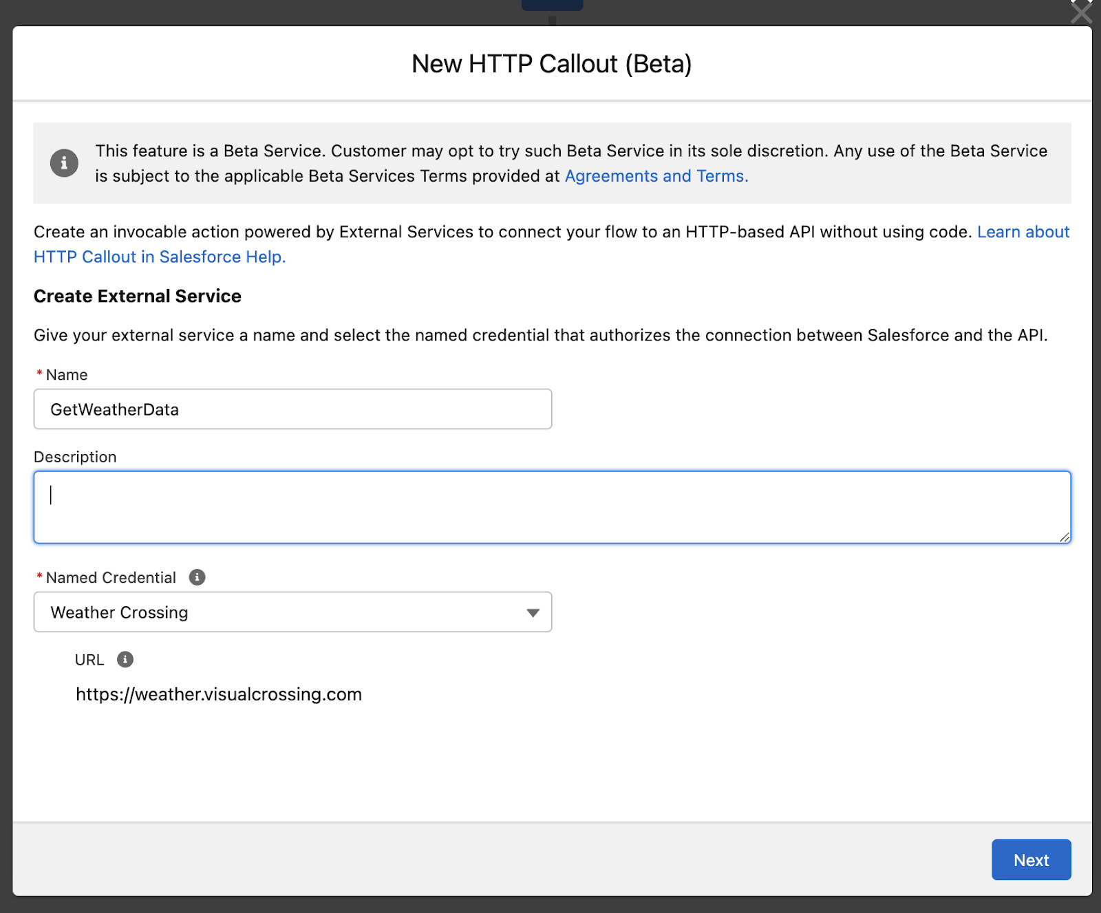
You can now create actions that make calls to external web services from within Flow Builder without any need for code!
Feature Overview
Create your external service directly from the Action by specifying a Named Credential
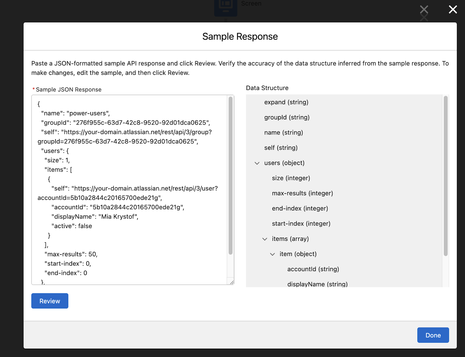
Paste a sample JSON Response and get a real-time preview of the data structure
Map data types from the JSON response to Flow variables
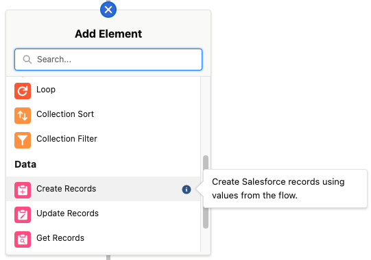
Create HTTP Callouts from this new button:
Add a Named Credential to handle the authentication:
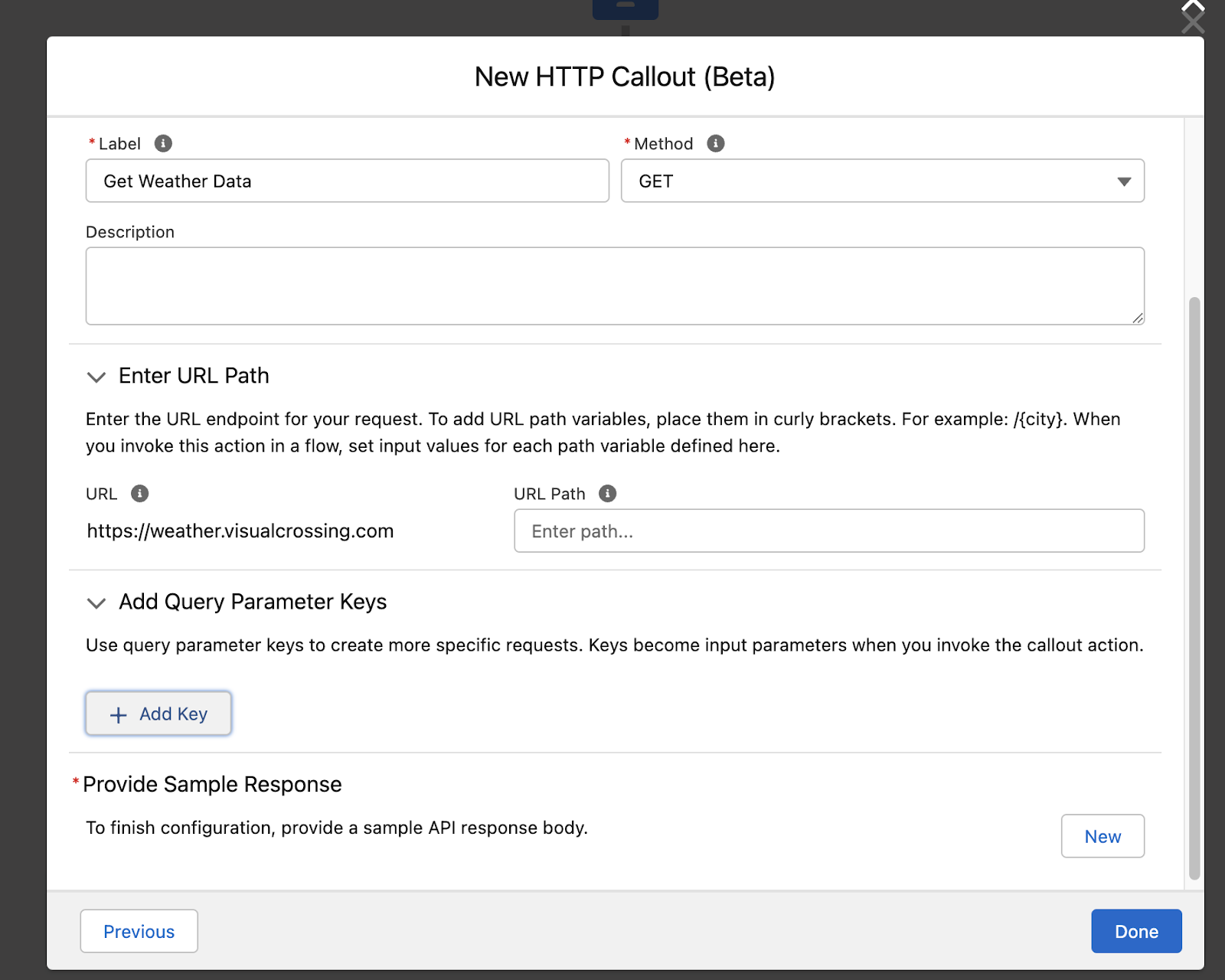
In Spring ‘23, only GET calls are supported. Setup any needed Query Parameters:
After you provide a sample JSON response, Flow will generate a matching data structure that can be accessed in Flow builder without code.
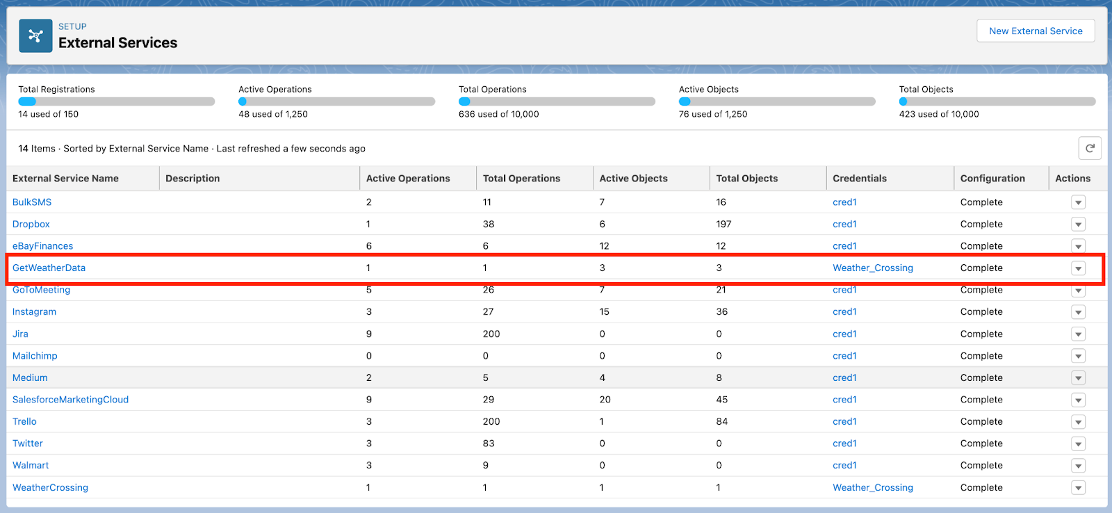
The actions you create with the new HTTP Callout feature become permanent, reusable actions you can add to any flow. You can view and manage these permanent actions from the updated External Services page:
Description Bubbles Now Surfaced in the Canvas
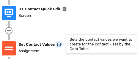
Documentation sticklers (like me) rejoice! You can now easily see an element’s description by hovering over the new documentation bubble next to an element. This will allow builders to easily see the notes left by others for each individual element. Note that if an element has no description, flow builders will not see the new documentation bubble icon.
Element Descriptions Now Easier to See
Before this release it wasn’t possible to see an element’s entire description. You can now hover over the information bubble to see what an element does – a great addition for newer Flow builders.
Screen Flow Improvements
Data Table now Generally Available
In Winter ‘23 we released the Beta version of our Data Table component and we’re taking it across the finish line in Spring ‘23! Some of the notable new features include:
Preview the data table and its columns in the screen builder
Improvements to configuration accessibility
Shuffled some settings in the configuration panel in Flow Builder to make things easier to understand and set up
Support for composite fields like Name and Address – no need to add each one individually now!
Builder Preview Mode
Two New Lookup Component Options Arrive in Spring ‘23
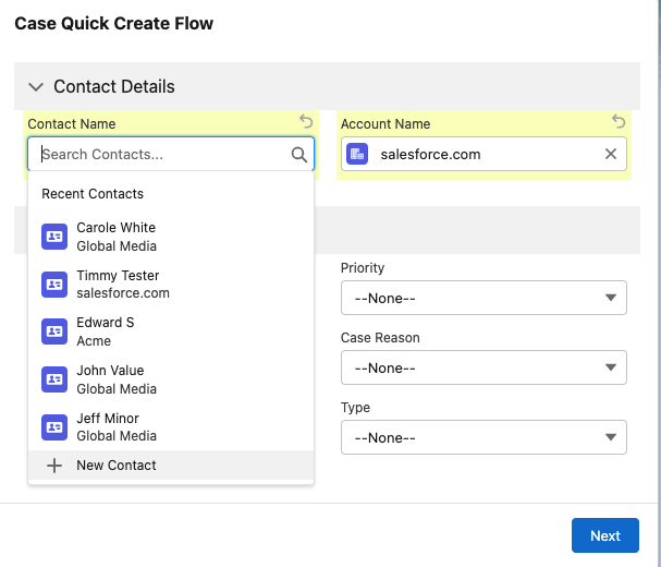
We’re introducing two new ways for Flow builders to create record Lookup experiences in Screen Flows: Lookup supported with Record Fields, and Choice Lookup (beta).
Lookups Supported in Record Fields (Dynamic Forms for Flow)
Drag your object’s lookup fields directly onto your Flow screen, saving you oodles of time. Aside from the simple configuration, it also lets your users create records from within the flow – a hotly requested feature now made possible. Once the user creates the record, the lookup will automatically be populated with the new record.
Created Filtered Lookups with Choice Lookup (Beta)
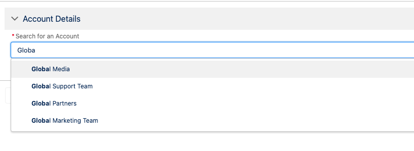
In addition to placing Radio Buttons, Checklist Groups, and Picklist choices, you can now represent your Flow Choices in a Lookup format using the new Choice Lookup component.
Flow builders have long asked for the ability to filter down a collection of records in a Lookup based on the actions a user takes in their Flow. Using a filtered Collection Choice Set or Record Choice Set, you can now create a Lookup using only contacts from a previously selected account in your Flow.
Because this new component is powered by Choices, you can also represent your object Picklist fields in this new format with Picklist Choice Sets, like the standard Account Type Picklist field:
The goodies don’t end there! One awesome behavior of Choice Lookup is that when a user clicks into the field, they’ll see all of the available choices. This addresses a 23,000 point IdeaExchange Post related to Lookup fields on the platform.
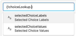
Lastly, you’ll notice something different about the way you reference the selected value from a Choice Lookup compared to other choices like a Radio Group or Checkbox Group component. We’ve added the ability for users to explicitly choose between the selected choice’s Label(s) or Value(s) – another frequent ask! For example, many builders have encountered a key issue when you reference a Choice in a Formula – it always returns the choice’s Label when they needed to return the choice’s Value. Now you’ll have a choice between the two.
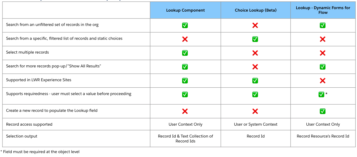
Which Lookup experience do I choose?
With three different record lookup options, we’ll admit that choosing between the three could get confusing. Over time it’s our goal to converge functionality between Dynamic Forms Lookup fields and Choice Lookup, but for now, here’s a helpful chart comparing the feature sets.
Dynamic Forms for Flow – Multi-select Picklist Support
We’ve now added Multi-select Picklist field type support to take full advantage of the record type awareness feature we built last release in Winter ‘23. Before this release, to get an object’s multi-select field onto a screen you would’ve needed to set up a Checkbox Group component with a configured Picklist Choice Set. Now all you need to do is drag over the multi-select fields from the Fields tab in your screen editor and you’re done!
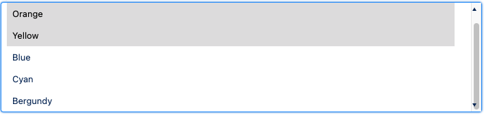
You’ll also notice the multi-select experience differs quite a bit from a Multi-select Choice. Dynamic Forms for Flow-based multi-selects mirror the experience found in record pages.
Record Field (Dynamic Forms for Flow) Multi-Select Experience
Multi-select Picklists with Choices
Create App-like Experiences With the Reactive Screen Components Beta
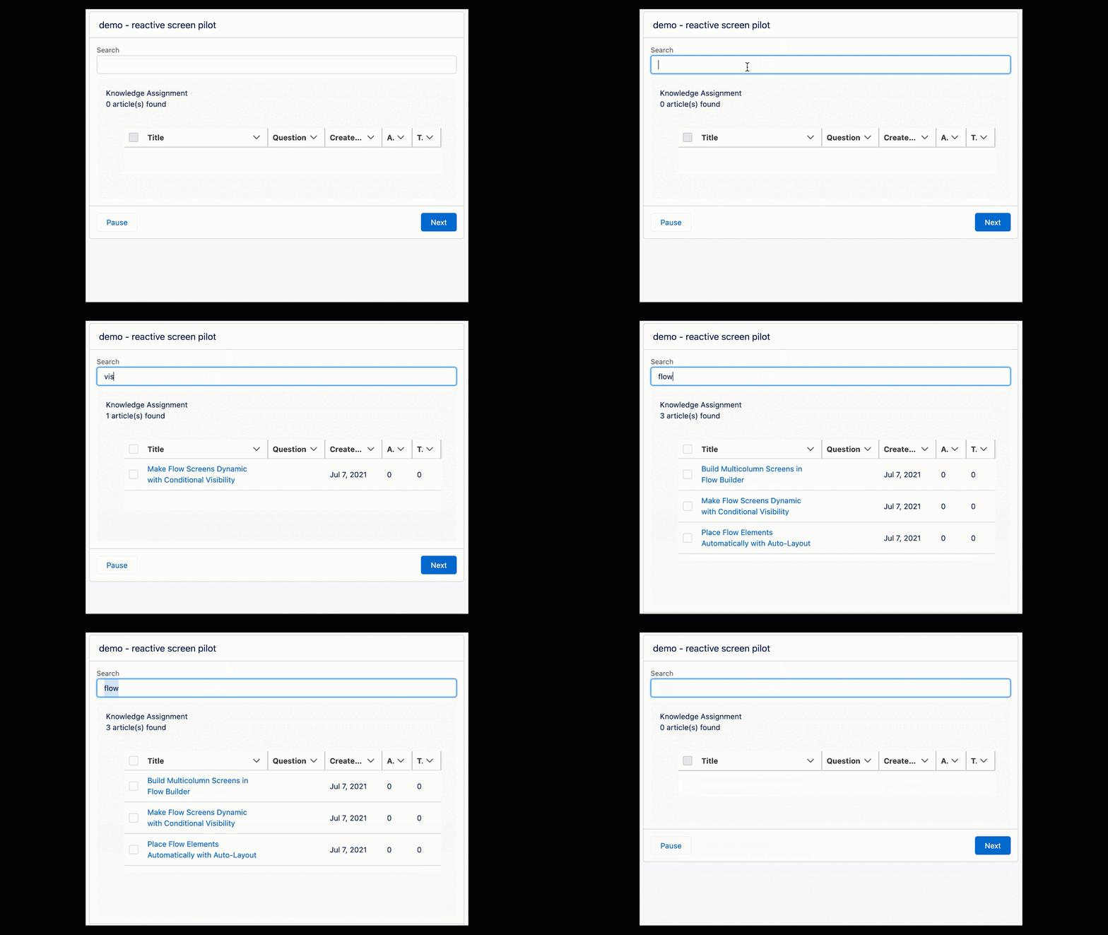
At long last our Reactive Screen Components effort enters Beta! With reactive screen components, you’ll be able to build bigger, more engaging screens by configuring your screen components so that they react to a user’s actions on the same screen.
Previously, for a component to react to changes in another component, you had to put them into separate screens or create large, monolithic custom components. For example, you’ll now be able to connect a Text input and feed the changes in the text input to a custom data table to search for knowledge articles as a user types.
This release marks the beginning of a slew of Screen Flow enhancements focused on flow interactivity. While the Pilot enabled custom lightning component reactivity, the beta now includes additional components like Text, Date, Date time, Checkbox, and Number. Components made reactive during the pilot should continue to work as before assuming they adhere to LWC flow screen component best practices.
For you developers out there, be on the lookout here and in our official docs for guidance from our team on ensuring your LWC components meet our best practice standards.
No Code Example Using Reactive Components
In this example – using all standard components – I created a ‘Contact Quick Edit’ flow that lets the user select and edit a set of contacts from a Data Table. Whenever the user selects a row, the selected row’s details get passed into supported inputs on the same screen. Below we pass in the selected row’s details to a set of Address, Name, Date, and Text inputs.
Developers and Admins will be able to use more modular, reusable components that can communicate with each other. This means that developers can offload UI components to Flow (like basic inputs or even a Data Table) while focusing their time and mental energy on the complexity of their own business-driven components.
Before, developers and admins would have needed to create giant screen components in order to achieve the same level of inter-component communication which hindered reusability.
Opt in to the Beta
You can opt into the beta by enabling the permission in Process Automation Settings.
Supported ‘Reactive’ Components in Spring ‘23
Text
Date
Date Time
Checkbox
Number
Password
Currency
Data Table
Email
Name
Address
Slider
Toggle
Custom LWC Components**
** Component must be designed to track change events from Flow as outlined here
Note that Choices, Formulas, Display Text, and Record Fields (Dynamic Forms for Flow) are not yet reactive, but are high on our list of things to support.
Stay tuned for a more in-depth best practices guide for wiring up your custom LWC components to be reactive.
Record-Triggered Flow Improvements
Process Builder Migration Tool Now Available
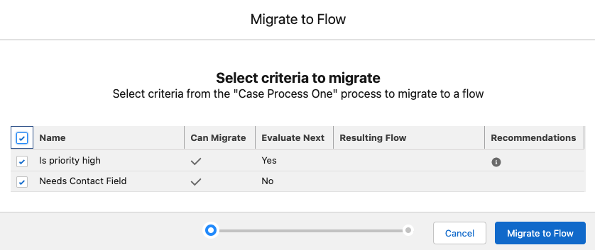
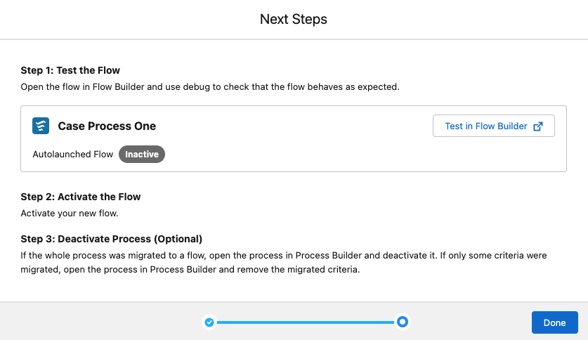
You can now convert many of your Process Builder Processes to Flows using the new migration tool. Check out the three easy steps to moving your Processes to Flow below:
Select your process you want to convert
Select the process’s criteria nodes that you want to move to Flow
Test and edit your flow
We heavily recommend you make edits to the converted flows like changing element and resource name and descriptions to make the converted Flow more human-readable.
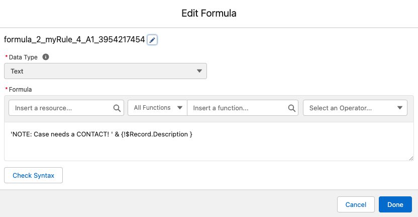
For example, the Flow converted below uses auto-naming for a Formula resource that sets a Case description… but the resource name could use a little human love:
Orchestrator Improvements
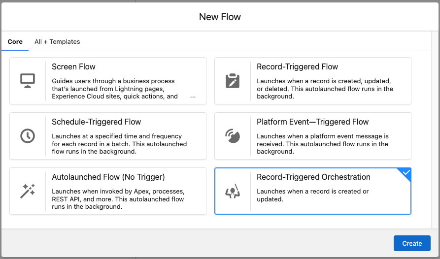
Record-Triggered Orchestrations added to the ‘New Flow’ Modal
Creating a new orchestration is now far more discoverable. We’ve added Record-Triggered orchestrations to the ‘New Flow’ modal that appears when creating a new Flow. If you need to access an autolaunched orchestration, you can still access that through the ‘All + Templates’ tab.
Work Guide Mobile Support Arrives
The work guide component can now be viewed on phones and tablets, ensuring your users running orchestrations can now participate in an orchestration on the go.
Orchestrations as Templates
Need to reuse an orchestration? You can now save Orchestrations as a template so your users or customers don’t have to start from scratch.
Screen Flows in Slack Goes GA
The ability to run Flows in Slack is now Generally Available! Here’s a Getting Started guide.
MuleSoft Integration
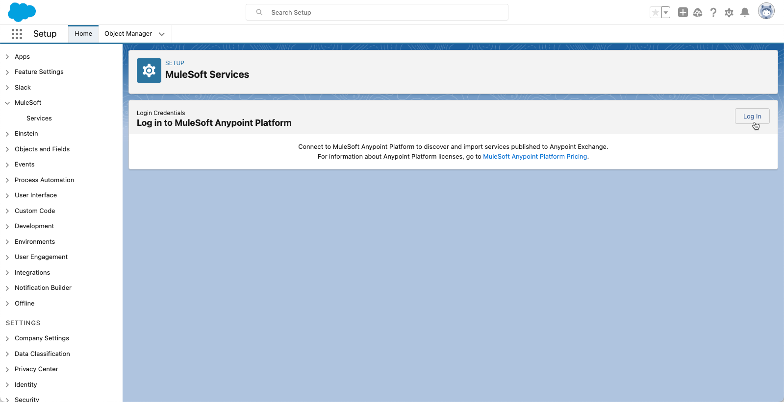
With the new MuleSoft Services page in Setup, you can now connect directly to the Anypoint platform with a simple login, then use this connection to discover and register REST APIs from your Anypoint Platform as an External Service.
This makes the process of connecting to the Anypoint Platform significantly easier and faster, saving you countless steps.
Service Cloud & Flow
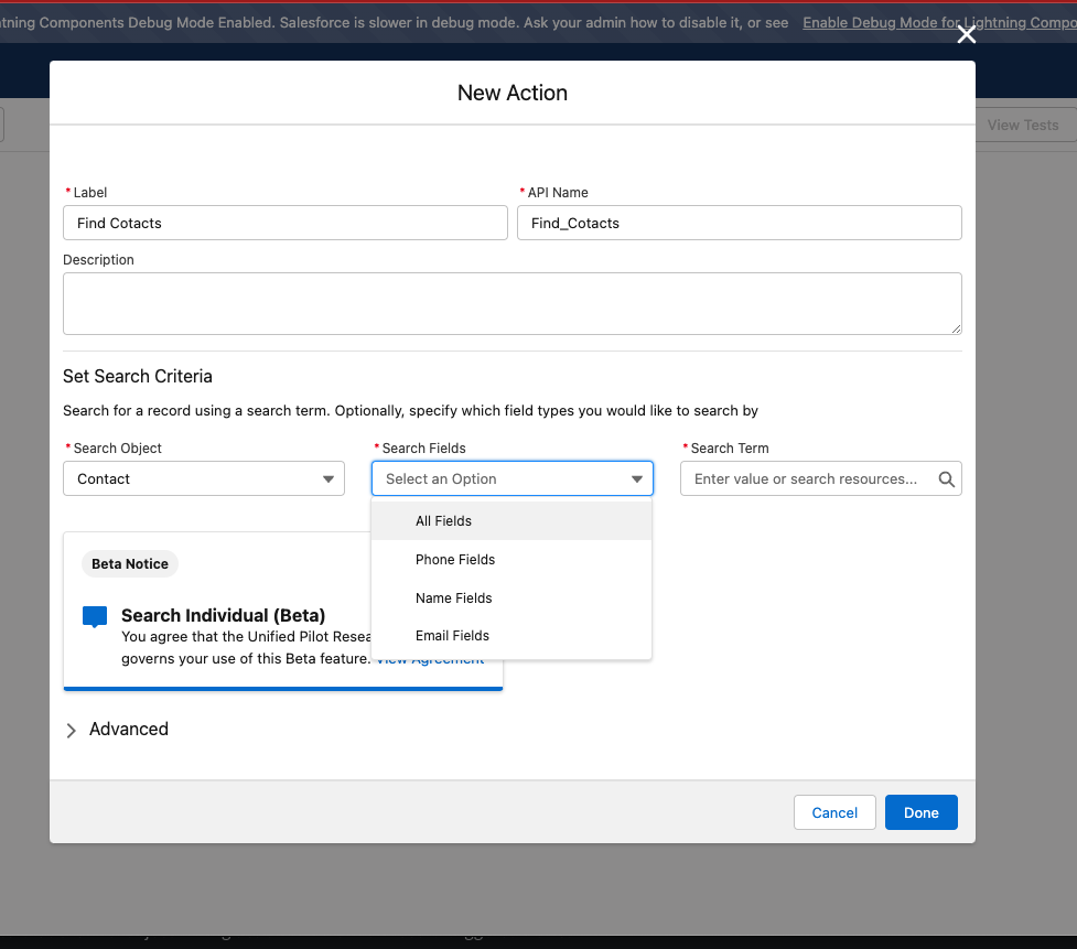
Fuzzy Search for an Individual with the ‘Search Individual’ Action (Beta)
Our friends in Service Cloud released an excellent action called ‘Search Individual’ as part of their improvements to linking unknown callers to a case and a Salesforce contact or lead. This new action allows you to perform a fuzzy search for Contact, Lead, and Individual record and then display those results in something like a Data Table. From there, you can then use the record(s) selected by the user to then relate them to a Case, Account, or an Opportunity as an example.
The action outputs a collection of Ids, so be sure to use that IN operator to convert it to a record collection before you throw the results into something like a Data Table.
Have a user(s) subscribed to five reports and can’t subscribe to any other reports? Or do you have users that don’t know which reports they are subscribed to and want to be removed? This component allows you to achieve just that. Utilizing the Analytics Notifications API returns APEX-defined records, and utilizing the Datatable by Eric, you can show the records and see who is assigned to specific reports. Added to the last action, you can remove users or remove a subscription from the report.
Take a look at how you can set up this action and utilize it below.
Video Walkthrough
Overview
Ever had a user state that they can’t subscribe to a report, or you want to see who is subscribed to which reports in a quick view. The Analytics Notification API is the key but is not accessible from the flow builder. That is where this component comes into play. This APEX invocable action will allow you to call the Analytics Notifications API to view report subscriptions, dashboard subscriptions, or wave notifications; not only that, you can get all notifications for a user or a record.
The best use of this component is with the Data Table Eric created, where you can use APEX Defined classes. Below are examples of what I came up with. All multi-dimensional objects have their own APEX class so that you can get deep into the details of the response. Lastly, this component will allow you to delete specific users from a subscription.
Basic Flow Setup
Advanced Flow Setup
Remote Site Settings
You will need to add a remote site setting that loops back to your salesforce domain for this to work correctly.
Component Details:
Get Subscription Data
Uses the Analytics Notification List API Documentation, which can be found here:
Required for GET calls. Specifies what type of analytics notification to return. Valid values are:lightningDashboardSubscribe — dashboard subscriptionslightningReportSubscribe — report subscriptionswaveNotification — Analytics notifications
ownerId
Optional for GET calls. Allows users with Manage Analytics Notifications permission to get notifications for another user with the specified ownerId. If you don’t enter a value the running users id is used.
recordId
Optional. Return notifications for a single record. Valid values are:reportId— Unique report IDlensId— Unique Analytics lens ID
Outputs:
definition_string
A stringified version of the Get Response Body
definition
An APEX defined class of the Definition Response
definitionDetails
A subclass that pulls out some key details from sub classes. This class also pulls in the Report Name which is not included in this API
definitionDetails_string
A stringified version of definitionDetails to be used within the data table
Parse Recipient Data
This is a helper class that will parse the selected row and gets the recipients that are subscribed to the selected record.
Attributes:
Inputs
definition_string
A string array of a single definition string record. This is normal output of a record selection from a data table
Outputs:
recipients_string
Gets a collection of recipients that follows the Recipient class that can be used within the data table
recipients
An APEX defined class of the recipients that were parsed
notificationId
The specific ID of the notification that was selected
definition
An APEX defined class of the Definition Response
Delete Selected Recipients
Uses the Analytics Notification API with the Method PUT if you are adjusting users or delete if you are removing all users. That documentation can be found here:
Required for GET calls. Specifies what type of analytics notification to return. Valid values are:lightningDashboardSubscribe — dashboard subscriptionslightningReportSubscribe — report subscriptionswaveNotification — Analytics notifications
ownerId
Optional for GET calls. Allows users with Manage Analytics Notifications permission to get notifications for another user with the specified ownerId. If you don’t enter a value the running users id is used.
Outputs
max
How many analytics notifications of the type specified by source the user is allowed to create.
remaining
How many more analytics notifications of the type specified by source the user can create before hitting the limit.
You can only see subscriptions from a particular user. If you subscribe another user to a report and you pass in their Id into ownerId you will not see that subscription, you would need to pass in the person who subscribed the user to the report.
https://unofficialsf.com/wp-content/uploads/2022/09/largeUCSF-300x133.png00Alex Edelsteinhttps://unofficialsf.com/wp-content/uploads/2022/09/largeUCSF-300x133.pngAlex Edelstein2022-12-02 20:05:202022-12-02 20:26:13From Andy Haas: Use Analytics Management Actions to Show Report Subscribers and Assignments