Yumi Ibrahimzade from the blog Salesforce Time has written a post explaining how to use flow to add a mass delete button to a list view. Pay special attention to the second solution that avoids performing DML inside a loop by using a custom action that can be found in the collection actions here on UnofficialSF
https://unofficialsf.com/wp-content/uploads/2022/09/largeUCSF-300x133.png00Tamar Erlichhttps://unofficialsf.com/wp-content/uploads/2022/09/largeUCSF-300x133.pngTamar Erlich2021-08-11 14:31:332021-08-11 14:31:36From Yumi Ibrahimzade: Using Flow to Mass Delete Records from List View
Version 2.1.6 released. Bug fixes – mostly involving checkbox issues, sending multiple versions of attachments, and various save as activity and tasks issues. Thanks to Gary Woodhouse, @ericsplayground, Betzalel Chaikin, Rabbi Kushi Schusterma, @josh-dayment etal. for finding, help resolving, and testing.
Orchestrator will go beta in Winter ’22. As a reminder, this is the home page for Orchestrator.
Here are the notable improvements in Winter ’22 for Orchestrator. To see the Winter ’22 preview for Flow, go here.
Background Steps enable Autolaunched Flows to be integrated into orchestrations
Background Steps are simple steps that don’t involve assignees. These steps essentially represent a single Autolaunched flow.
Orchestrations can loop back to repeat earlier stages
This functionality leverages the new ‘Go To’ connectors in Auto-Layout Mode
Orchestrations can be packaged
When you add an Orchestration Flow to a package, it will spider in the rest of the Orchestration’s metadata. It also properly adjusts for assignees, which were breaking cross-org packages.
Orchestrations support Manual Variables, Input Variables and Output Variables
You can now define manual variables in an Orchestration flow, just as in other flows, and configure them to be exposed to receive inputs or provide outputs.
Orchestrator Instance Records Available in Flow Builder
Orchestrator in Winter ’22 is lacking in tools to show the status of running orchestrations, but that temporary gap is already getting filled by the community, which can leverage the ability to query for all three of the core Orchestrator instance objects: Orchestration Instances, Orchestration Stage Instances, and Orchestration Step Instances
Here’s a quick preview of the functionality coming to Flow in Winter ’22. Note that this is not the complete list of changes and you should carefully check the Release Notes for changes that may impact your org.
Auto-Layout Now Supports All Flows with ‘GoTo’ Connectors
You can now create flows in Auto-Layout mode that route to previous elements:
When you route a path from an element to a target that already has an inbound path, the canvas represents it as shown above, with a stub path and an incoming ‘connections’ message. With this addition, all flows can be opened in Auto-Layout mode.
Use the New Rollback Element to revert committed changes
To understand this one, first recall that when your flow has a sequence of datatabase operations, like the two Create Records shown below, Flow tries to combine them into a single ‘transaction’ and commit them all at once. In the example here, a Lead and Appointment are being created at the same time in the same transaction. Suppose that one of the database operations fails?
In this example, if the Appointment create fails, and the Lead create succeeds, you’re left with a Lead without an Appointment. Sometimes that’s desirable, but sometimes you want the transaction to have an ‘all or nothing’ characteristic. Now you can route fault paths to a Roll Back element that will ensure that all of the operations in the transaction are properly undone if one fails.
Rollback is currently only available in screen flows because it does not support bulk use cases.
Enhanced List View Choices Provide Information on Triggers
Until now, it hasn’t been possible to see the trigger of a flow when looking at it in the list view. Now you have a Trigger column and also a built-in Triggered Flow list view.
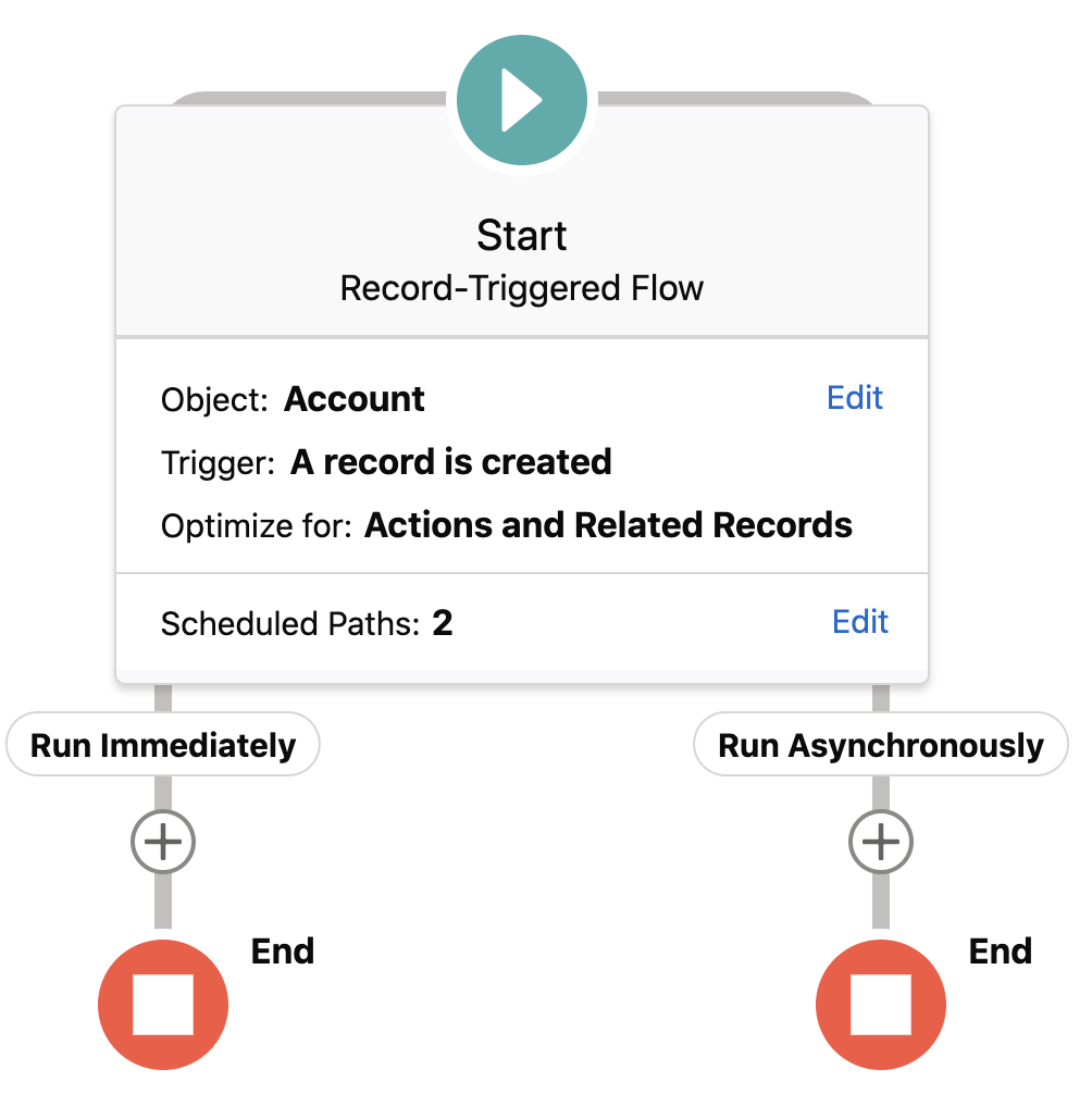
Combine Callout Actions with Record-Triggered Flows with the new Run Asynchronously path
When you create a record-triggered flow, you can now add a pathway for elements that you want to execute slightly _after_ the record operation that caused the trigger completes. This allows the use of callouts with triggers. To enable this, check this checkbox:
This will cause the ‘Run Asynchronously’ path to show up:
…and callouts can be placed on that path. For background: The triggering process opens a new transaction, and the Salesforce platform doesn’t allow callouts to be made while a transaction is open. Elements on the Asynchronous path get executed after that initial transaction is completed. You can also use an asynchronous path to avoid the “mixed DML” error. As an example, in a flow that’s triggered to run when an opportunity is created or updated, use an asynchronous path to update a value on a user record.
Like all asynchronous operations in Salesforce, it’s possible that execution will be delayed by higher priority activity. In general I’ve found that my asynchronous activities almost never get delayed more than a few seconds. You can monitor the progress of asynchronous exeuctions on the Time-Based Workflow page in Setup.
The above images also feature the redesigned Start Element configuration. ‘Fast Field Updates’ is the benefit of what we’ve typically called Before-Save Triggers.
Record-Triggered Flows Can Now Include the Subflow Element
The last big gap in Flow trigger support has now been filled. Note that it currently isn’t the case that the global $Record and $Record_Prior are available automatically in subflows invoked from a record-triggered flow. To get the triggering record ‘into’ the subflow, you need to wire things up manually by 1) making sure that the flow being called by the subflow element has input variables for the record and prior record and 2) on the property editor of the subflow, map the global $Record and $Record_Prior to those inputs.
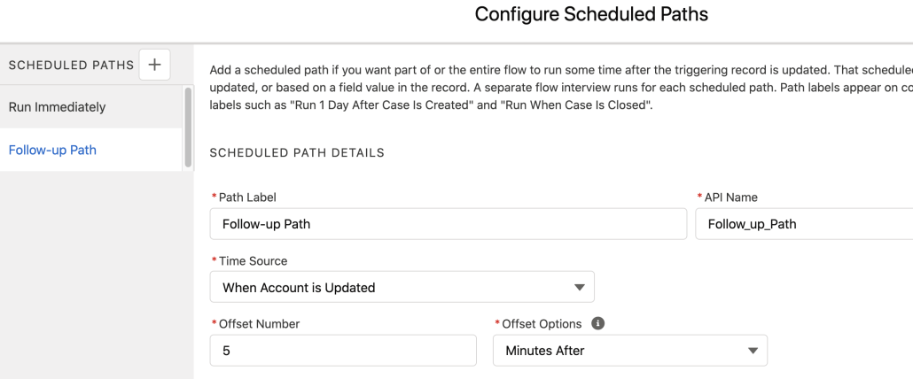
Scheduled Paths can now be configured with minute granularity
This retires a 13-year-old idea! Not exactly something to celebrate, but good to get that box checked.
Scheduled Paths can also now have configurable batch sizes
This is an advanced feature that allows heavy consumers of flows tune their CPU time consumption and more easily prevent APEX CPU limits from being exceeded.
And finally, Scheduled Paths now use the asynchronous 1 minute timeout limit
Previously flows activated on schedules derived from Scheduled Paths used the standard 15 second timeout limit. Because they’re asynchronous, they now get more time to work.
New Debugger Facilities for Record-Change Triggered Flows
You can now debug selected Scheduled Paths in a Record-change triggered flow:
Additionally, Debugger readouts now feature Labels instead of API Names, to make it easier to correlate the debug data with the visible canvas elements. (You can turn the API names back on).
Finally, In a record-change triggered flow, you can now temporarily change the values that you’re updating on the record that you’re debugging with.
Modify the Labels of the Buttons in the Flow Screen Footer
Of this improvement it has been said: “the lack of this resulted in more custom Flow screen components than any other lack”.
Note that these text fields do not currently support merge fields.
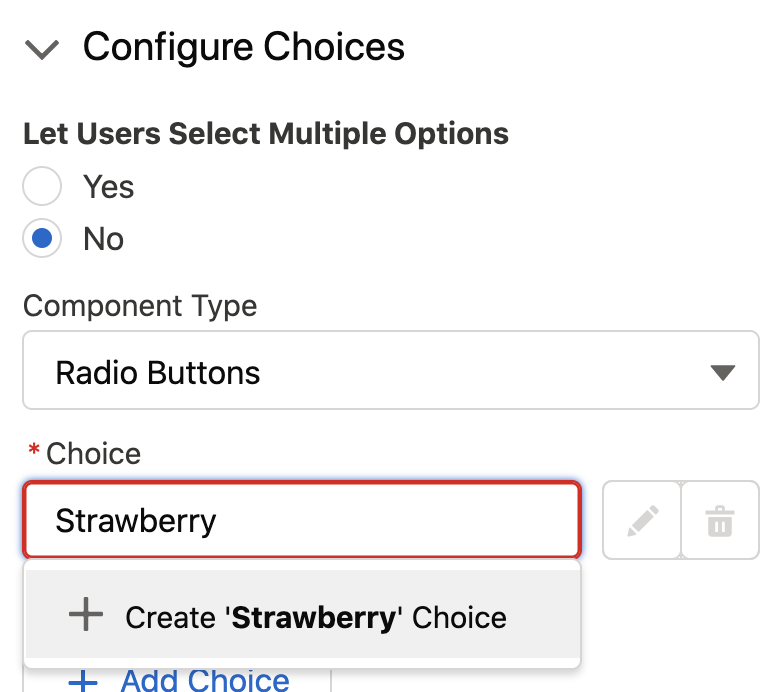
Choiceapalooza: Create Choices by just typing them in
The campaign to improve Choices continues! We’ve long wanted to make it easy to just type choices in rather than have to create special separate resources. Now, the resources are handled in the background, automatically. You can then modify them easily by clicking that pencil icon:
Reactive Screens let components pass values to each other on the same page, triggering instant updates (Pilot)
Traditionally, you could have rich components on a flow screen, but they never talked to each other, and you generally needed the user to click Next to get things to happen. Reactive Screens allow the output from one part of the screen to be fed into the input of another part of the screen, enabling a more ‘single-page application’ feel. Whenever the output of the one component changes, the other component is refreshed, enabling real-time response to user activities. Type in the field of one component and see your changes reflected immediately in another component. This initial release supports the inputs and outputs of Flow Screen Components (and not native components) and doesn’t incorporate formulas into the reactivity, but you can expect more enhancements in this direction.
We’ll get a post together soon that shows the impact of this.
Mulesoft Actions for Flow and Bots are Generally Available
Import your MuleSoft Anypoint Platform APIs in a few clicks with External Services Enhancements for MuleSoft. Select your MuleSoft Name Credentials and let Salesforce do the heavy lifting of importing your endpoints and converting them into actions immediately available in Flow Builder. This was previously in pilot and is now GA.
Event Monitoring is a premium Salesforce service that provides tools to track status and evaluate issues. Customers can now see Flow runtime performance metrics in their Event Log Files
Add Einstein Discovery predictions to your flows via the new Einstein Discovery prediction actions
When Einstein Discovery is available, you’ll see deployed predictions surface as choosable actions:
Enhancements to Flow-driven Omnichannel Routing
Omnichannel Routing has been reimplemented as a set of Standard Flows with some specialized Omnichannel Flow Actions. The base functionality is now GA and includes these additional features:
The Add Screen Pop action opens related records when work, such as a chat, is routed to an agent.
The Channel-Object Linking action links channel interactions to objects. For example, use it to automatically identify the customer who is calling you.
Start an Omnichannel Flow from the New Flow modal:
Here’s an example of a flow that’s dictating routing based on a number of factors:
Omni-Channel Flow is GA for chats, cases, leads, and custom objects
In addition, support for messaging sessions and voice-call routing is now available in Beta.
For Developers: Custom Property Editors now support the setting of literal values on Inputs that have types SObject, Apex-Defined, SObject[] and Apex-Defined[]
Custom Property Editors (CPE) allow Flow Actions and Flow Screen Components to be created with attractive and useful property editors. Until now, though, the event dispatch mechanism that enables the CPE code to notify Flow Builder of a user-provided value was limited to primitive types if you wanted to store literal values such as text typed by the flow creator into one of your CPE’s text fields. In Winter ’22, you can assemble, in your CPE javascript, JSON representations of any SObject or Apex-Defined Type, or a collection of them, and pass them as literal values. This techique is being used, as an example, by the Salesforce Surveys team to create a new three-dimensional matrix question as a Flow Screen Component. The creator provides labels and values for the question and they’re provided as a literal Apex-Defined object to Flow Builder for storage in the flow definition.
Here’s another use case: Suppose you’re creating an invocable action that makes a callout to order car parts from a web service. The web service expects a JSON data structure that represents the car, its wheels, tires, and rims. To model this, your invocable action uses an Apex-defined type. When admins configure this action in Flow Builder, you want them to have a visual way to indicate which upstream data should be mapped to each tire, wheel, rim etc, so you use your Custom Property Editor to show the image of a car and put picklists where the wheels sit in the image. Previously, there was no way for your Custom Property Editor to assemble the data provided by the user configuring the flow into a complex Apex-defined Type. With this new feature, assemble the information into a JSON data structure matching the format of the Apex-defined type and at it to the payload of of a dispatch event.
For Developers: You can now invoke Invocable Actions from Apex Code
Invocable Actions are wonderful for declarative use inside of builders like Flow Builder and Bot Builder but they are now also powerful ways to tap into reusable functionality when writing Apex code. This feature is in Developer Preview and only works in Scratch Orgs in Winter ’22. You enable it by adding “CallIAFromApex” to your scratch org configuration:
For Developers: Input Attributes in Flow Screen Components can be marked to surface them in Translation Workbench
In a typical Flow Screen Component, some of the input attributes refer to information that is visible at run-time to the user as text. For example, a component might have an input attribute called ‘Label’ and when the flow runs, whatever you enter into that text field is displayed to the user as the label of something on the screen. These have not previously been translatable. Now, developers can add the property ‘translatable=true’ to the description of an input attribute in the LWC meta file. This will cause that attribute to show up in Translation Workbench. Just as it is a best practice to add ‘callout=true’ to all invocable actions that make callouts, so we encourage developers to add ‘translatable=true’ to all of the attributes of their components that result in text visible to end-users running flows.
For ISV’s: Flow Overrides allow a flow in a Managed Package to be customized by a customer without requiring any changes to the package
This eliminates an impediment for packagers trying to incorporate flows into a managed package. The potential is enormous: you can build and sell functionality while letting your customers declaratively customize it in Flow Builder. However, the reality is that the flow that the customer is cloning usually has things pointed at it. Most notably: references from parent flows to subflows. Until now, if the customer cloned a flow, all of those references remained pointed at the original packaged version.
The Override concept allows a flow from your managed package to be cloned as normal. The admin then marks it as a specific override of your packaged original. Flow will ensure that any other flows or resources that use this flow are redirected to the override version.
A user trying to use a custom invocable action in a scheduled flow reported: I have installed version 1.28 but in my Scheduled flow I get an error that says “Profile does not have access to: copycollection”. I am system admin and have checked; my profile does have access to the copycollection apex. When I try the same thing in a Screen Flow it works.
The problem is that currently, Scheduled Flows do not run in the admin personal user context, but instead use a special account called the Autoproc User. It is currently possible, but difficult to give the Autoproc User account the ability to execute invocable actions. You have to use Developer Console to assign a permission set to the User that has an alias of ‘autoproc’:
insert new PermissionSetAssignment(
   AssigneeId = [SELECT Id FROM User WHERE alias = ‘autoproc’].Id,
  PermissionSetId = ‘<your Permission Set Id here>’
);
In Winter ’22, coming this October, new flows and existing flows that are resaved with version 53 or higher will run not as the Autoproc user but as the Default Workflow User, which is a recently added setting in Process Automation Settings in Setup:
Example of a “confirmation interaction”, invoked programmatically from an event handler
Overview
lwcModal provides an easy way for LWC developers to add modals (aka pop-up dialogs) to components they’re building. It serves two related but distinct use cases:
Customizable, composable modal. Pass any markup into the modal, including custom buttons. This part I shamelessly stole took inspiration from James Simone’s blog post and component and made a few tweaks.
Programmatic user confirmation. Embed user confirmation—that is, presenting the user with a message and the choice to confirm an action or cancel it—into your functions without modifying your markup. This is what really makes lwcModal worth talking about, IMO.
Features
Custom Modal
I highly recommend reading James’ blog post because mostly I’m just trying to replicate what he did. You can wrap lwcModal around any custom markup you define. The modal is hidden by default. Select the component using this.template.querySelector(), then call the component’s open() function to display the modal and close() to hide it again. This is commonly used for create/edit screens.
You can optionally set any of the following properties:
Name
Required
Default
Description
header
Header text of the modal. Default is none.
cancelButtonLabel
Cancel
Label for the Cancel button.
confirmButtonLabel
Label for the Confirm button. Unless a value is provided, the Confirm button is not displayed.
confirmButtonVariant
brand
Variant for the Confirm button. Supported values are brand (default), neutral, outline-brand, destructive, text-destructive, success.
validateOnConfirm
false
Before dispatching the Confirm event, run reportValidity() on all Lightning input elements that have been slotted in and only proceed if they all pass.
The component dispatches the following custom events:
buttonclick: fires when the user clicks any of the footer buttons (Confirm, Cancel, or a custom slotted button).
confirm: fires when the user clicks the Confirm button.
cancel: fires when the user clicks the Cancel button.
Note that the buttonclick event is dispatched any time any of the buttons in the modal footer are clicked. When the Confirm or Cancel button are clicked, a second event is then also dispatched: confirm or cancel, respectively. As a developer you can mostly just use onconfirm; onbuttonclick is primarily designed for the confirmation functionality and oncancel is rarely necessary (normally just having the modal close when the user clicks Cancel is all you want, and it does that on its own).
Programmatic Confirmation
A common use case for confirmation is when the user clicks a button that triggers an important action, such as deleting a record or submitting a form, to protect against the possibility of an accidental click or warn the user of the impact their action will have. Currently, there’s no native LWC way to capture this confirmation. Developers can use modals (either building their own or installing a custom component) to pop up the confirmation, but each individual confirmation requires modifying your markup and adding complexity to your code. lwcModal allows you to add just one compact, generic “confirmation” component to your markup and programmatically invoke it from one or more of the event handlers in your component.
Below is a simplified example of programmatically requiring user confirmation for a given action.
import { LightningElement } from 'lwc';
import { getConfirmation, handleConfirmationButtonClick } from 'c/lwcModalUtil';

export default class LwcModal extends LightningElement {
    @track confirmation;

    deleteConfirmationDetails = {
        text: 'Are you sure you want to delete everything?',
        confirmButtonLabel: 'Delete',
        confirmButtonVariant: 'destructive',
        cancelButtonLabel: 'Never mind',
        header: 'Confirm Delete'
    };

    handleDeleteClick(event) {
        this.confirmation = getConfirmation(
            this.deleteConfirmationDetails, // modal configurations
            () => this.deleteEverything(), // callback function when user 'confirm' clicks confirm
            // optional: () => this.handleCancel()
        );
    }

    // We pass the event to the function imported from the utility class along with the confirmation object
    handleModalButtonClick(event) {
        handleConfirmationButtonClick(event, this.confirmation);
    }

    deleteEverything() {
        // Delete everything... or whatever you want to happen when the user confirms
    }
}
Our markup contains a standard issue Delete button with a standard issue onclick event handler. Next is our lwcModal component, which is hidden from view until it’s called upon by the controller. The modal has an event handler for a custom event called onbuttonclick, which calls handleModalButtonClick. The other important attribute is confirmation, which represents the confirmation interaction, as we’ll see in the JS controller.
What our simple lwcModalDemo component looks like when rendered
The confirmation dialog that pops up when a user clicks the Delete button
In our JS controller, we first import two functions from lwcModalUtil.
getConfirmation() will be used to generate a confirmation instance
handleConfirmationButtonClick() is invoked when the user clicks either the confirm or cancel button in the modal
Then we declare our confirmation object. Again, this object represents our confirmation interaction, by which I mean the process of presenting a message to the user, asking them to click either a Confirm or a Cancel button, and then acting on the user’s selection. As such, our confirmation object consists of the following properties:
details: (required) defines the look and feel of a modal, such as header and body text and button labels.
onconfirm(): (required) a callback function to be invoked when the user clicks the Confirm button.
oncancel(): (optional) a callback function to be invoked when the user clicks the Cancel button.
Next we define what we want our Delete confirmation modal to look like with deleteConfirmationDetails. This details object supports the following properties:
Name
Required
Default
Description
text
TRUE
Body text of the modal. This should explain to the user what you are asking them to confirm or cancel.
header
Header text of the modal.
confirmButtonLabel
Confirm
Label for the “confirm” button.
confirmButtonVariant
brand
Variant for the “confirm” button. Supported values are brand (default), neutral, outline-brand, destructive, text-destructive, success.
cancelButtonLabel
Cancel
Label for the “cancel” button.
Now it’s time to bring it all together. In handleDeleteClick(), which is called anytime our demo Delete button is clicked, we set the value of our confirmation object by calling getConfirmation, which we imported from the utility class. It takes the following parameters:
Name
Required
Description
details
TRUE
The configuration details for a confirmation modal. This value can either be a details object (see above), or a string value containing the modal body text; if you enter a string, all other details properties will use their default values.
onconfirm
TRUE
Callback function to be executed when the user clicks the confirm button.
oncancel
Callback function to be executed when the user clicks the cancel button. By default, the modal closes and no other actions are taken.
Last but not least, we have handleModalButtonClick, which is the event handler for the onbuttonclick event on the lwcModal component. That means that this handler gets invoked when the user clicks the Confirm or Cancel buttons. All we need to do here is call the handleConfirmationButtonClick function from the utility file and pass along event and our configuration object as we’ve defined it. Since we already defined which actions the modal is supposed to take onconfirm and oncancel (if any), this function simply tells the component which of those outcomes to trigger.
Note that the repo also contains a component lwcModalTest which serves as a more sophisticated live demo than our sample code above, and showcases 3 different use cases of lwcModal. Once installed, it can be dropped onto any Lightning App or Home page.
Screenshots & Examples
In addition to the confirmation functionality, whose utility is hopefully clear by now, another common use for modals is editing data. This is used not only for custom components, but is a common interface throughout Salesforce, like when you click “Edit” on a record page:
Example of using a modal for editing details within Salesforce’s standard UI
A recent example was the “Button Builder” interface I built for the Flow Button Bar component’s Custom Property Editor. I needed a way to enable users to modify multiple properties for each button without taking up a ton of space in the main editor. The solution? Show just the buttons themselves in the main editor, but allow users to open an “edit” modal for any one button. Here’s a quick clip of what that looks like:
An example of using a modal as a create/edit screen
Here’s another, simpler example of an input modal:
They can also be useful for simply presenting information to the user, either to let them know what’s about to happen before some kind of transition, or as a form of advanced help-text, presenting supplemental information to the user, as in the following examples:
Example of using a modal to display additional information to the user. In this example, clicking a column header launches a modal containing more detail about that field’s purpose.
Example of using a modal to display data that is optional, supplementary, or simply doesn’t fit within the main component
https://unofficialsf.com/wp-content/uploads/2022/09/largeUCSF-300x133.png00David Fromsteinhttps://unofficialsf.com/wp-content/uploads/2022/09/largeUCSF-300x133.pngDavid Fromstein2021-08-04 13:17:502021-08-05 08:54:58Easily Add Confirmation Dialogs to your Lightning Components with lwcModal!
The original mode of Flexcard is designed for each card to have a number of pop-up subflows. You can now choose a different mode of operation by setting the boolean input TransitionOnClick to True. When you do this, each card becomes a button and clicking on the card causes an immediate transition. Check it out here.
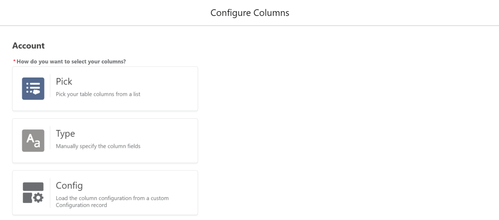
The latest release of the Datatable component adds a major new feature. You can now Save and Retrieve settings for your Column Configurations. If you find yourself adding identical or similar Datatables to multiple flows, this will be a tremendous time-saver.
Check out the updated documentation for all the details on how to take advantage of this new feature.
There is a new advanced attribute you can set to allow the Datatable to overflow its container. This is useful when you are allowing picklist fields to be edited on a table with only a few records and want to avoid causing the user to have to scroll up and down to see the picklist values.
The Table Height attribute is ignored when using this setting. This is not recommended for wide tables being displayed in a narrow container, because the table, if needed, will overflow horizontally as well.
Other changes in this release include:
Reduced the number of rows displayed in the Column Configuration Wizard from 10 to 6 to allow more of the new save configuration options to appear on the Wizard screen.
Fixed an error that ocurred when trying to save an edited row from a datatable that contained a time field.
Fixed a bug that kept Date and Time fields from displaying in datatables when the User’s locale displays numbers with a . separator instead of a , separator.
Rows with editable picklist fields will no longer default to a taller height (Even without picklist fields, all rows will still be slightly taller if any fields are editable).
This new update to ConvertToFlow adds the ability to create Flows from Workflow Rules. Most WFR are supported, although Flow doesn’t support Outbound Messages yet and is not expected to support Recursion. Here’s a video showing some conversions:
https://unofficialsf.com/wp-content/uploads/2022/09/largeUCSF-300x133.png00Alex Edelsteinhttps://unofficialsf.com/wp-content/uploads/2022/09/largeUCSF-300x133.pngAlex Edelstein2021-07-14 19:25:032021-07-14 19:25:07Convert To Flow Now Migrates Workflow Rules to Flow
We wanted to give Forcelution Apps a chance to talk about the functionality they add to Approval Requests with their Enhanced Approval Requests extension. It’s available as a free version and as a paid, supported, enhanced version.
Filling Gaps
Salesforce out of the box provides the ability to submit and process records for approval. This is a feature used in many orgs as it is easily configurable and extendable by adding multiple approval steps. On the other hand, especially since Lighting Experience was introduced, it currently lacks some key features to efficiently and accurately submit and process approval records. Fortunately, there are solutions using the AppExchange app Enhanced Approval Requests (Pro).
Some of the key features currently missing
Submitting records for approval in bulk instead of going to each and every record page to submit it for approval;
Organizing submitted and pending approval requests in list views;
Approving, rejecting, reassigning and recalling approval requests in bulk;
Having detailed insights on the underlying records in one overview to allow bulk processing of records;
Having the ability to filter approval requests in a list view based on one or more criteria.
Being more efficient
Some of the missing key features can easily be solved by installing the free app Enhanced Approval Requests. As an admin you can configure a list view for approval managers that displays relevant data of pending approval requests. Approvers can select multiple items and approve, reject or reassign them in one go. Without the need to navigate to each and every approval record page, approvers save a great portion of their time!
Managing approval requests like a pro
Although the app Enhanced Approval Requests helps to process approval requests more efficiently, it lacks the ability to see key information about the requests you’re processing. As mass processing can only truly be useful if you have all relevant information at hand, the pro-version of the app provides the ability to display data of the underlying records in the list view. This allows users to mass process approval requests with full confidence!
The app Enhanced Approval Requests Pro focuses on managing approval requests more efficiently and accurately for submitters, approvers and administrators, through the following features:
Mass approve, reject or reassign approval requests;
View your approval requests on Lightning pages;
View details of related records through table columns and popovers;
Review and verify by consulting the summary overview before processing;
Organize approval requests using list views;
Refine approval requests with filters;
Intuitively manage approval requests on your mobile;
Mass submit records for approval from any object list view;
Mass recall your submitted items;
Track your submitted items;
View all and process any approval request as an administrator.
You can try out the app in your sandbox or install the 30-day free trial in your org.
Watch the videos for a quick walkthrough of all the benefits that comes with Enhanced Approval Requests Pro!

